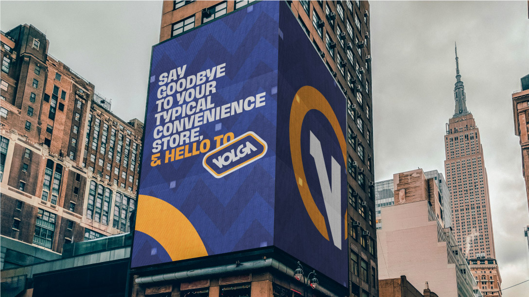
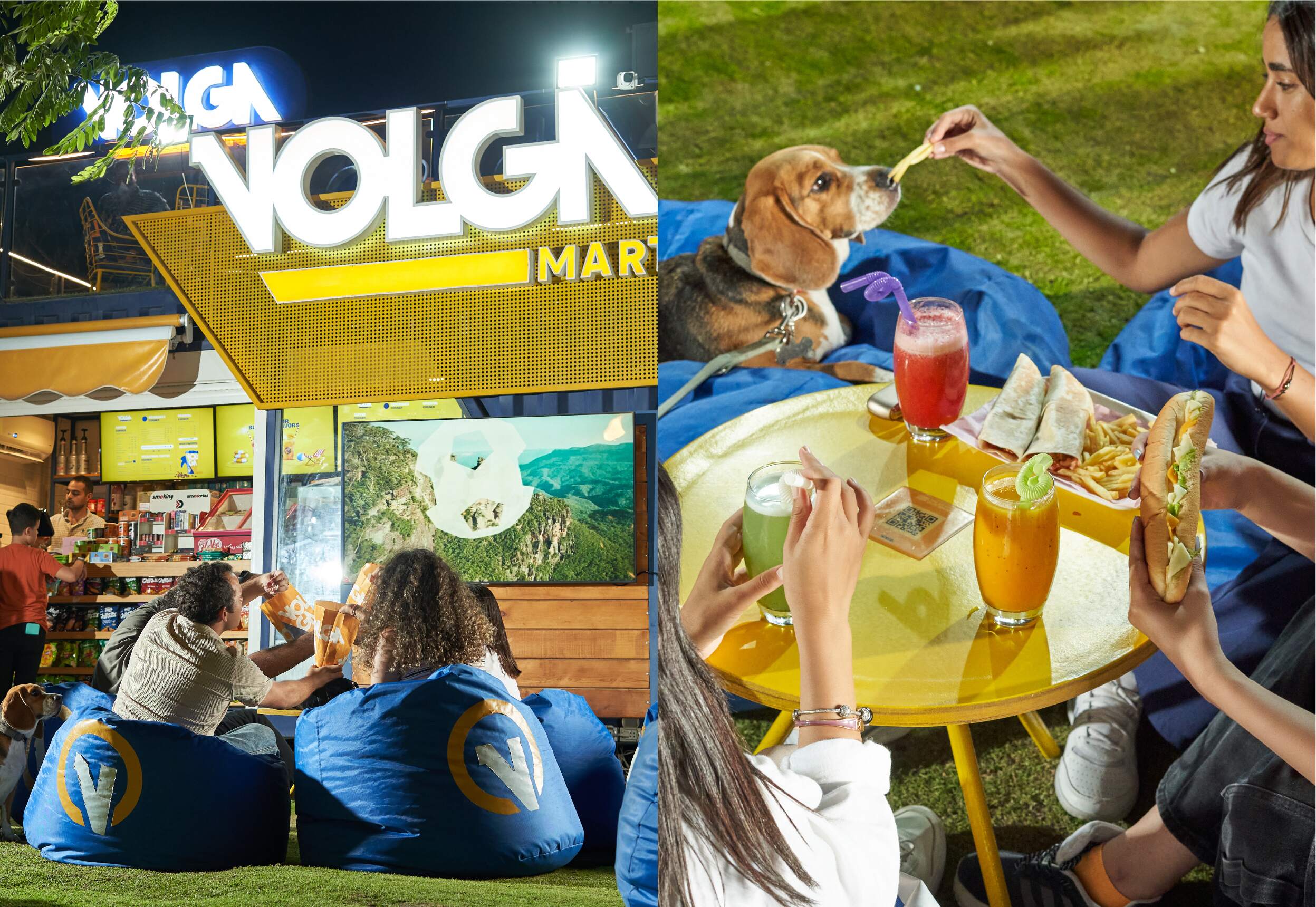
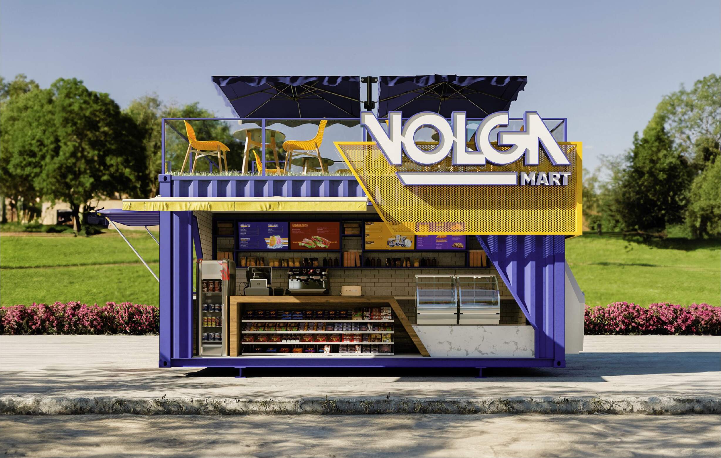
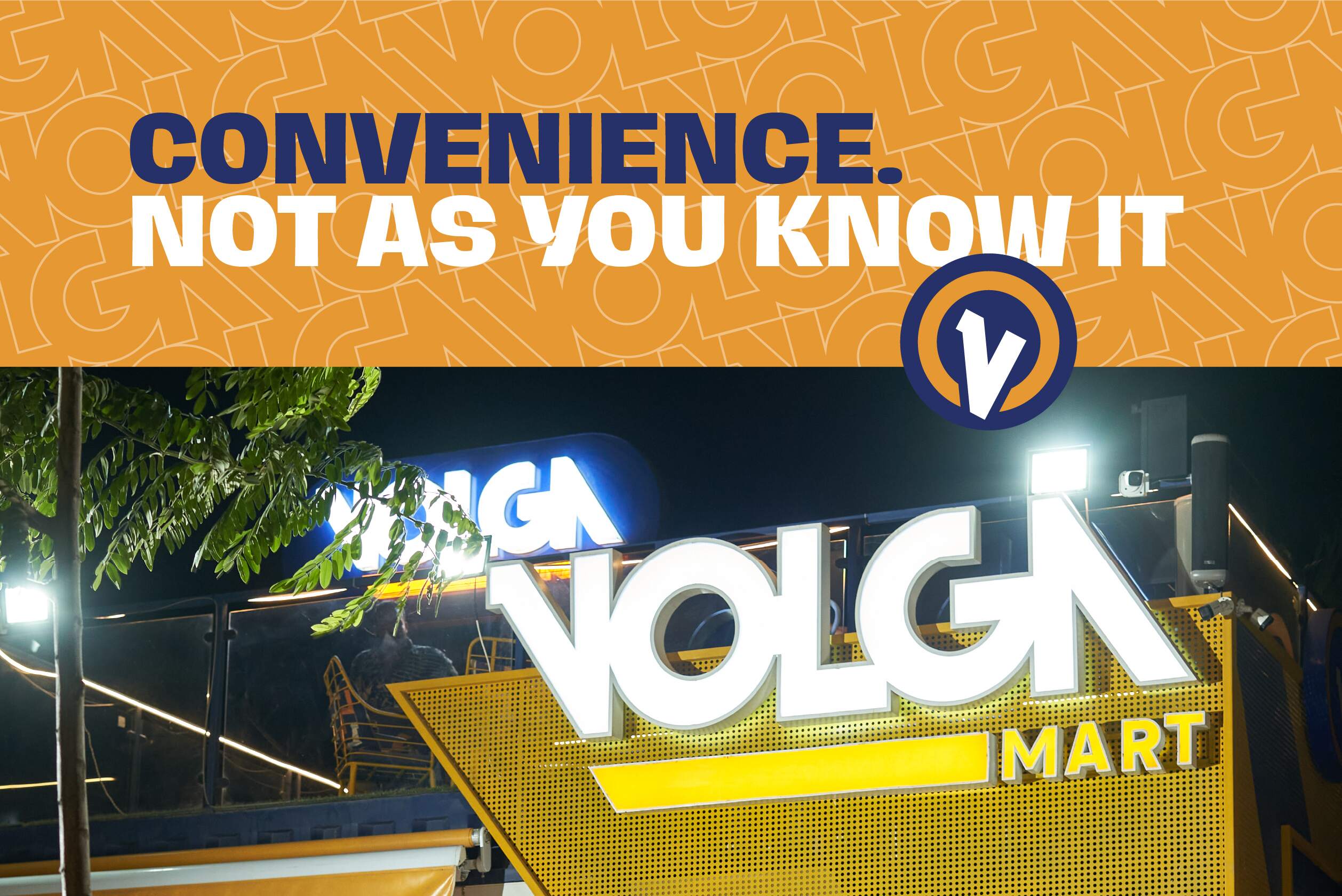
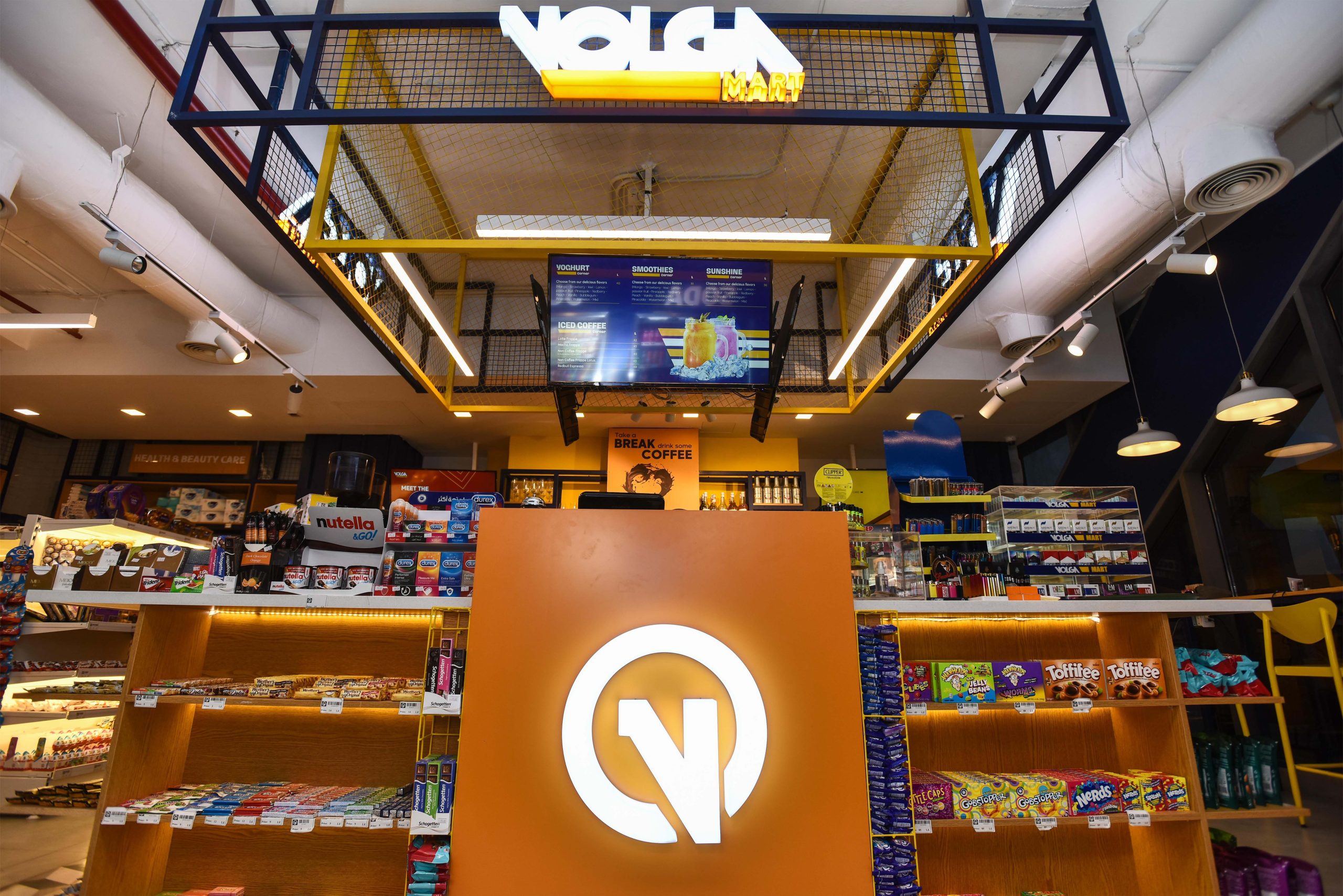
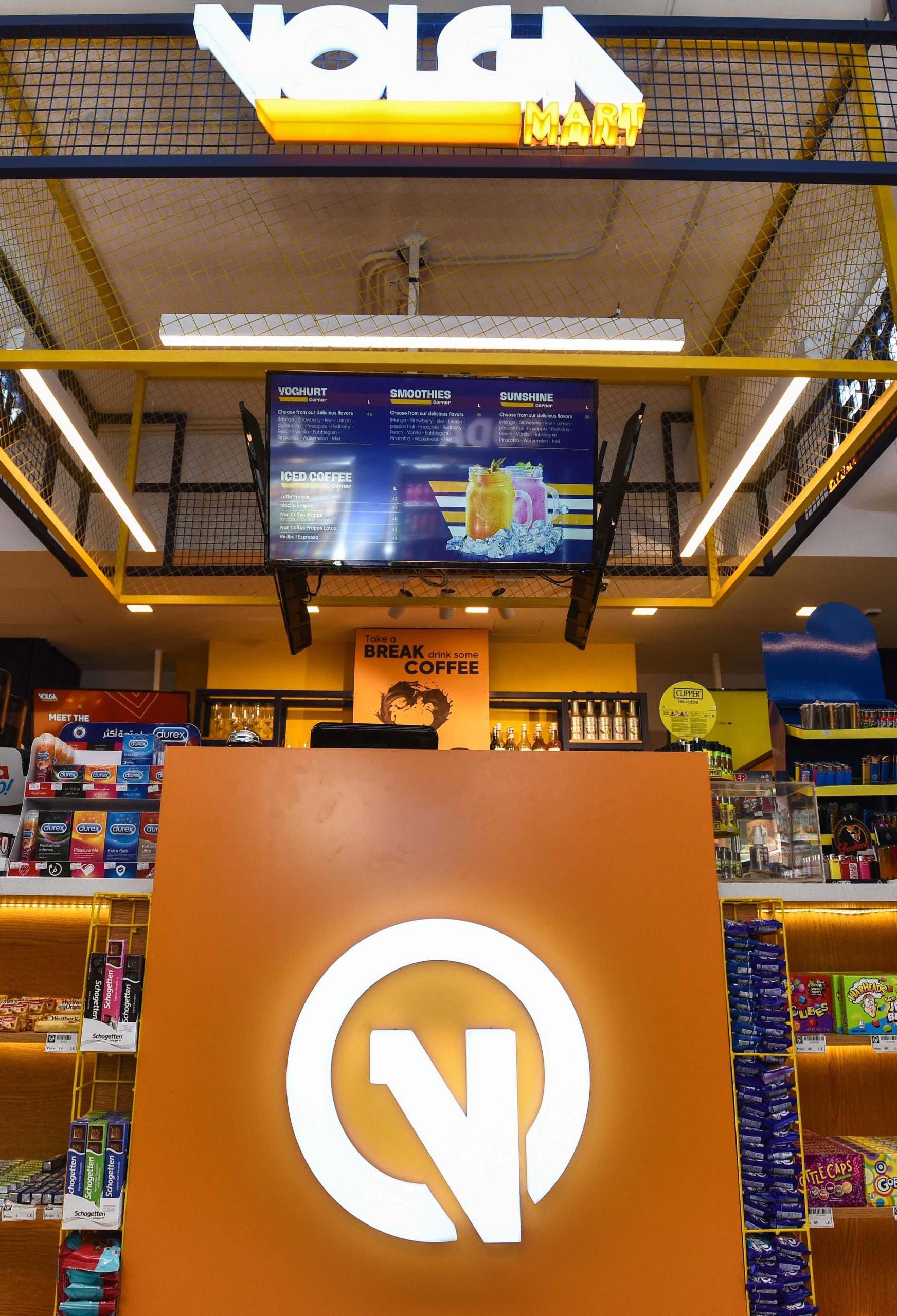
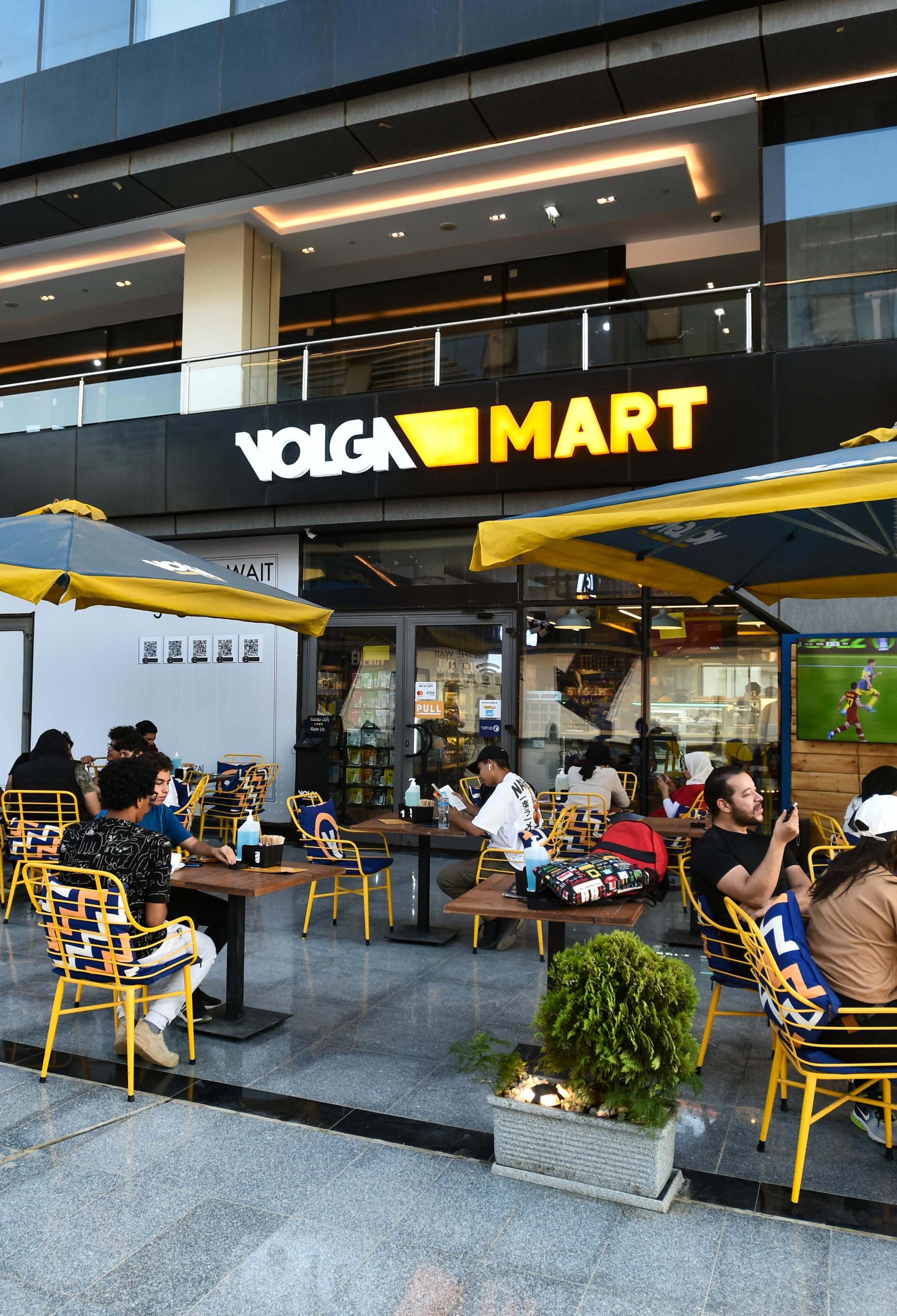
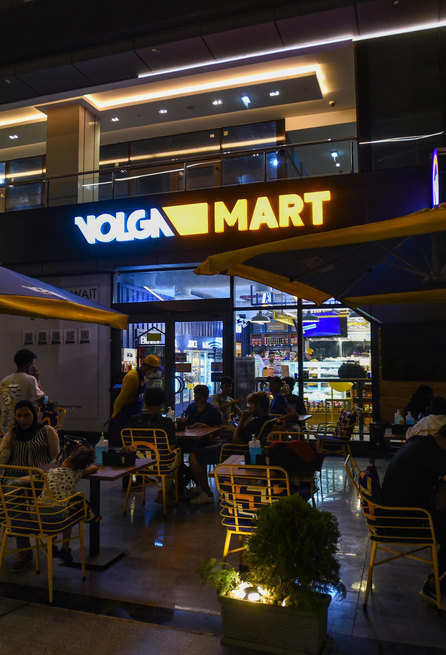
Say goodbye to your typical convenience store, and hello to VOLGA MART!
Overview
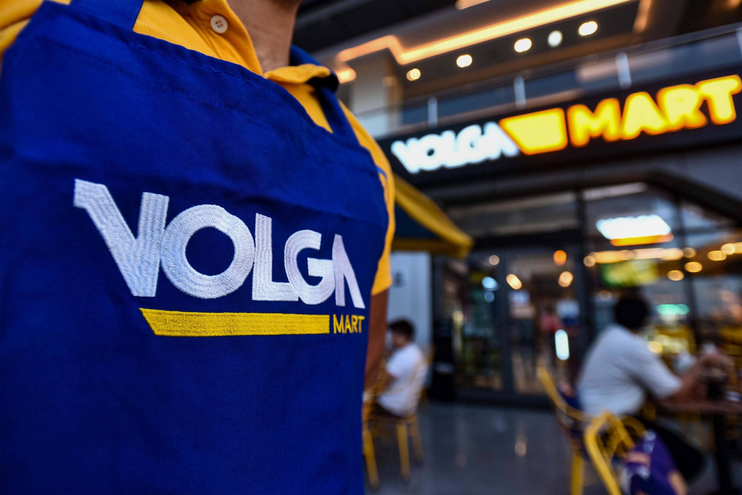
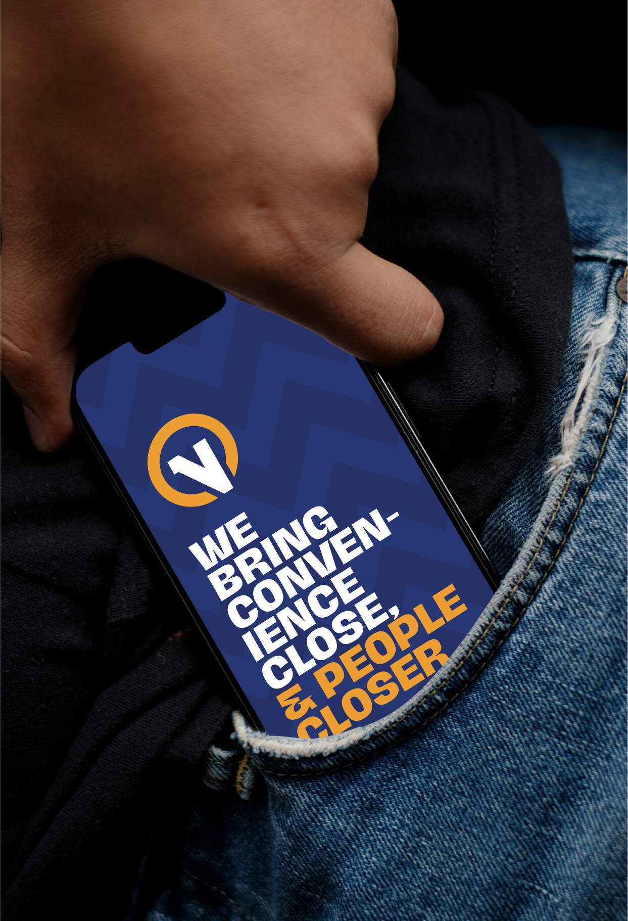
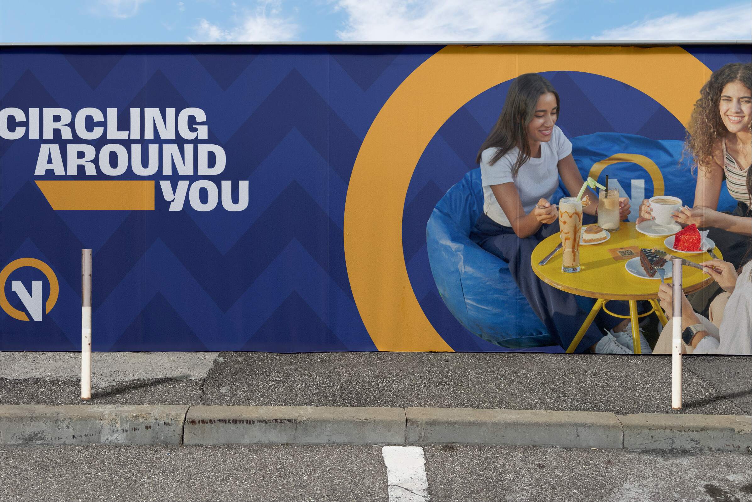
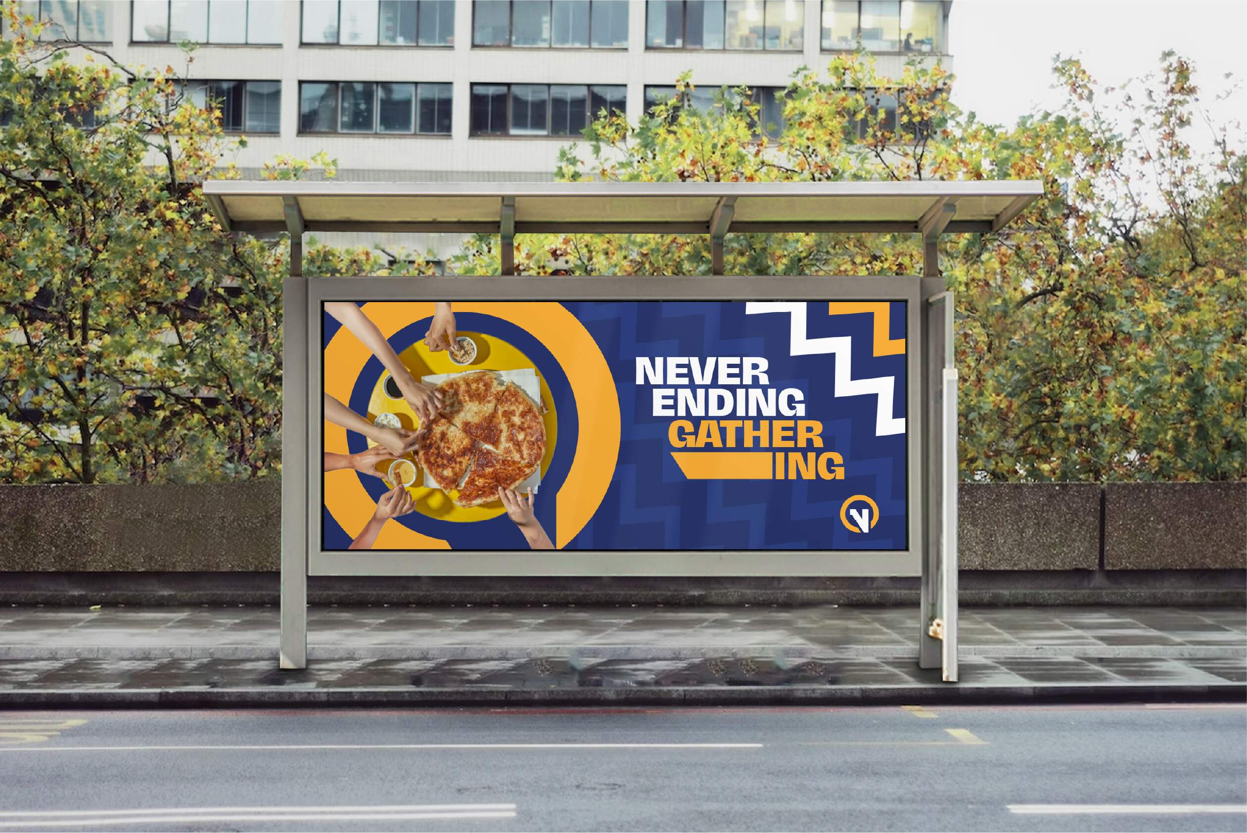
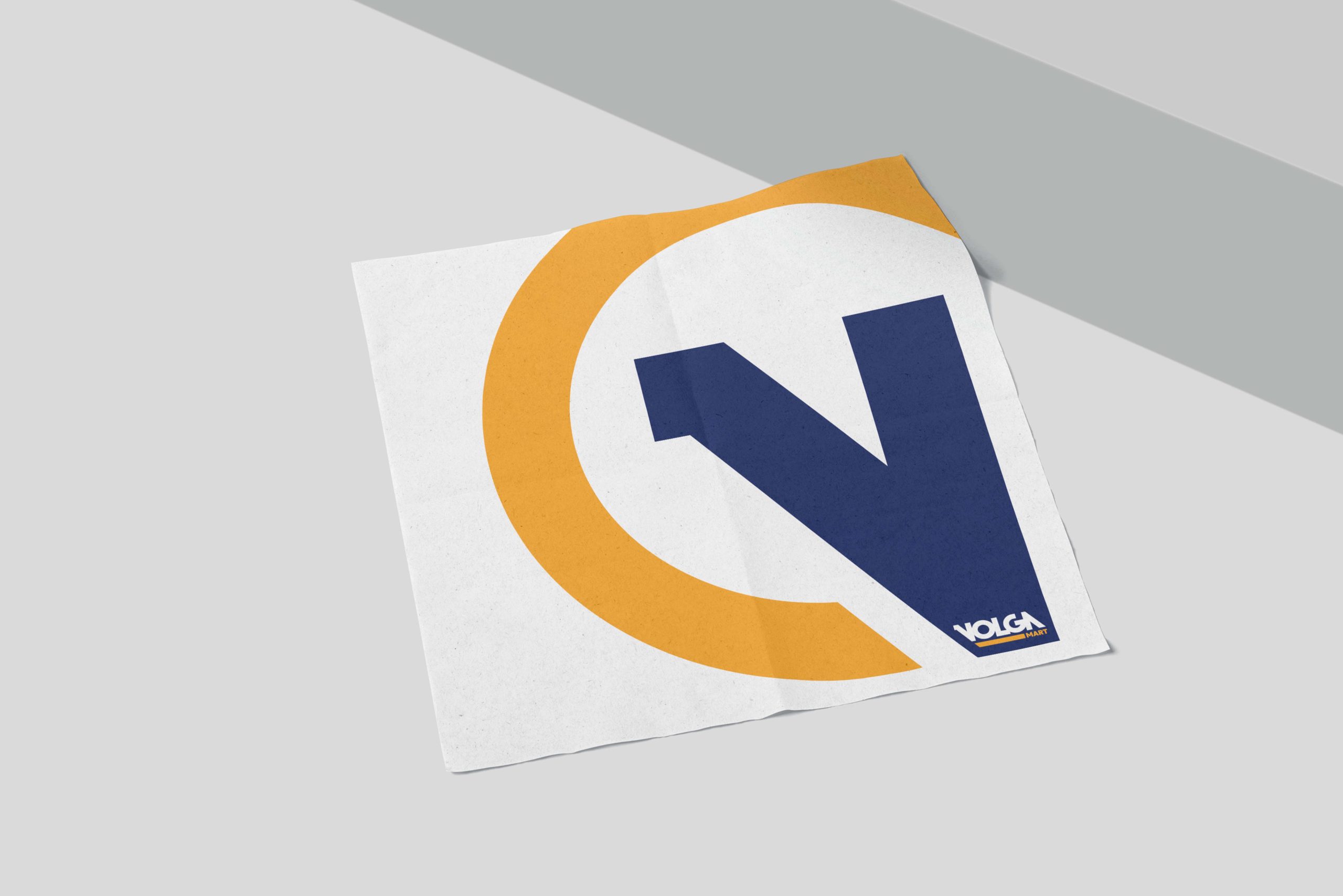
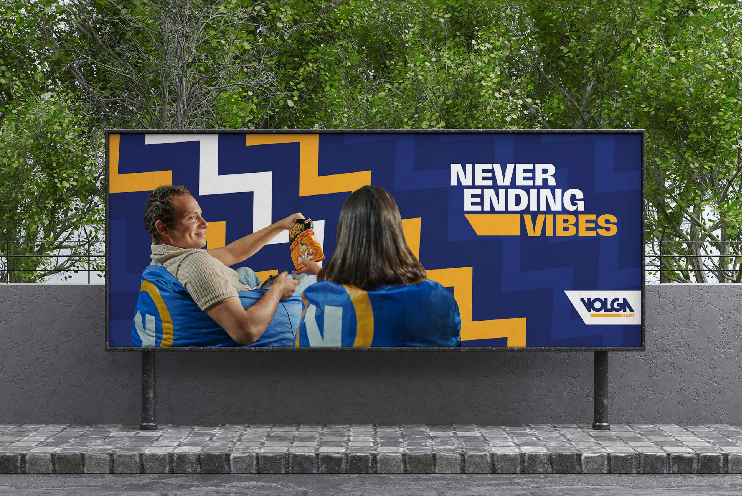
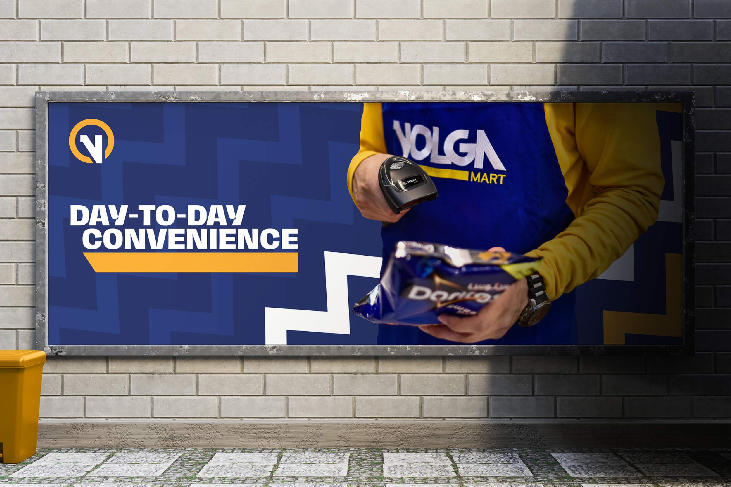
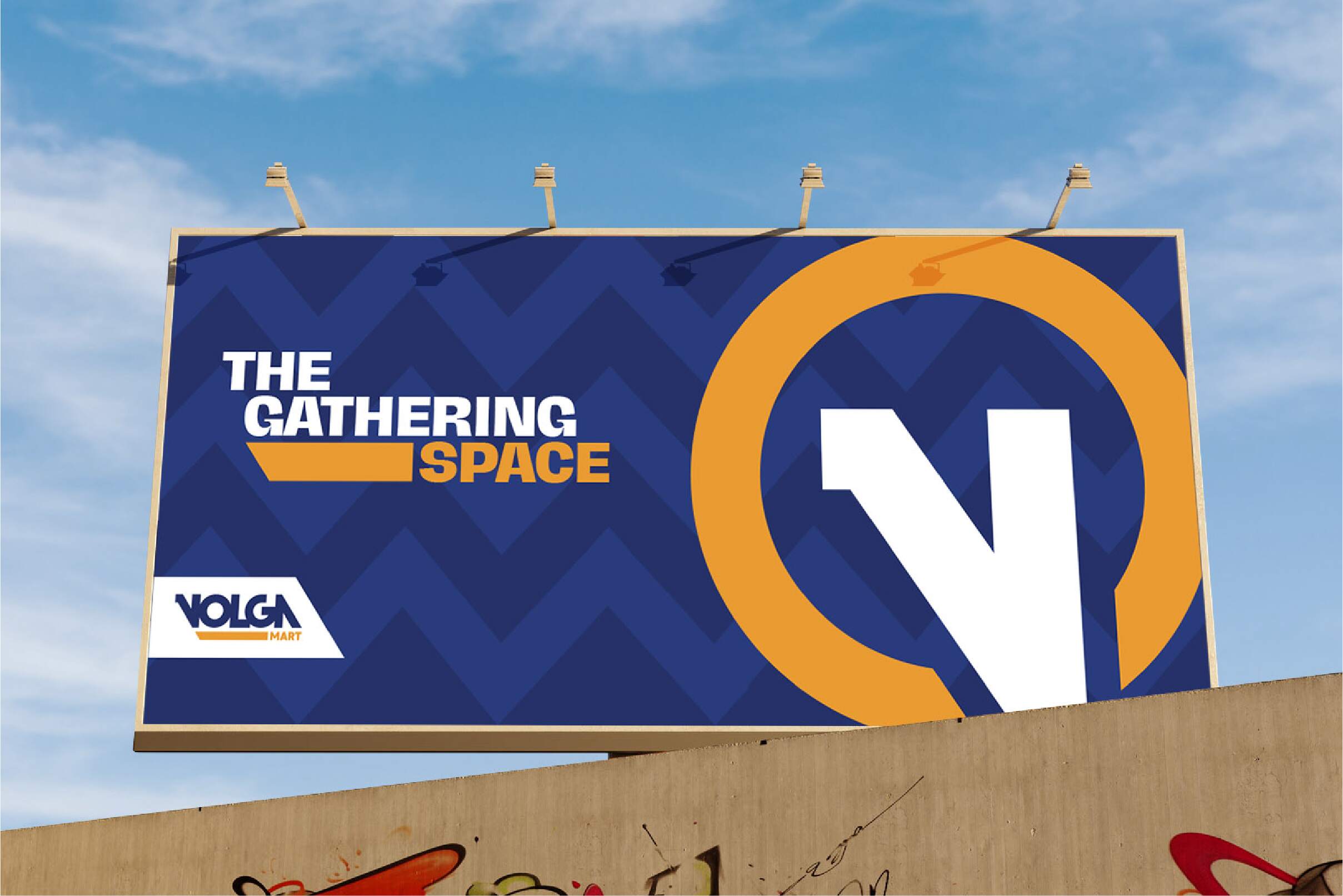
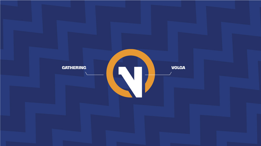
The uplift was driven by a single, universal idea. WE BRING CONVENIENCE CLOSE, AND PEOPLE CLOSER. It’s expressed through every part of a new identity. A vibrant and youthful brand – a new brand symbol of gathering with a unique circle shaped around the letter V. A young and bold tone of voice is written to be instantly striking.
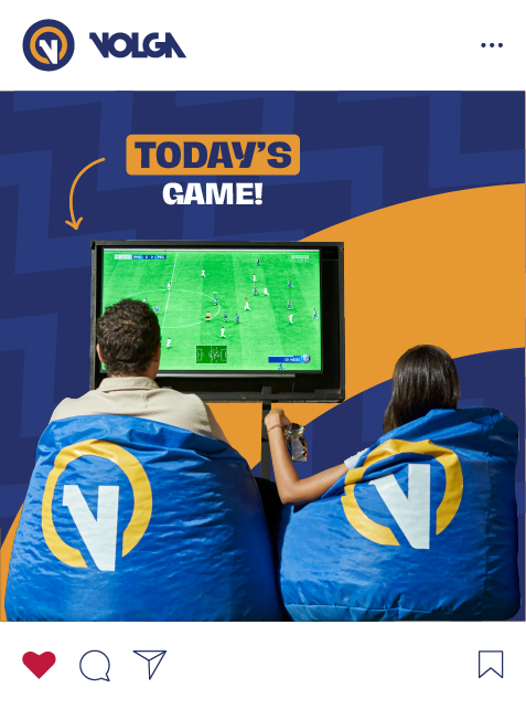
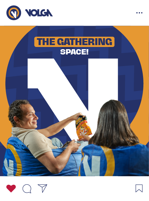
We’ve transformed the entire convenience store experience. Like seriously, a brand built with people and convenience in mind. FOR PEOPLE WHO LOVE TO GATHER. EVERYWHERE.
- Experience Design
- Customer Analysis
- Market Research
- Brand experience
- Empathy Mapping

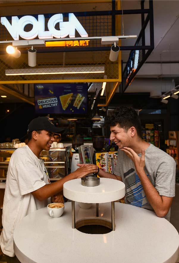
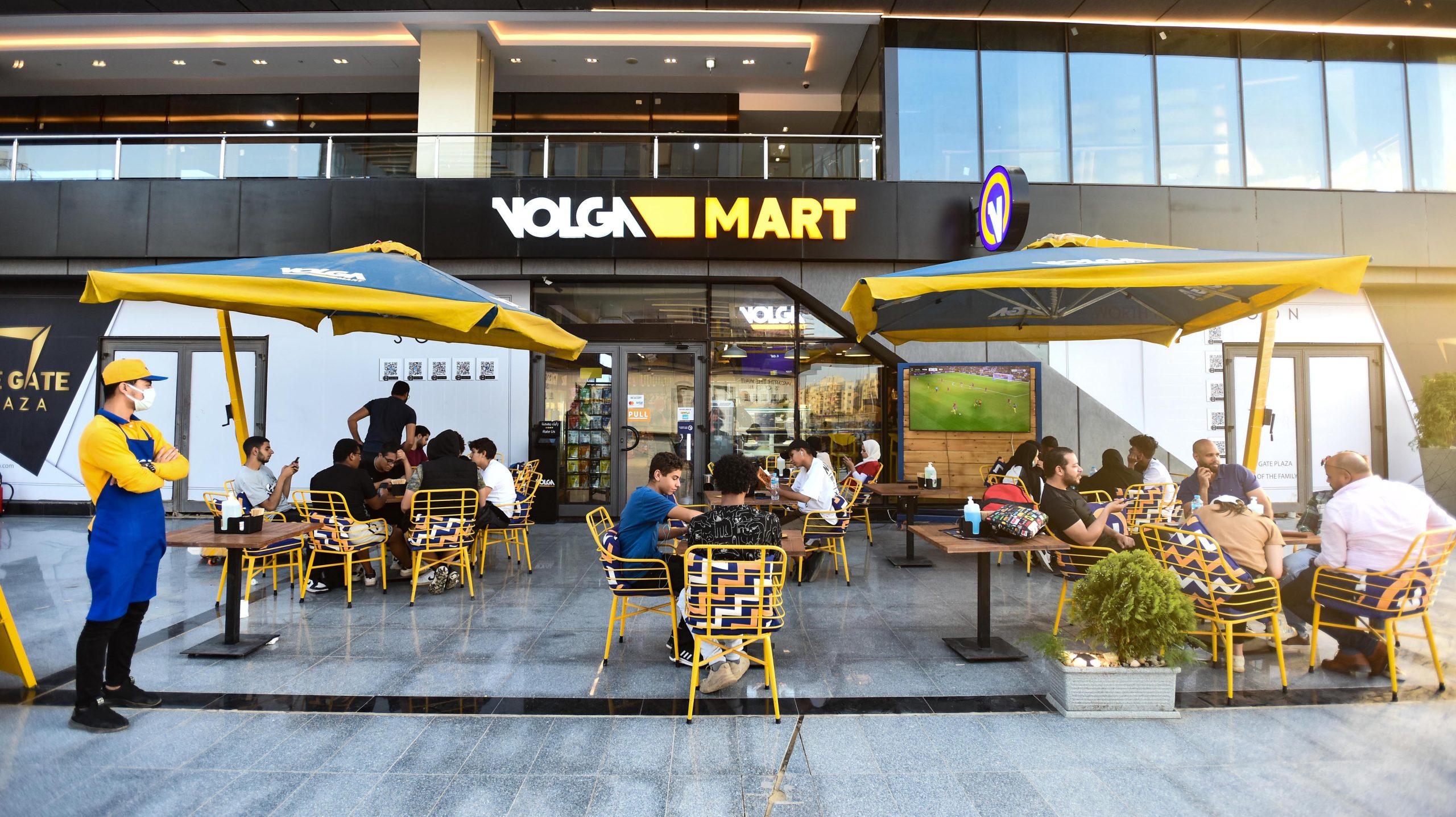
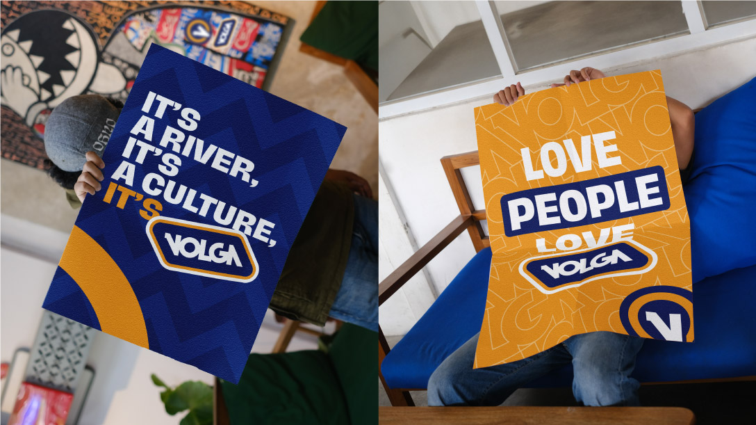
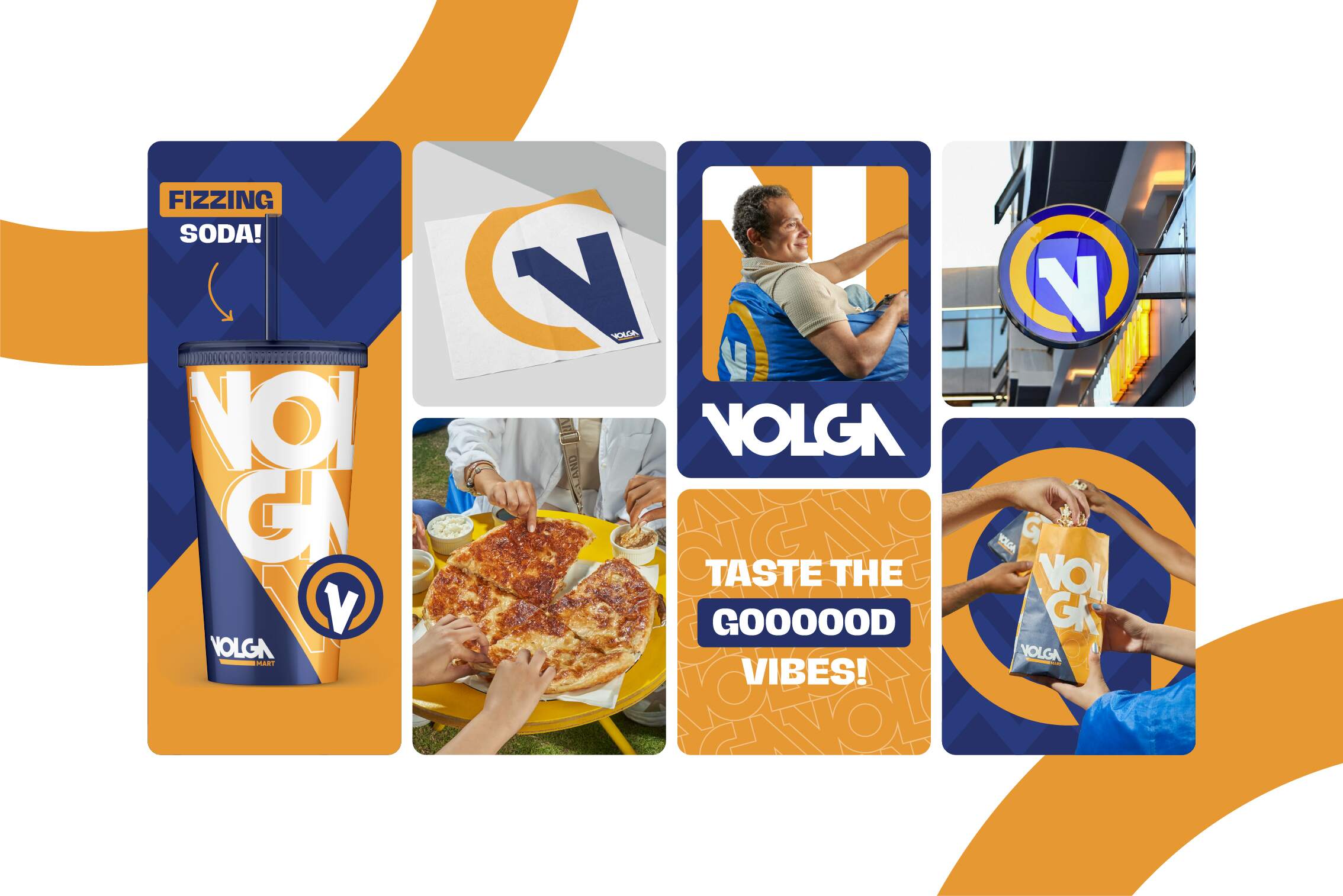
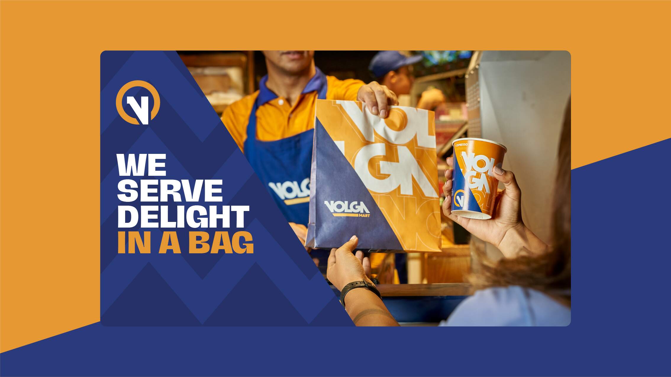
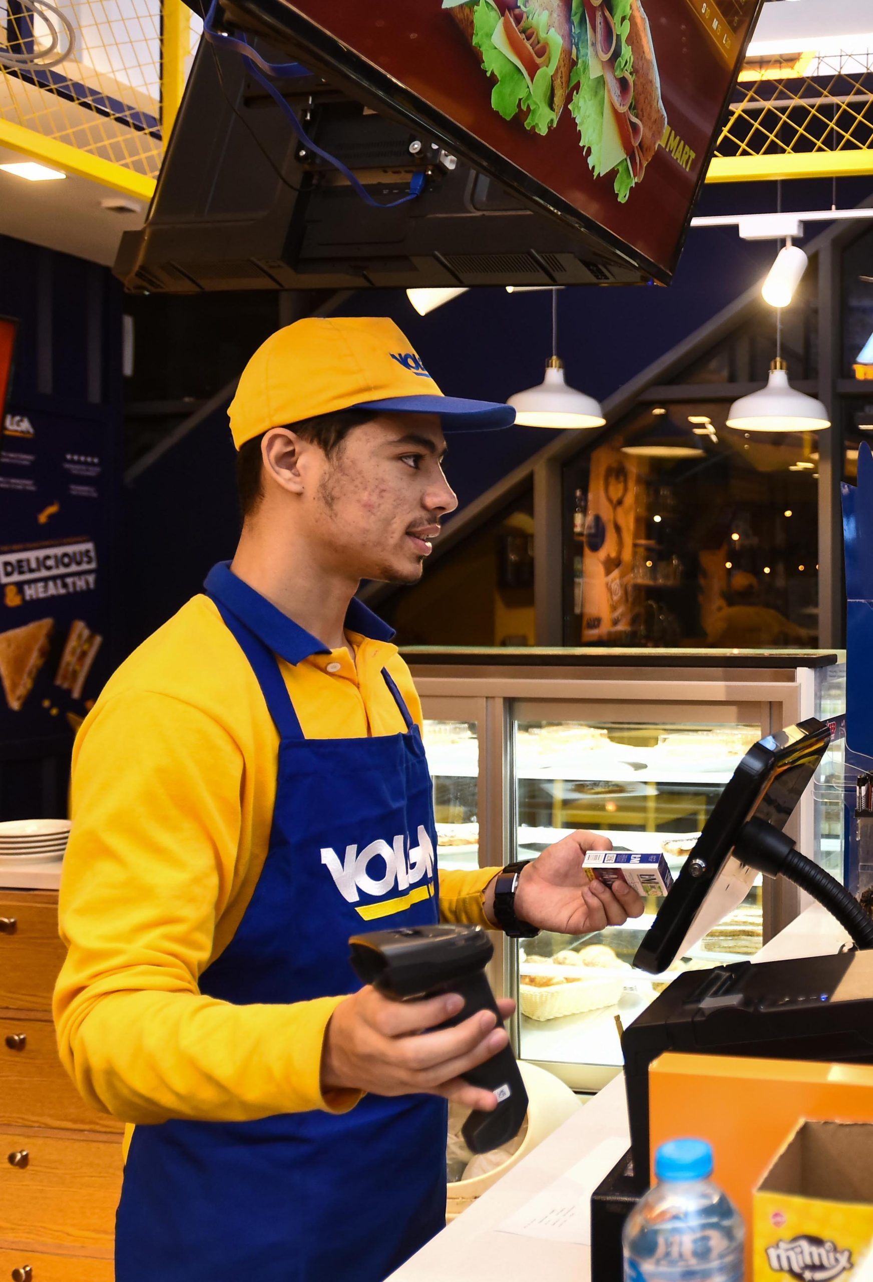
Our team studied the roots of the brand, its origins and target audience, discovering why it’s different and how to communicate this difference. VOLGA is not only a successful convenient store, but a genuine brand that puts people first, and so we did. By designing the customer experience in each and every touchpoint in detail, from strategy to on ground execution. The result is a brand culture that resonates gathering.
- Brand Strategy
- Identity System
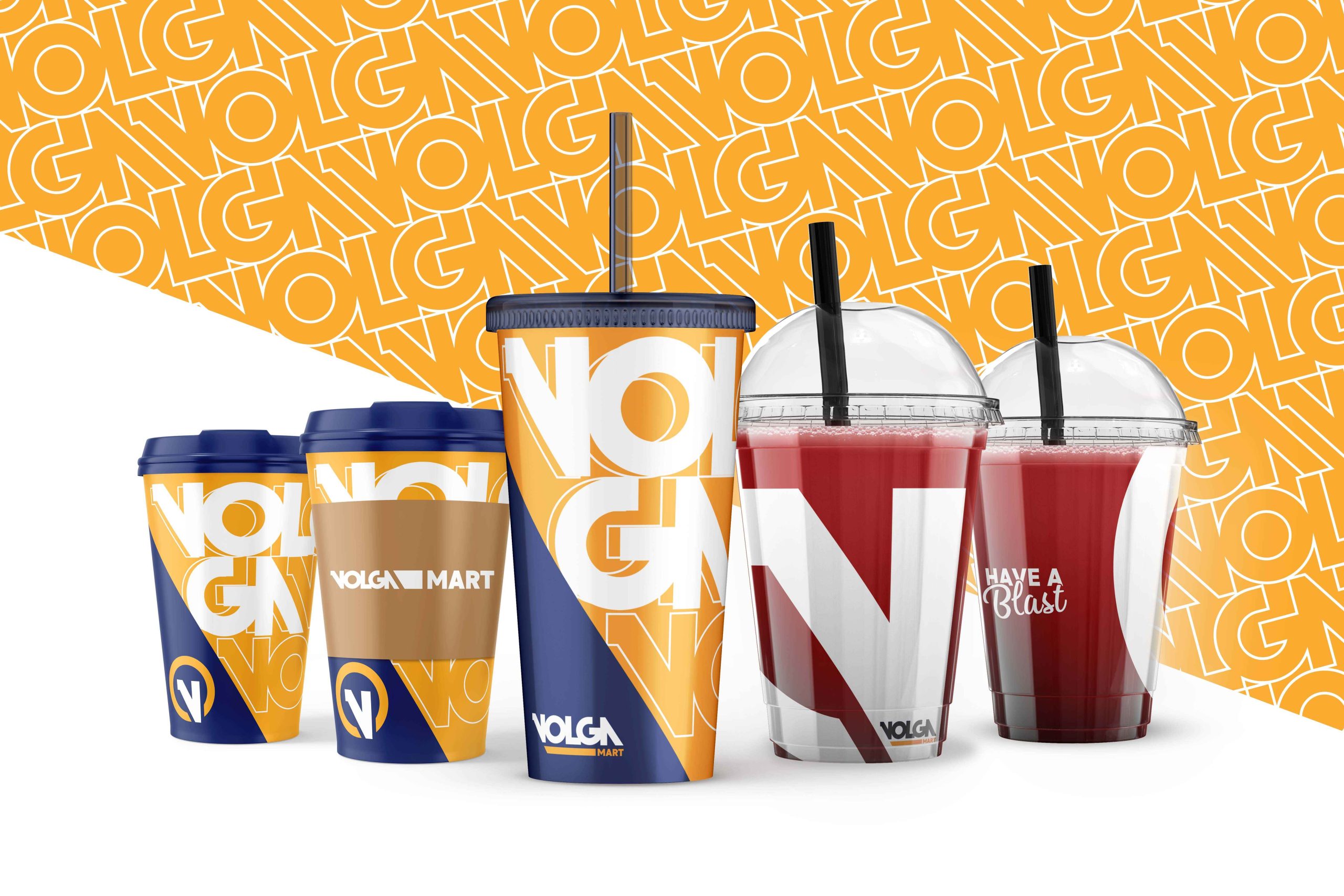
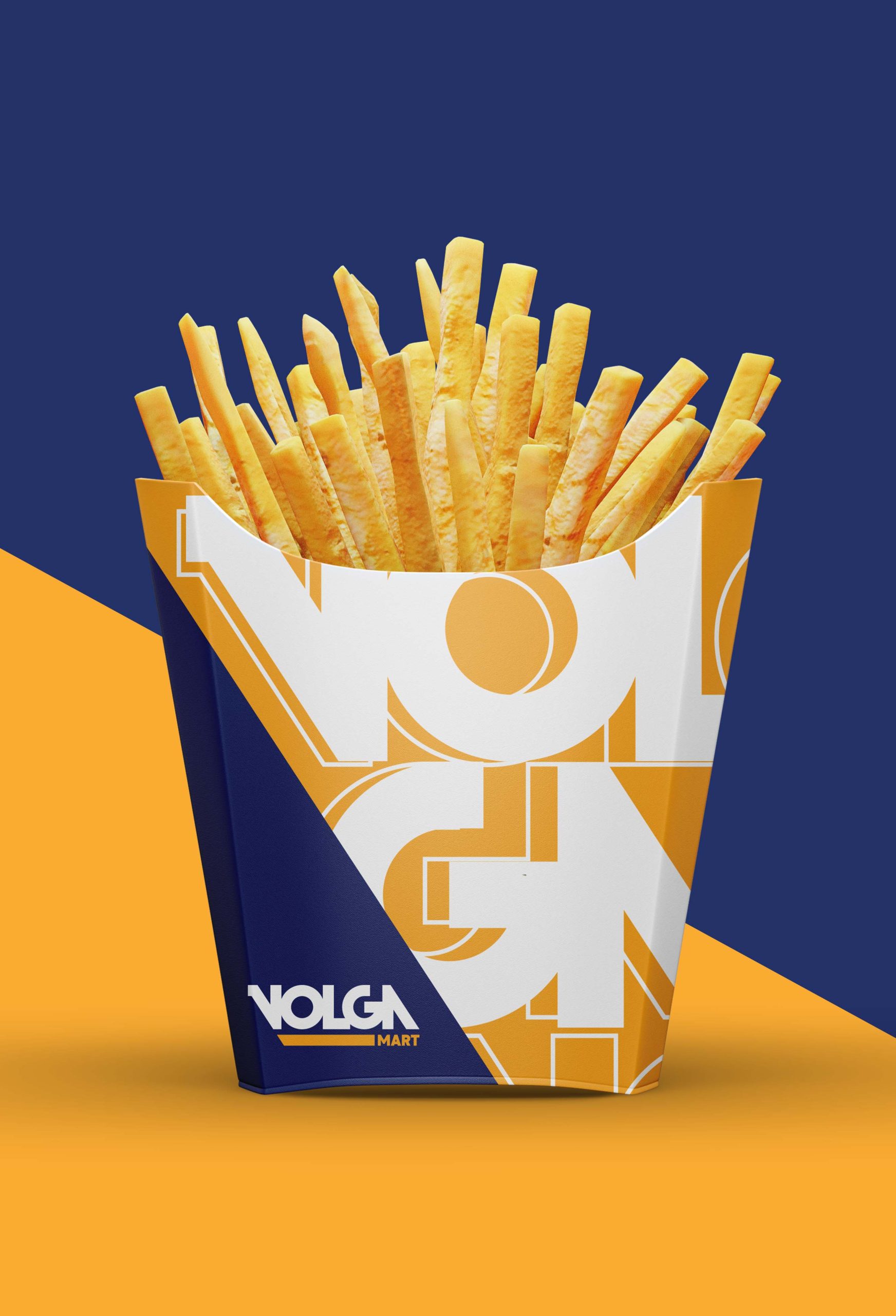
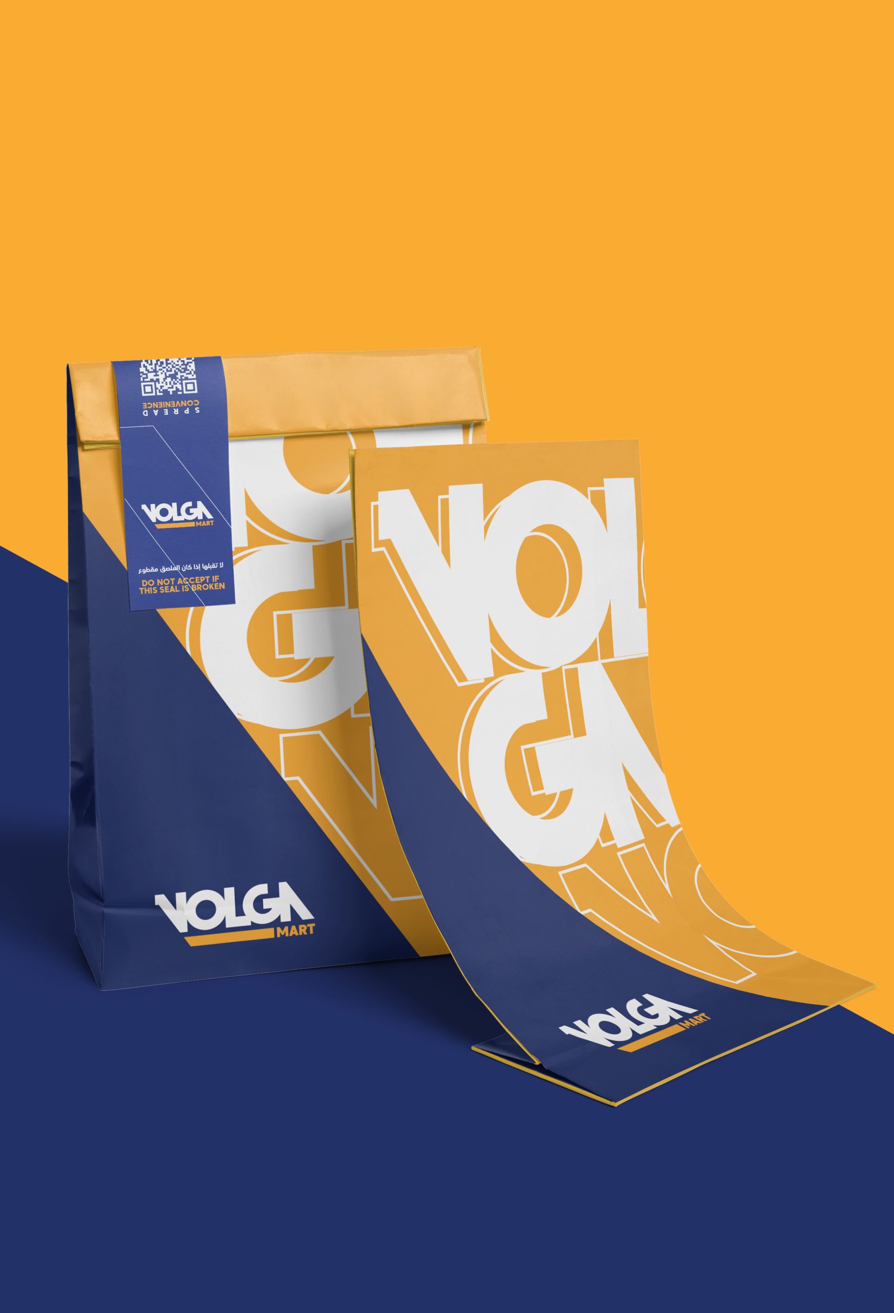
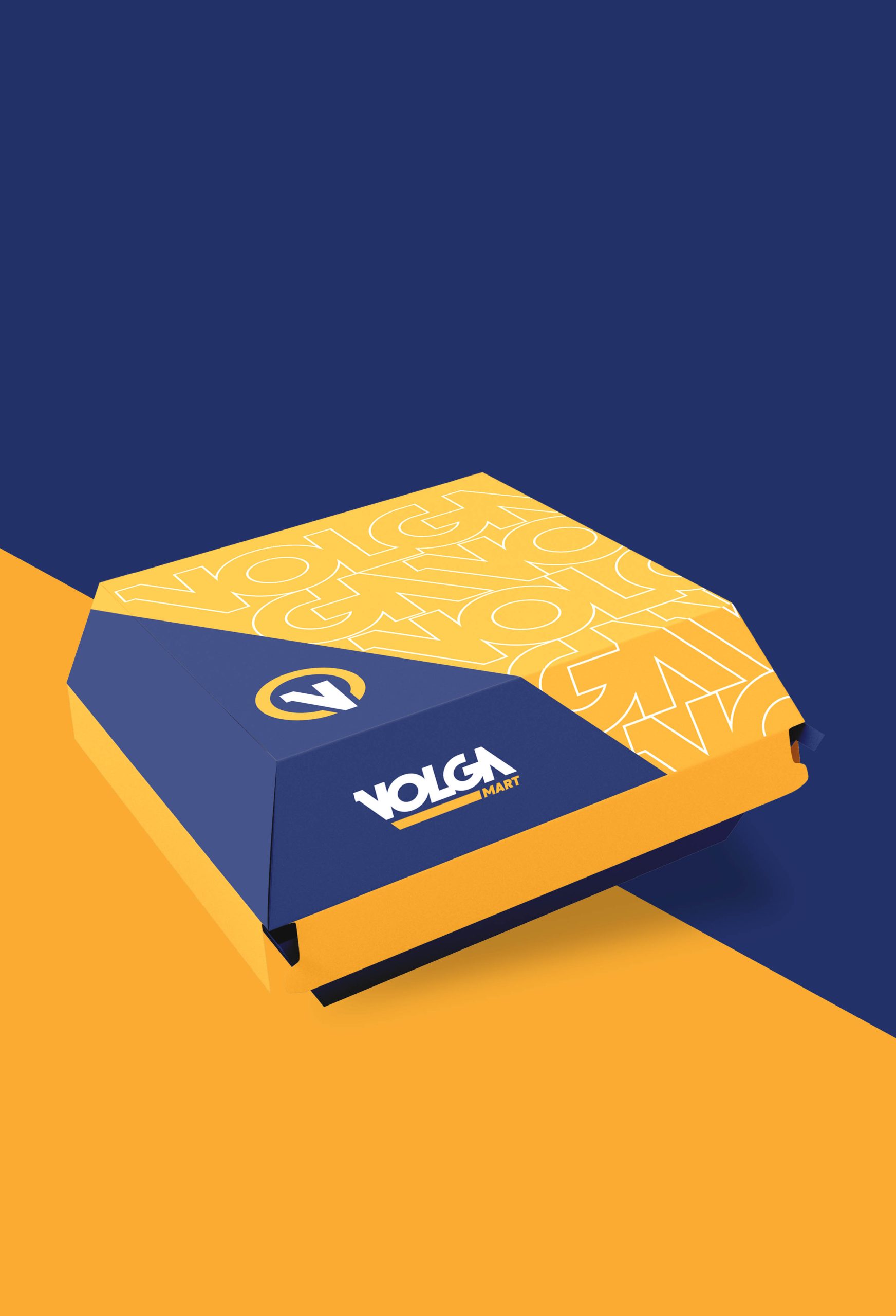
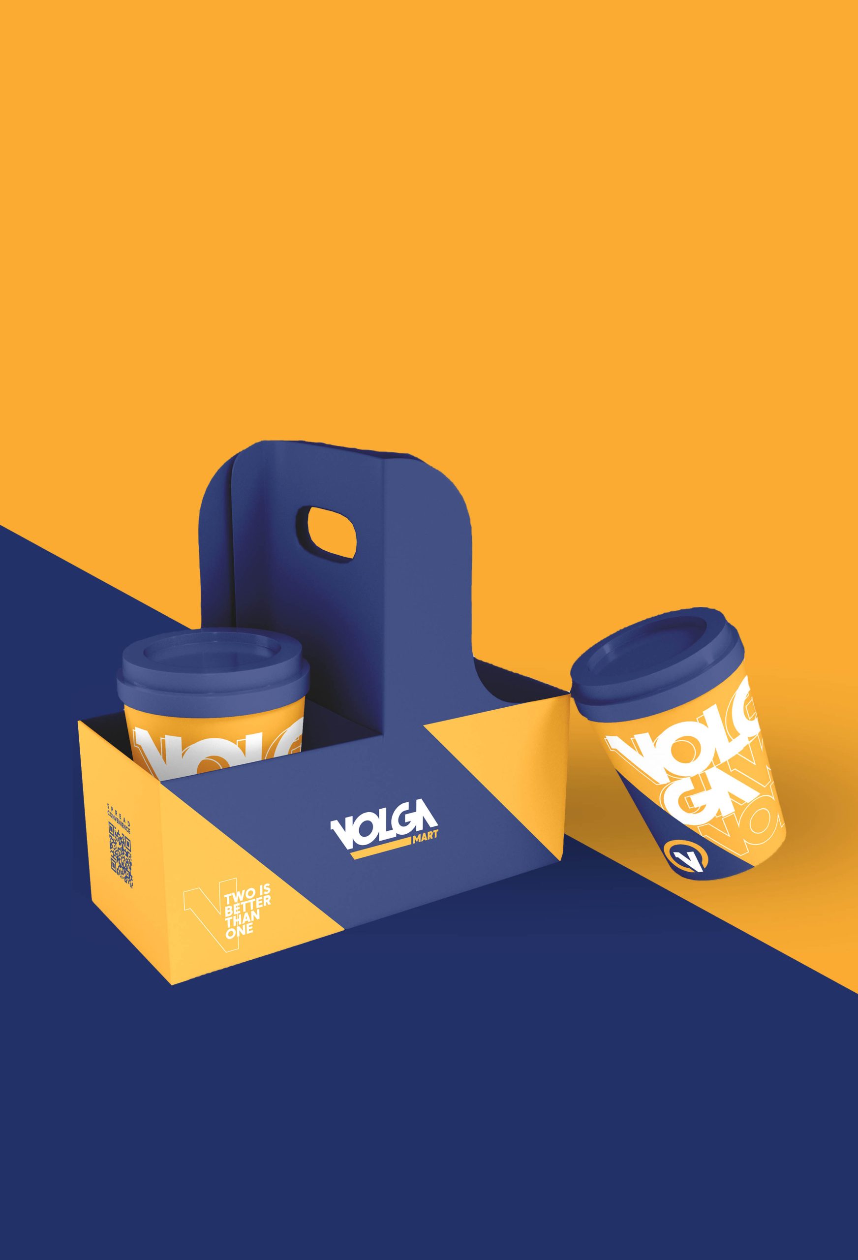
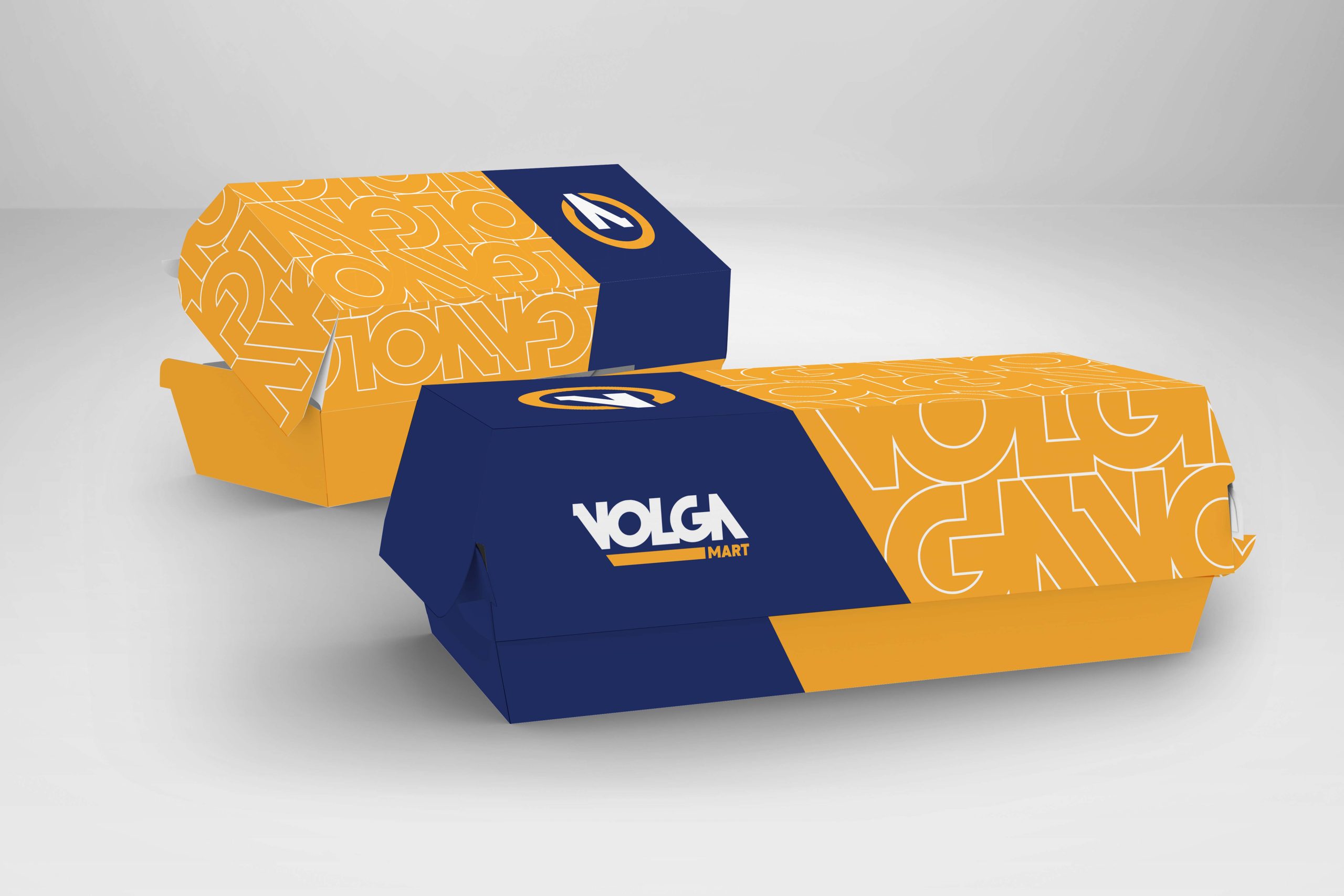
- Packaging
- Motion Graphics
- Brand Photography


That’s what VOLGA strives to be. and we helped them do just that. While brand consistency relies heavely on logo usage, color and typography, we recognize that these are not the only elements withen an iconic brand identity design system.
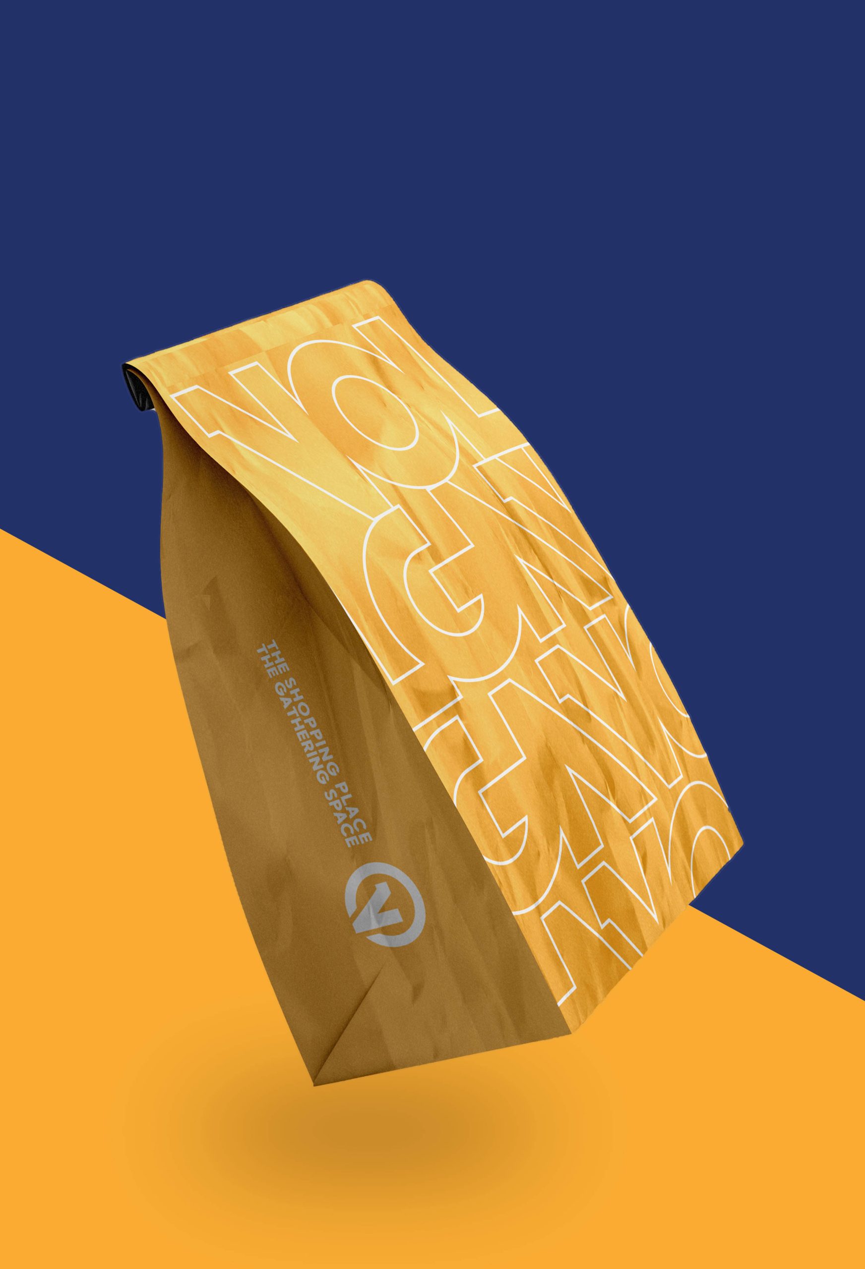
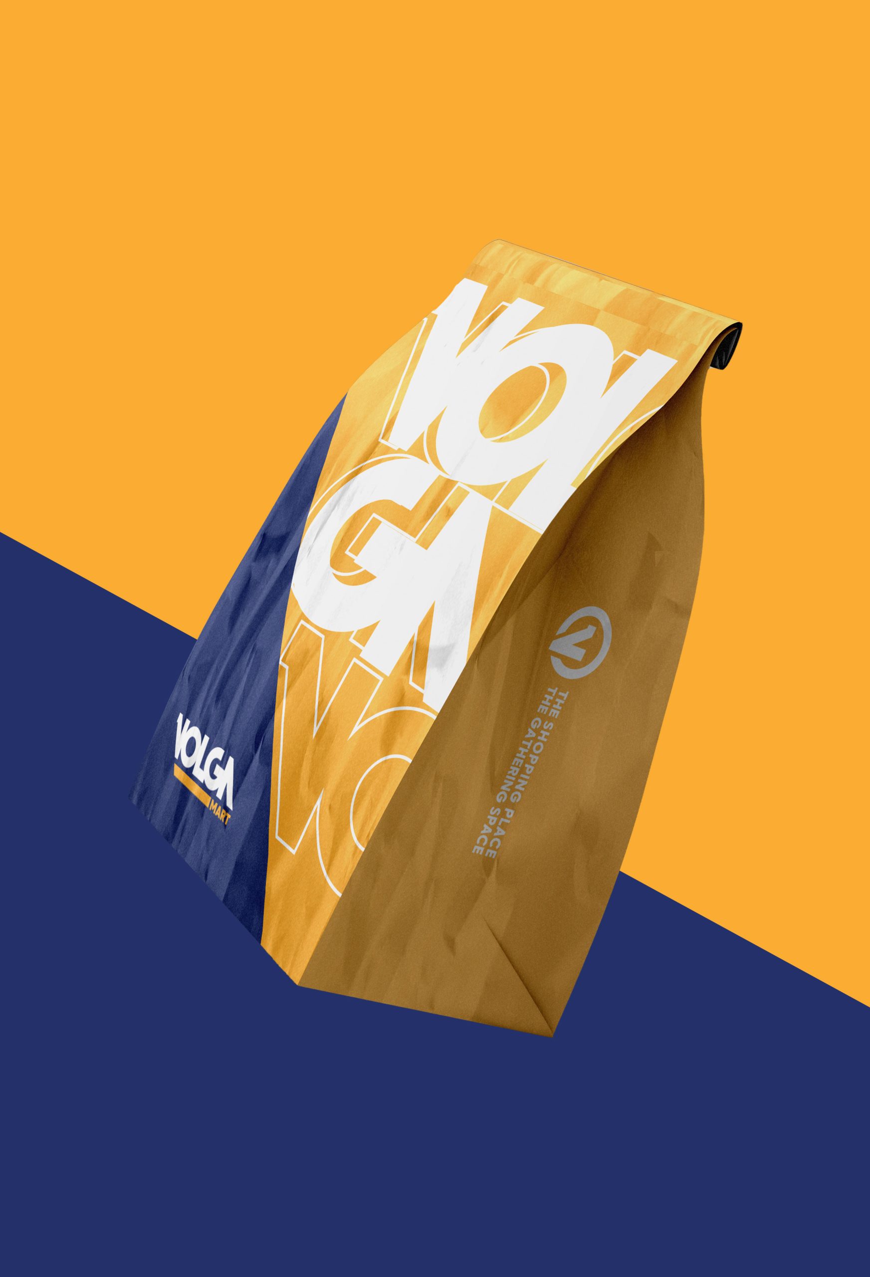
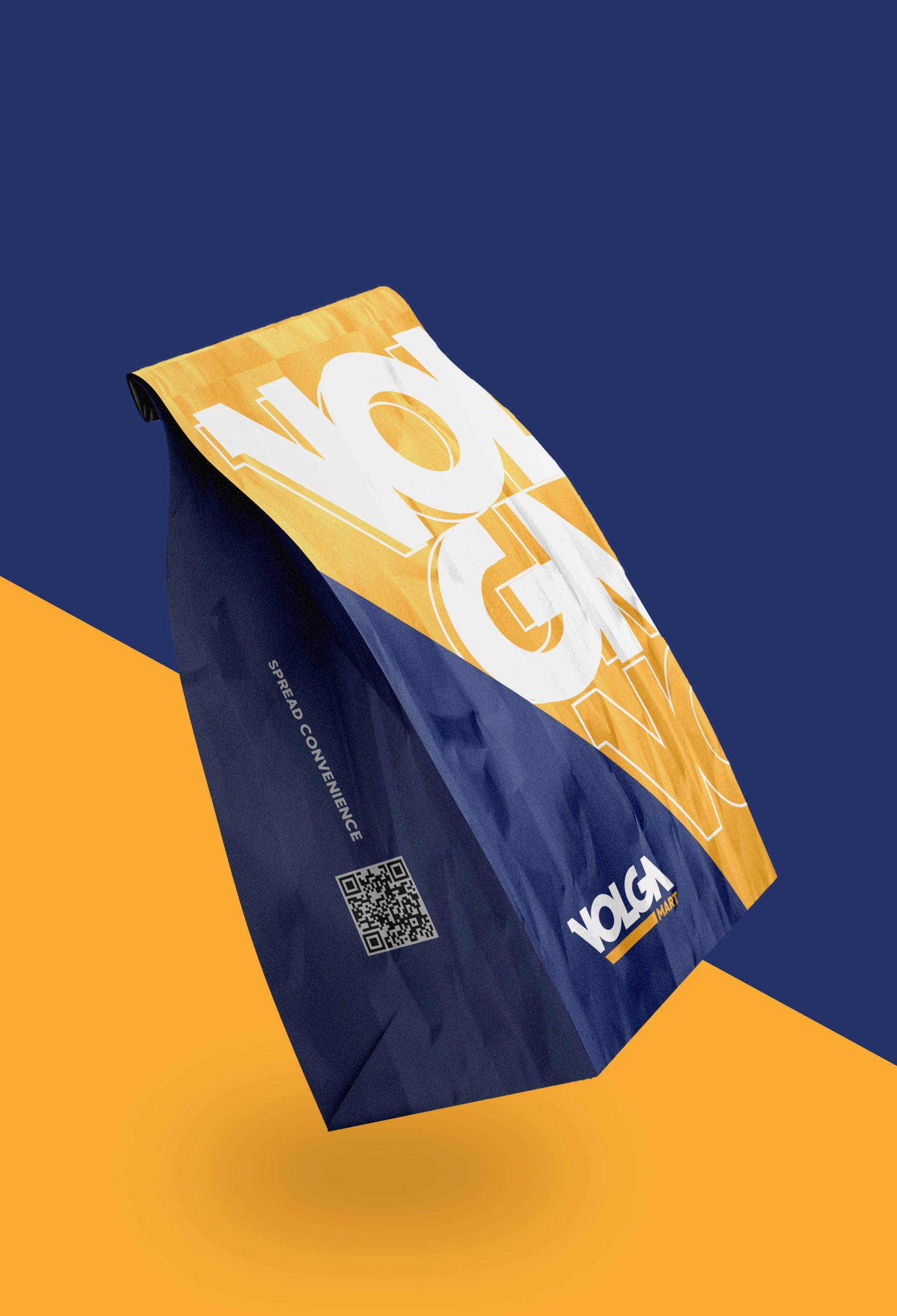
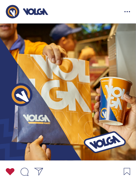
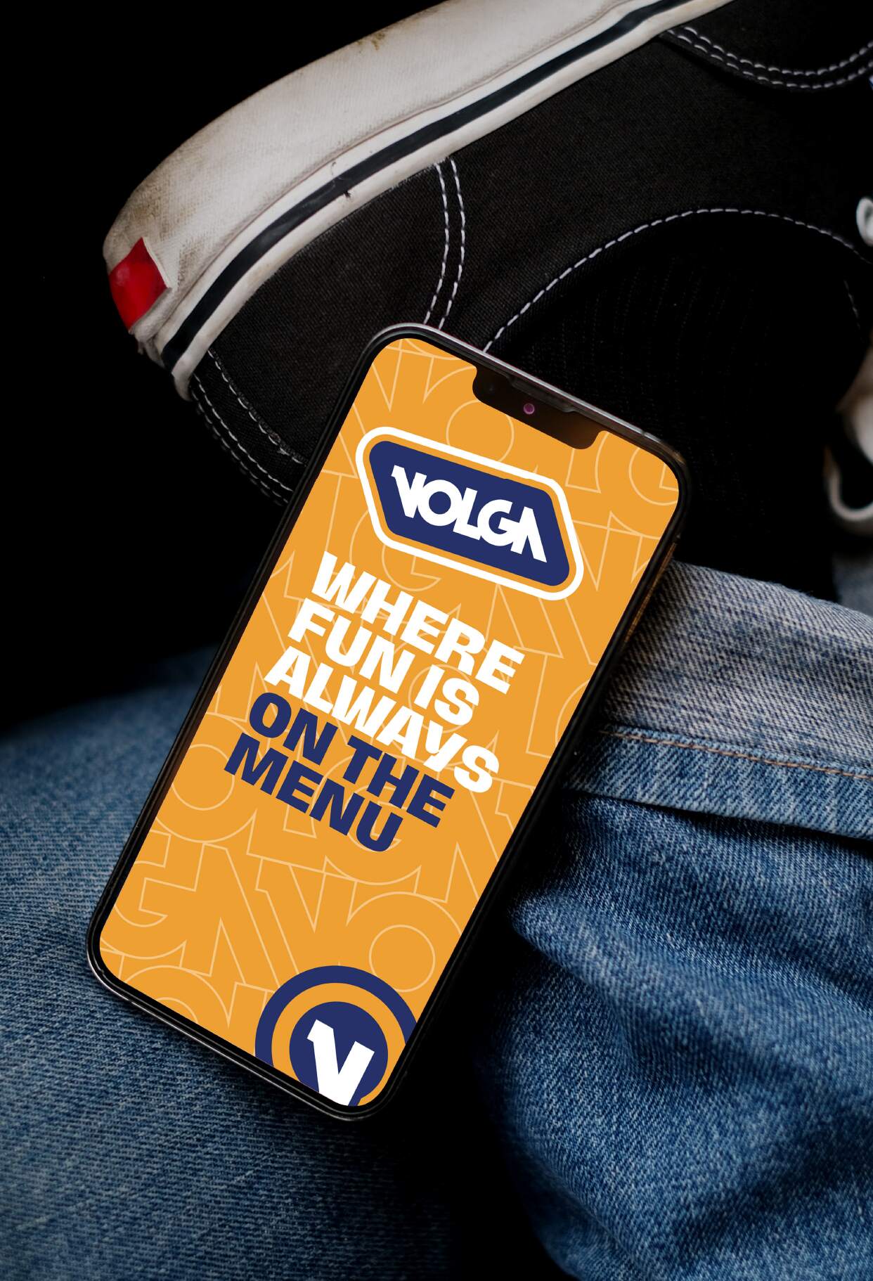
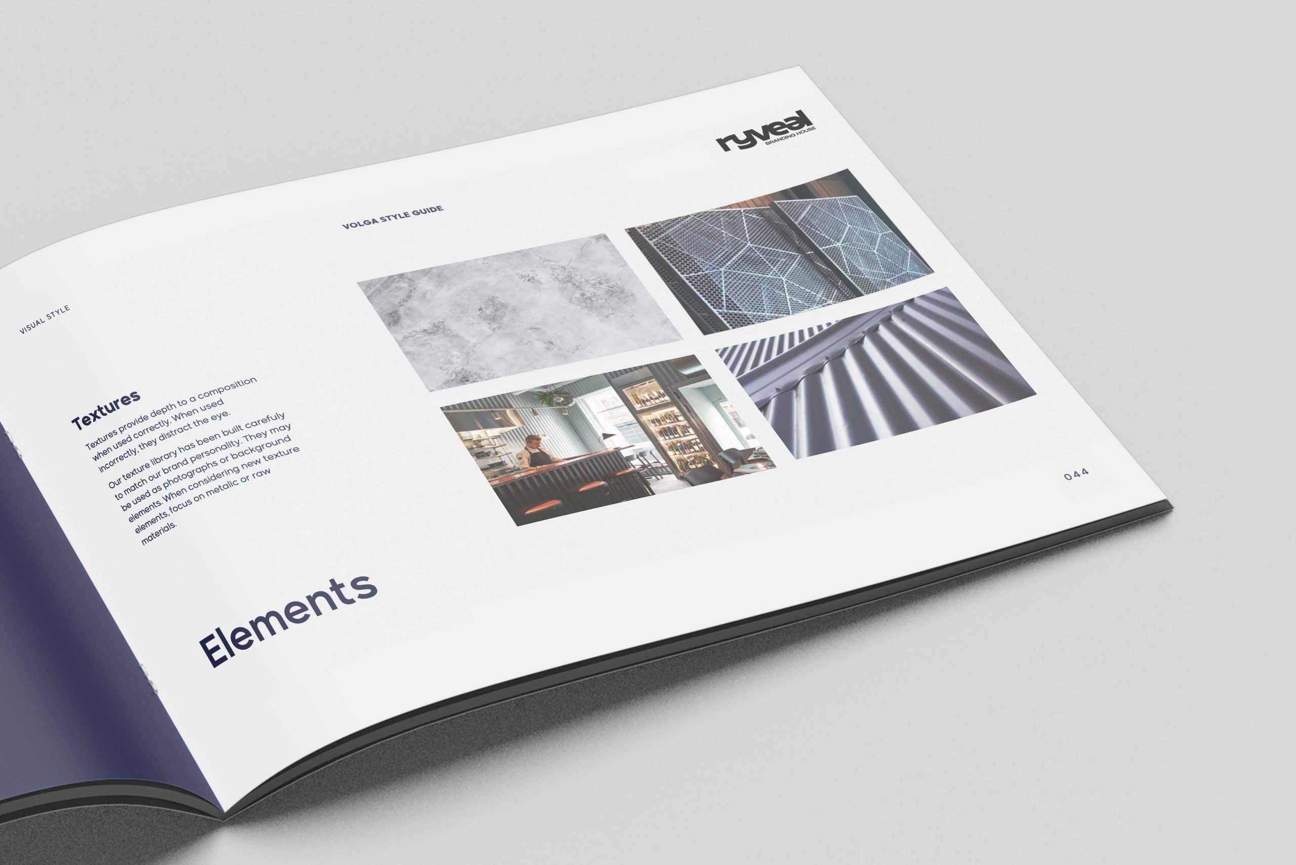
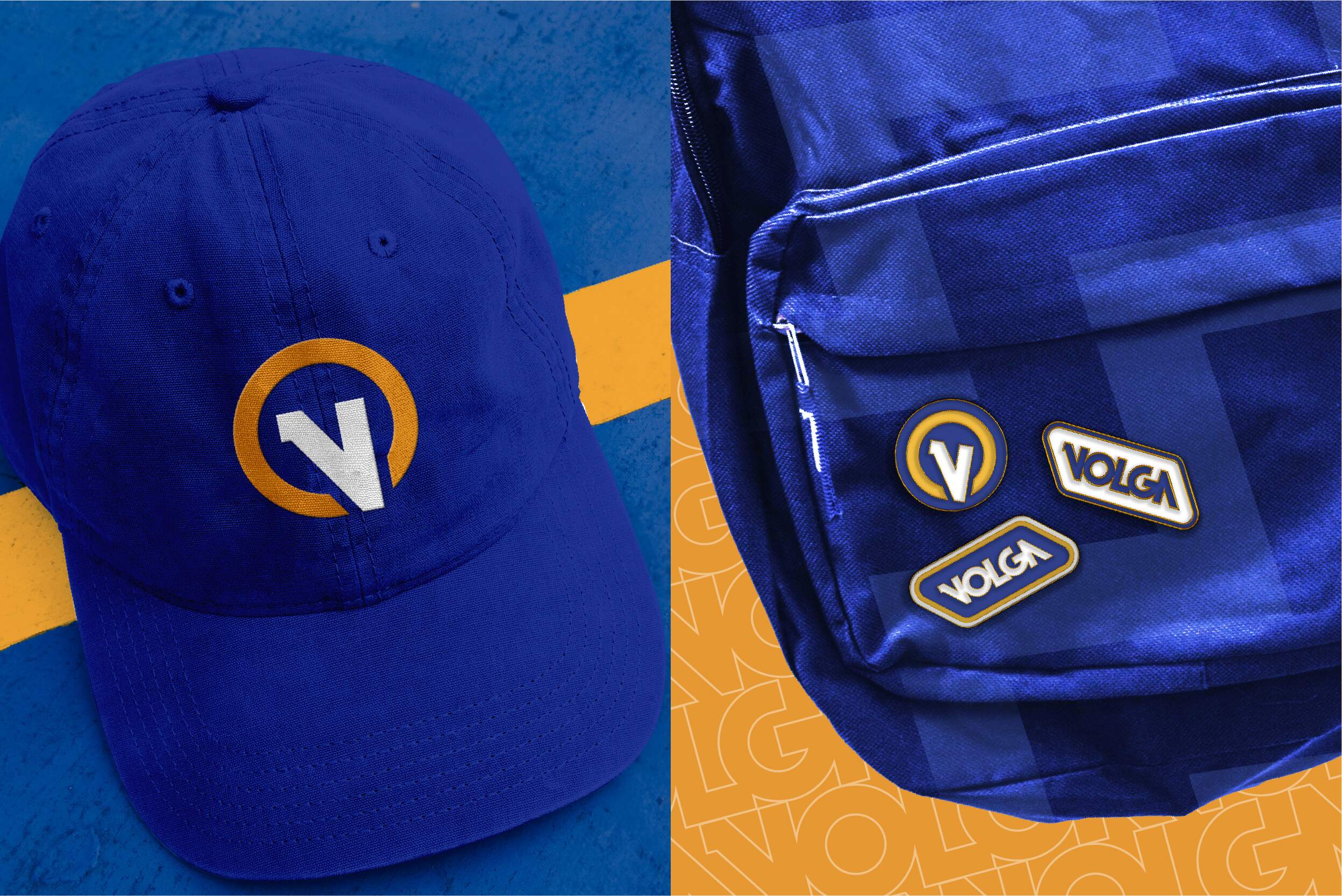
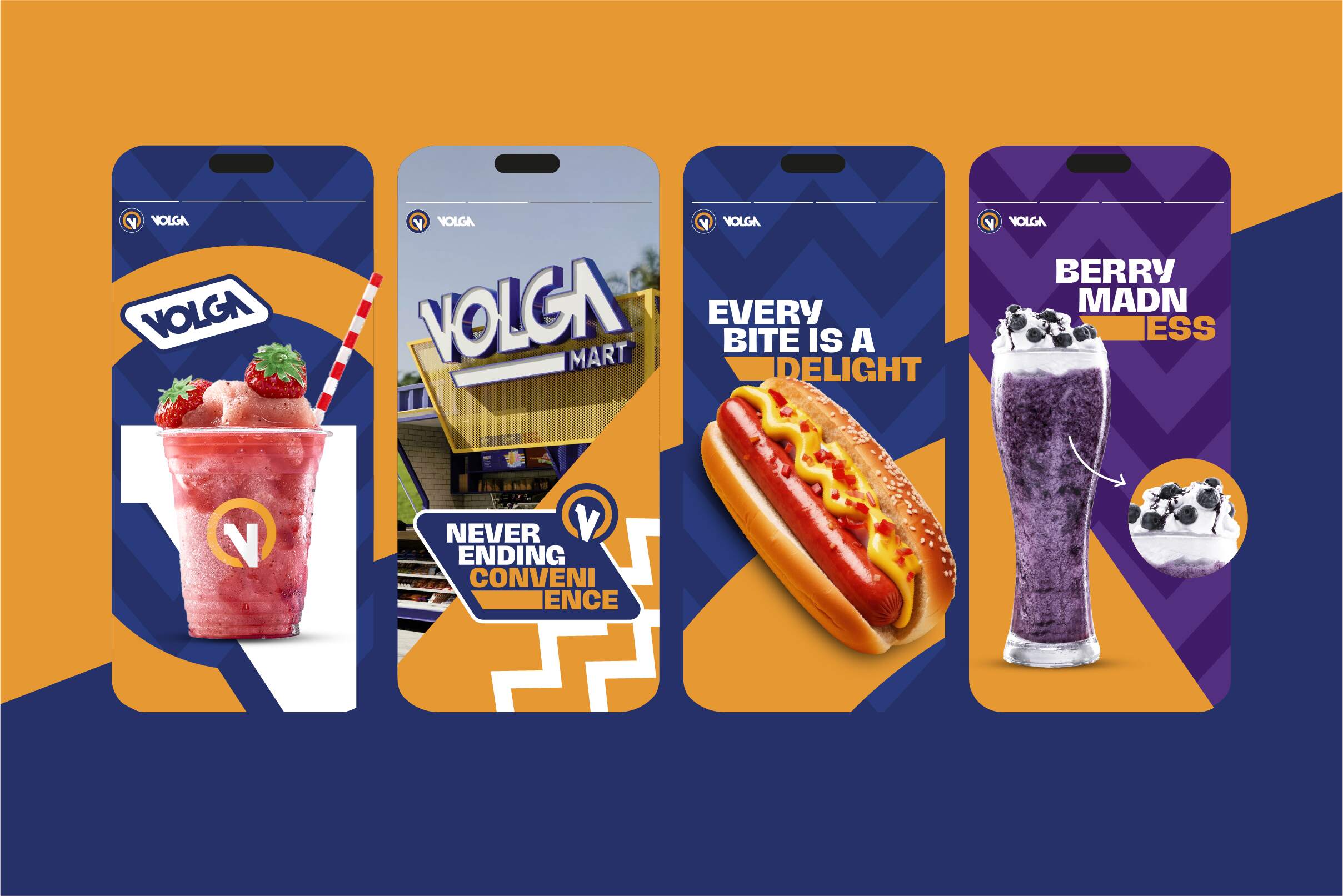
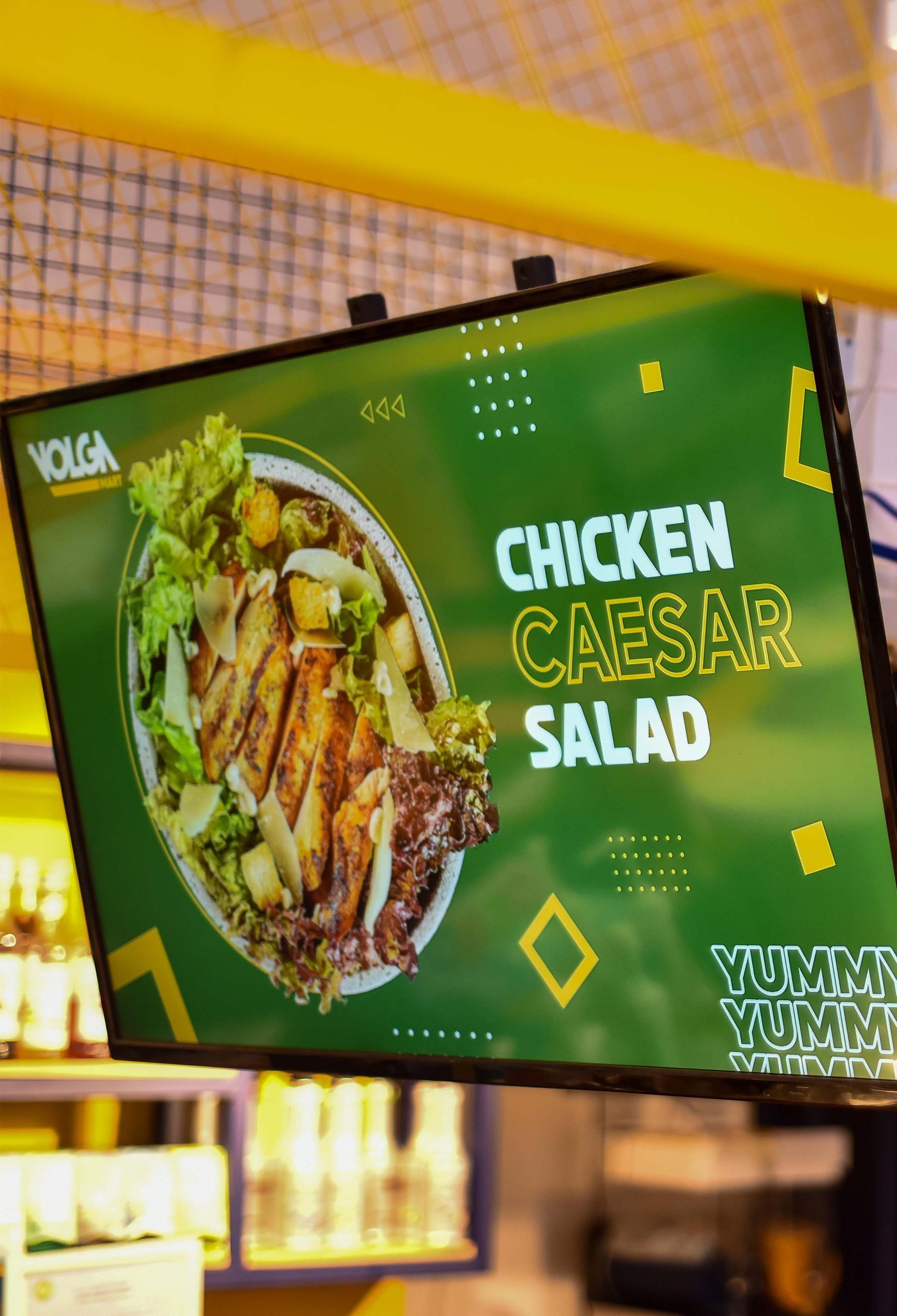
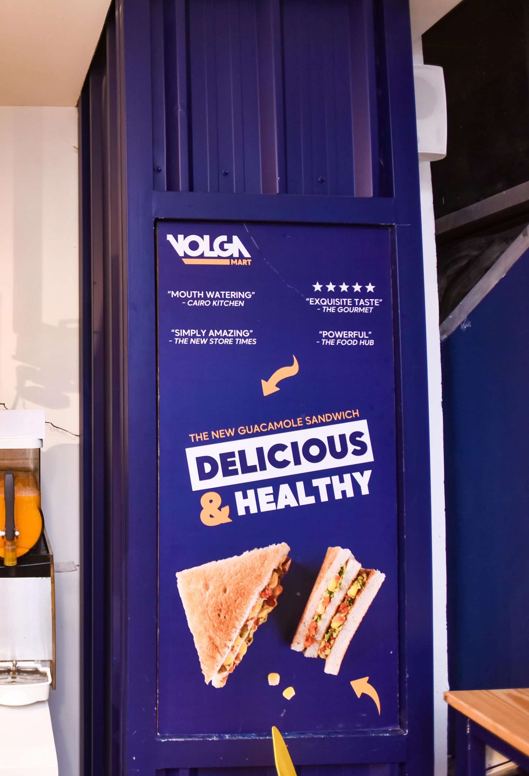
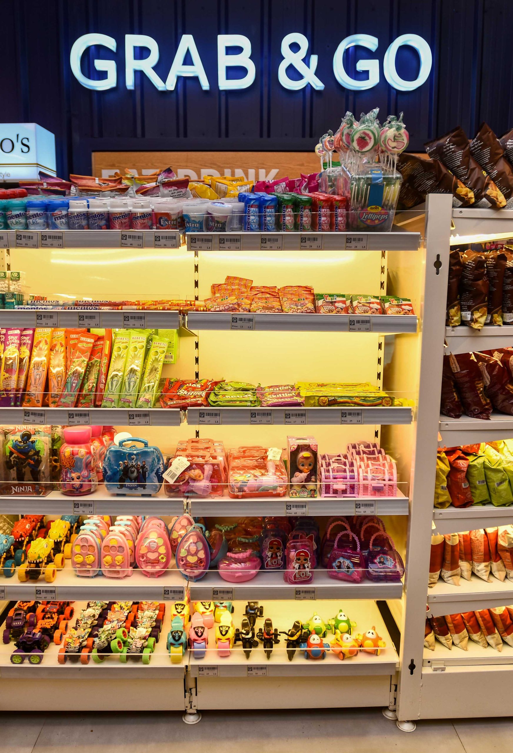
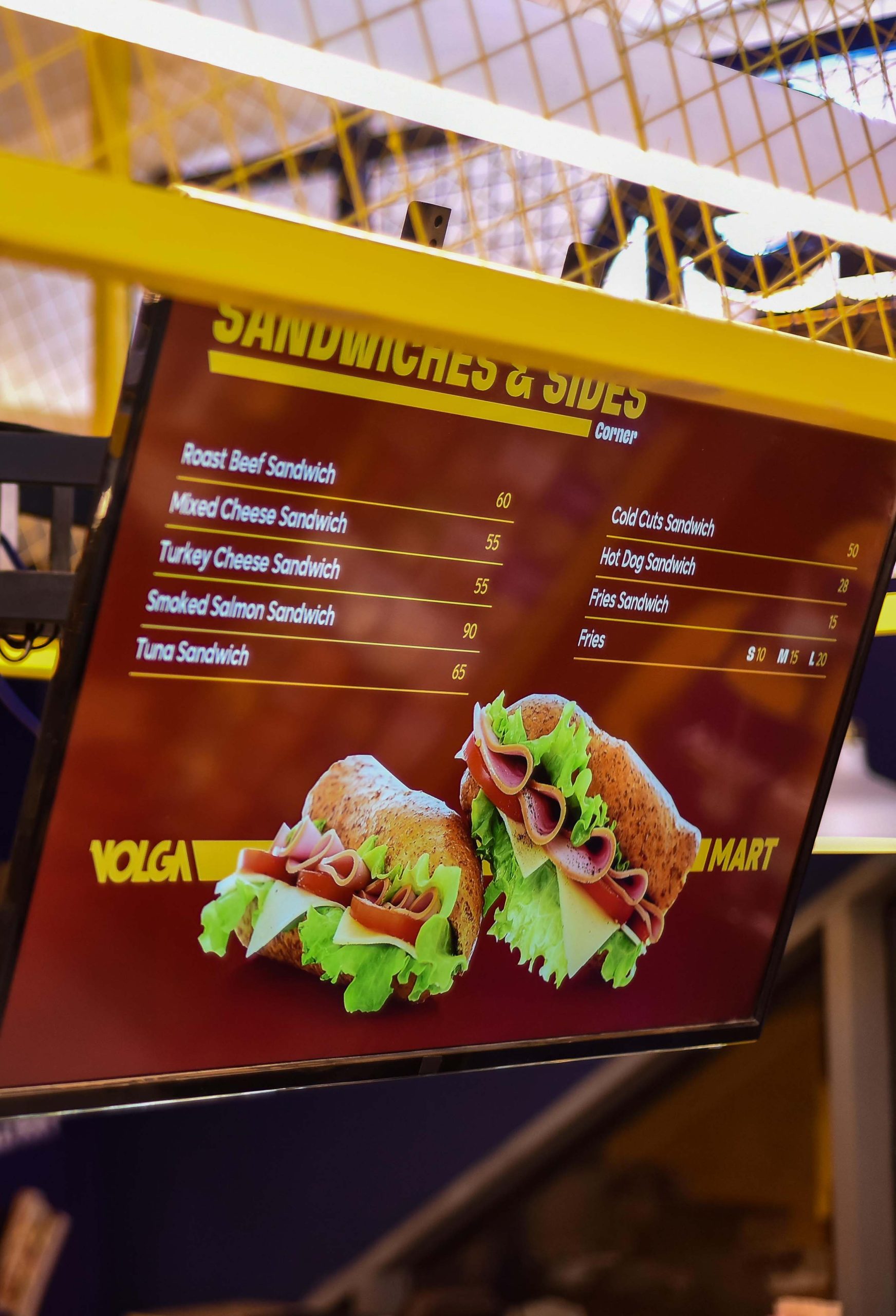
Ryveal reimagined VOLGA’s visual elements. Including messaging, communication, patterns, packaging, photography, digital and textures. Applying them on all touchpoints, everywhere. Weaving culture and gathering in every single touchpoint.