START POINT
START POINT Autoservices, a brand that is revolutionizing the auto service industry with its innovative approach to time and quality. With a focus on offering competitive prices, 24/7 services.
Project
Overview
Overview
CHALLENGE
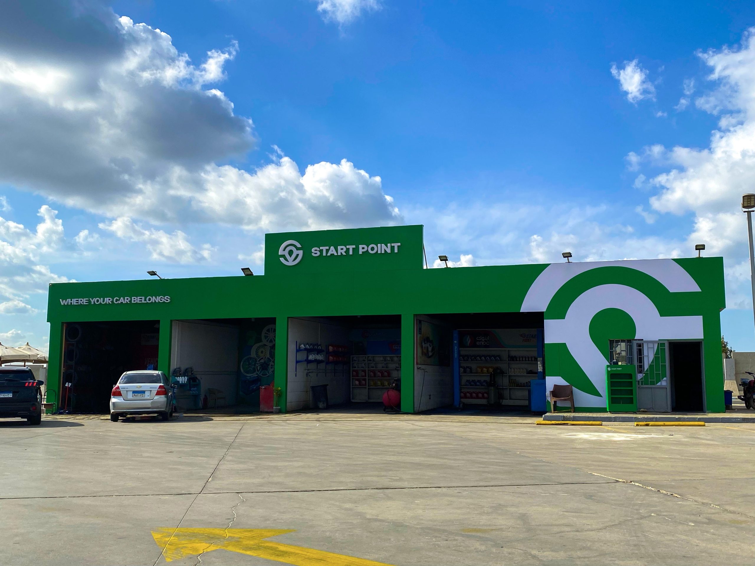
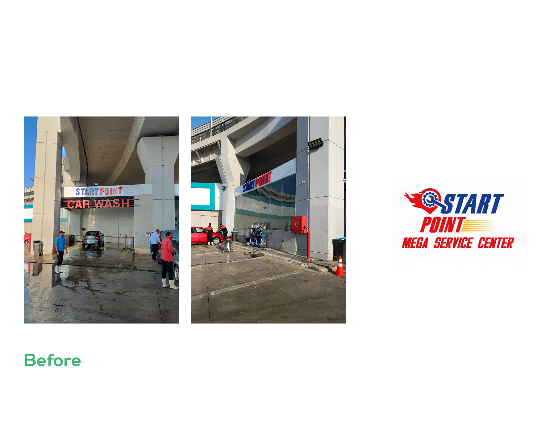
Fast growing brand with an outdated Identity. Overcoming the Limitations of the Original Identity.
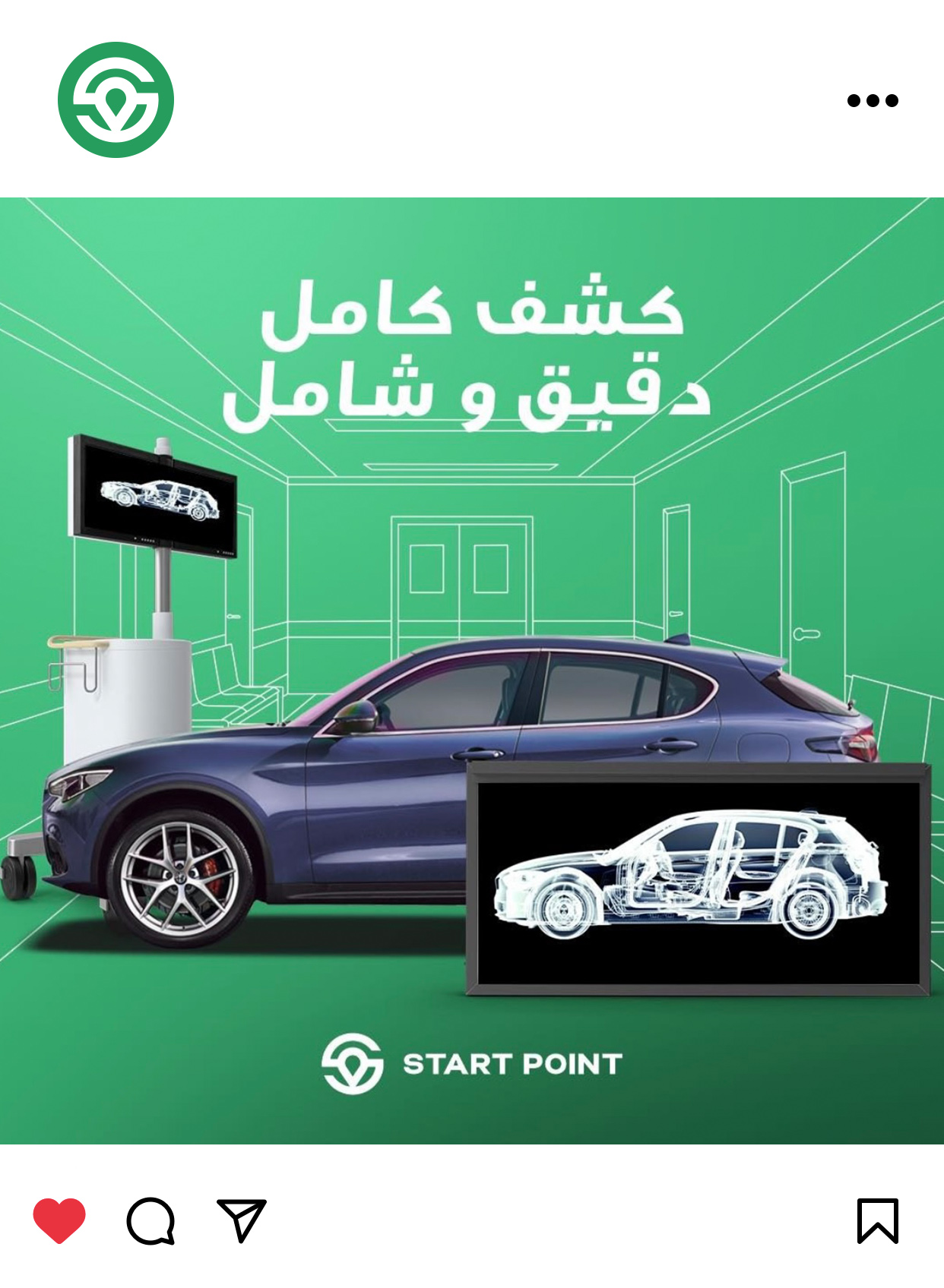
START POINT is a successful brand that decided to take their client’s experience to a whole new level of professionalism and higher expectations. The original identity of START POINT had many issues, including a crowded design, too many concepts for a logo, an outdated typeface, and a color palette similar to the competitors. The identity did not reflect the brand values and personality, lacked hierarchy and balance, and did not work well in small spaces.
APPROACH
Revolutionizing the Autoservice experience. Striving for a better future for cars and their owners.
Ryveal takes a closer look at START POINT, a brand that is revolutionizing the auto service industry with its innovative approach to time and quality. With a focus on offering competitive prices, 24/7 services, and a team of well-trained technicians and experts, START POINT is committed to providing its clients with the best possible experience.
- Brand Experience
- Empathy Mapping
- Target Audience Research
- Customer Behavior

A brand revolution in Auto Services industry.
START POINT aimed to own a new brand identity that becomes a breakthrough in the Autoservice industry standing out from competition. A brand that values integrity, consistency, reliability, and easy access for all its clients, and guarantees these qualities in their services.


SOLUTION
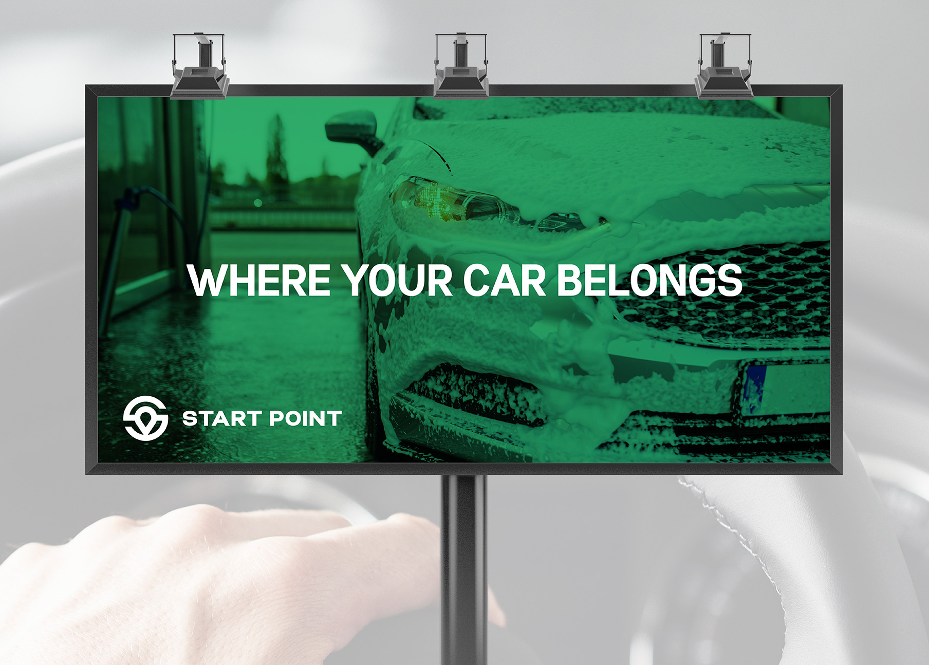
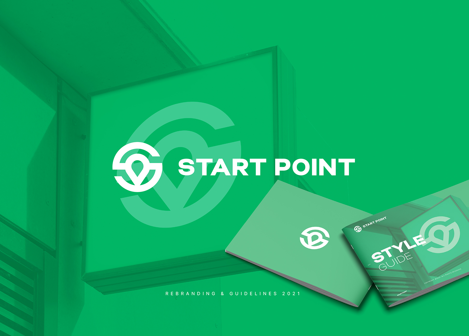
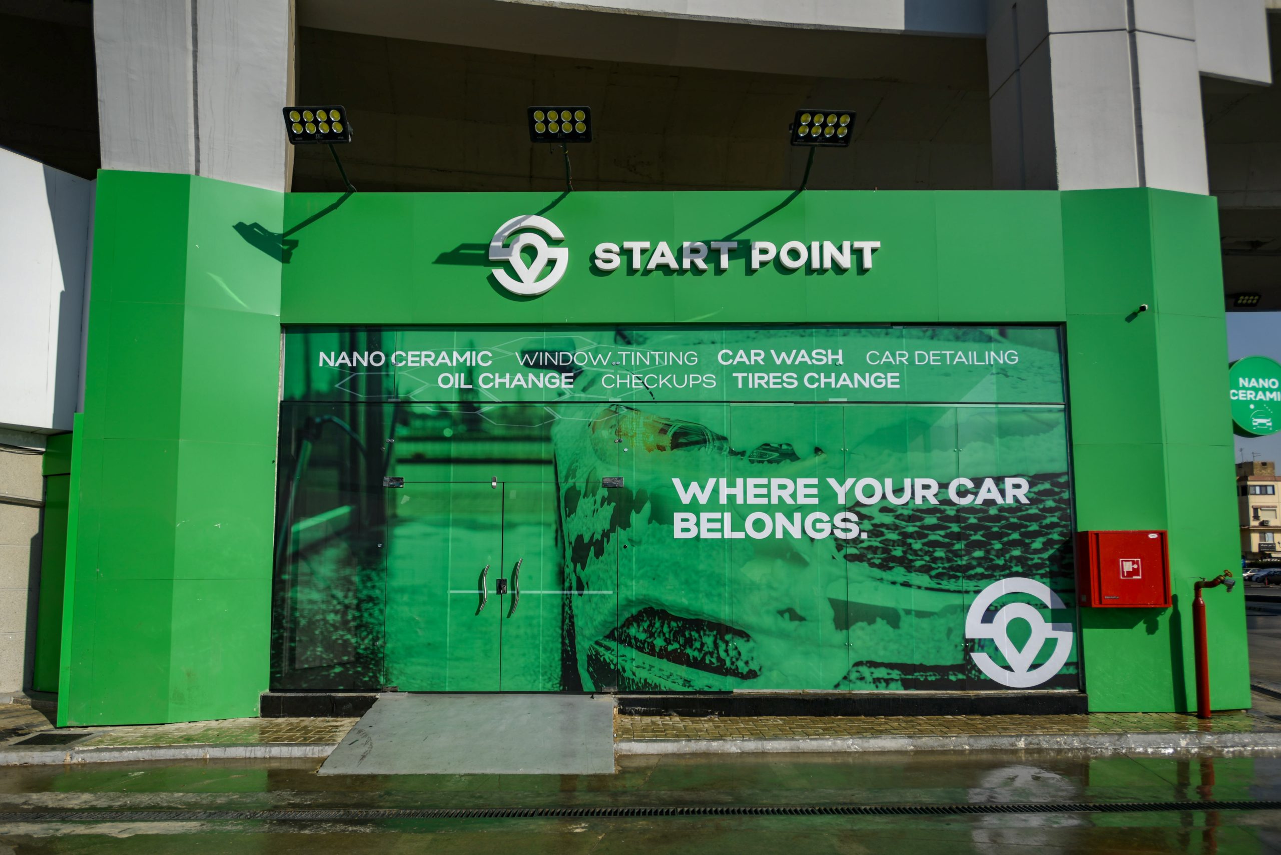
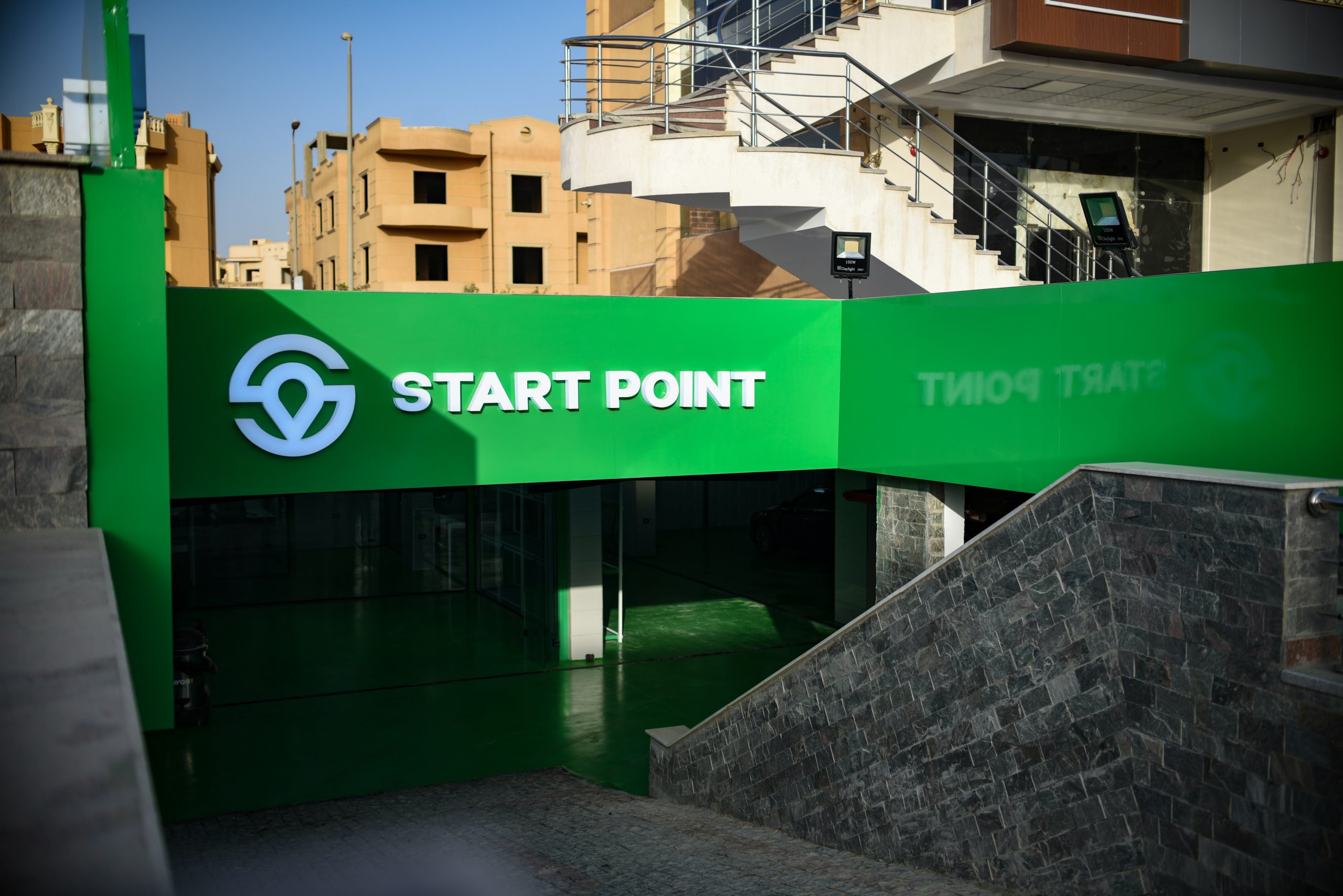
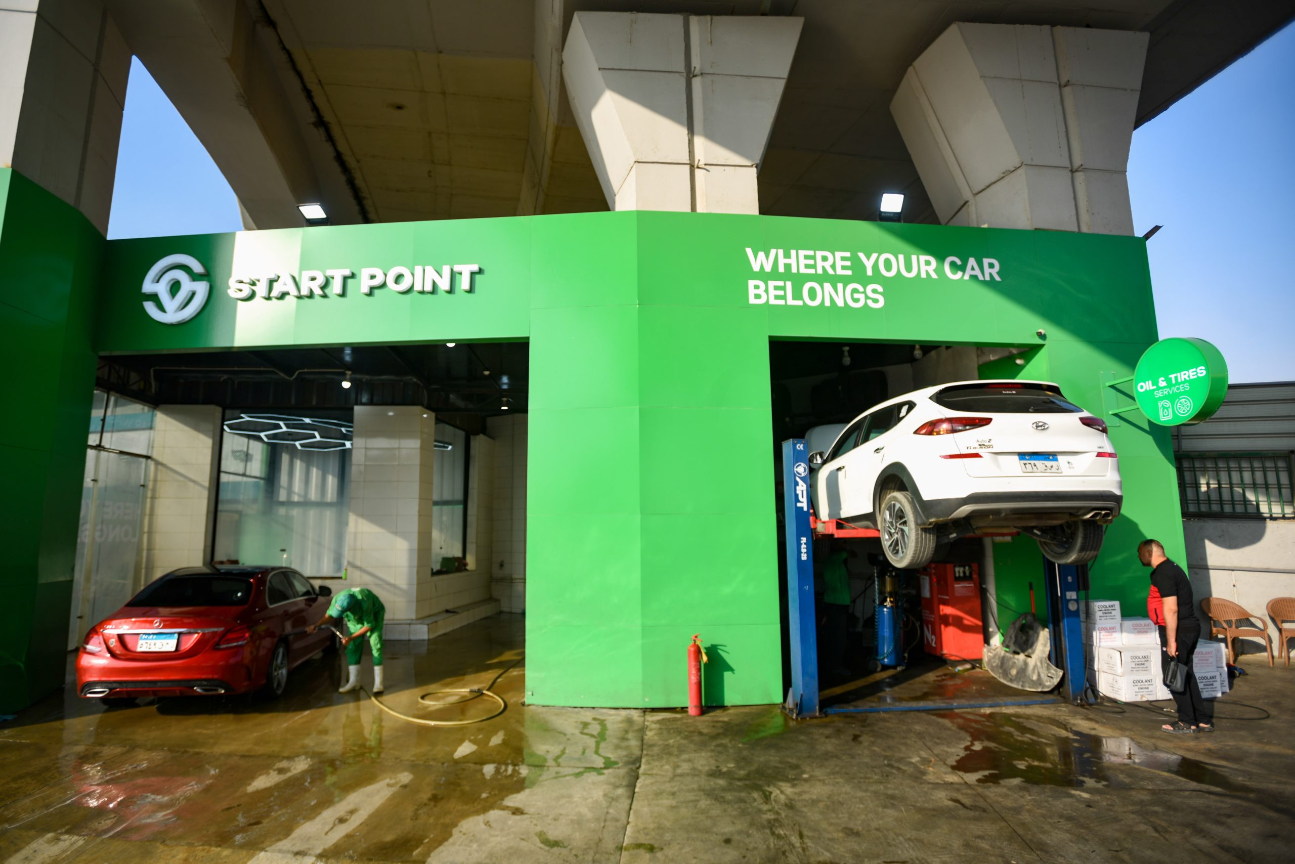
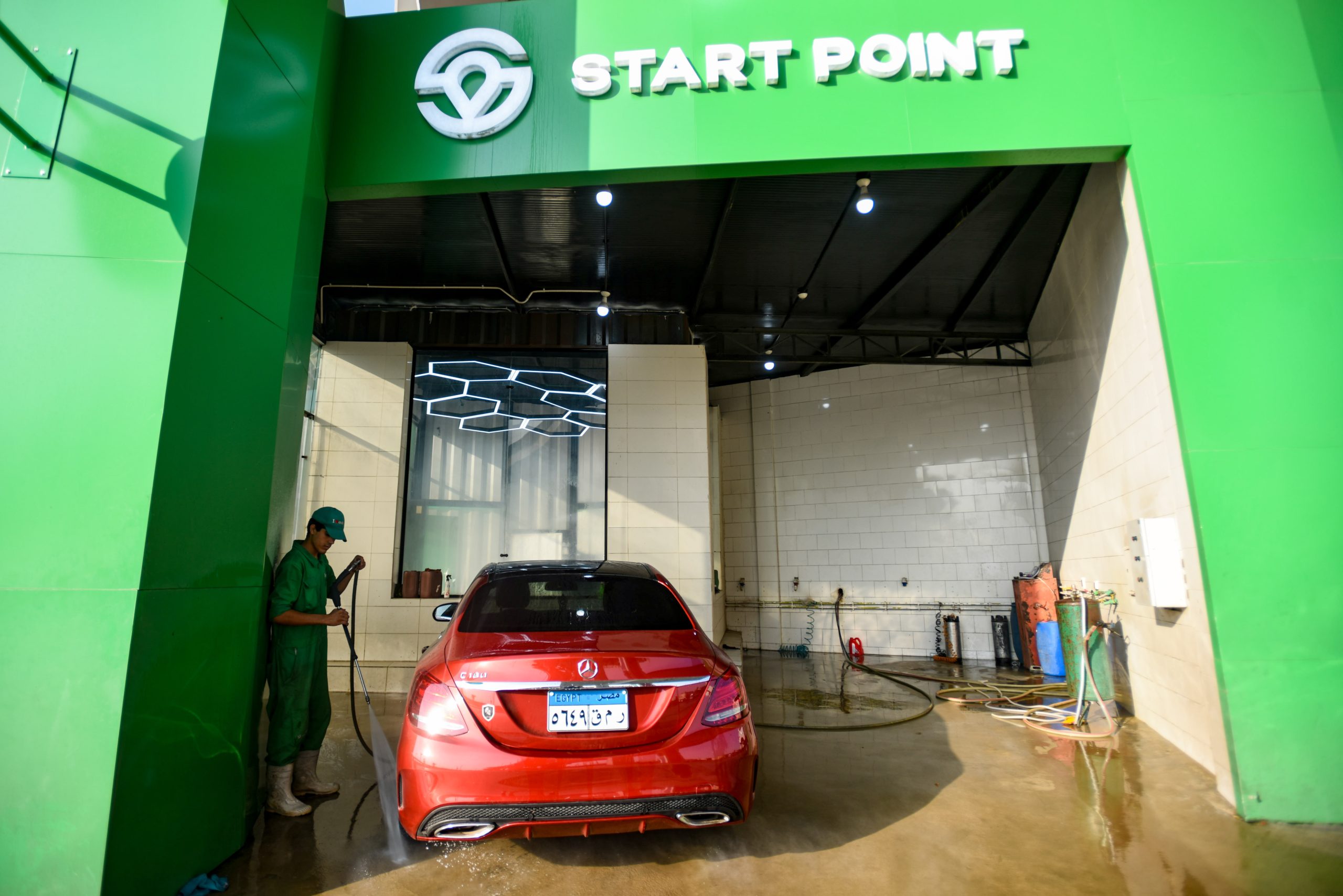
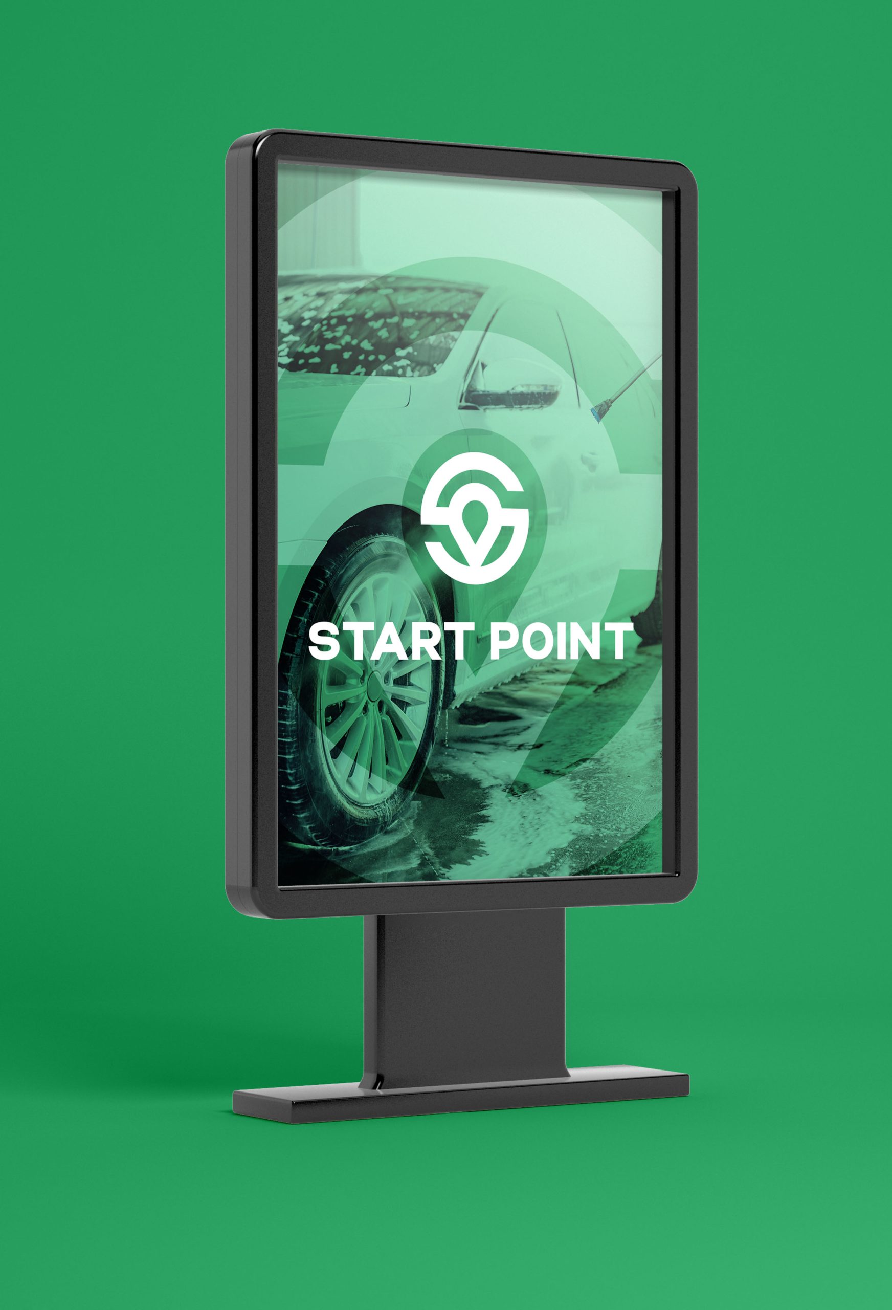
An iconic green brand that stands out from miles. A distinctive visual identity.
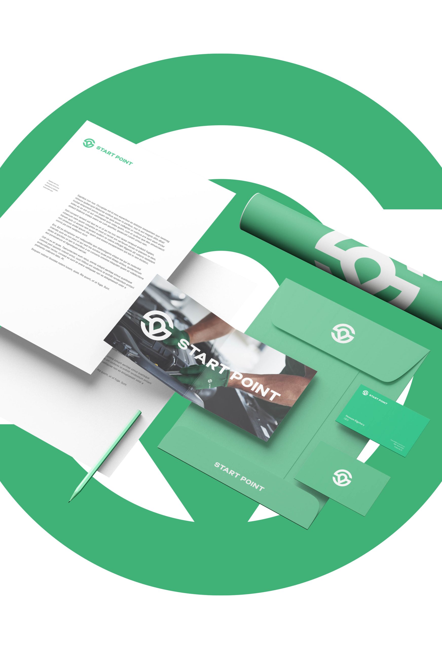
The solution to the challenges of the original identity was to reimagine a cohesive visual identity that immediately differentiates START POINT from its competitors. The new identity communicates professional services, enables the brand to occupy a cleaner, deeper, and fresher space in customers minds, reflecting the brand personality and message in the simplest form.
- Brand Strategy
- Identity System
- Brand Positioning
- Motion Graphics


A new era of professionalism and higher expectations.
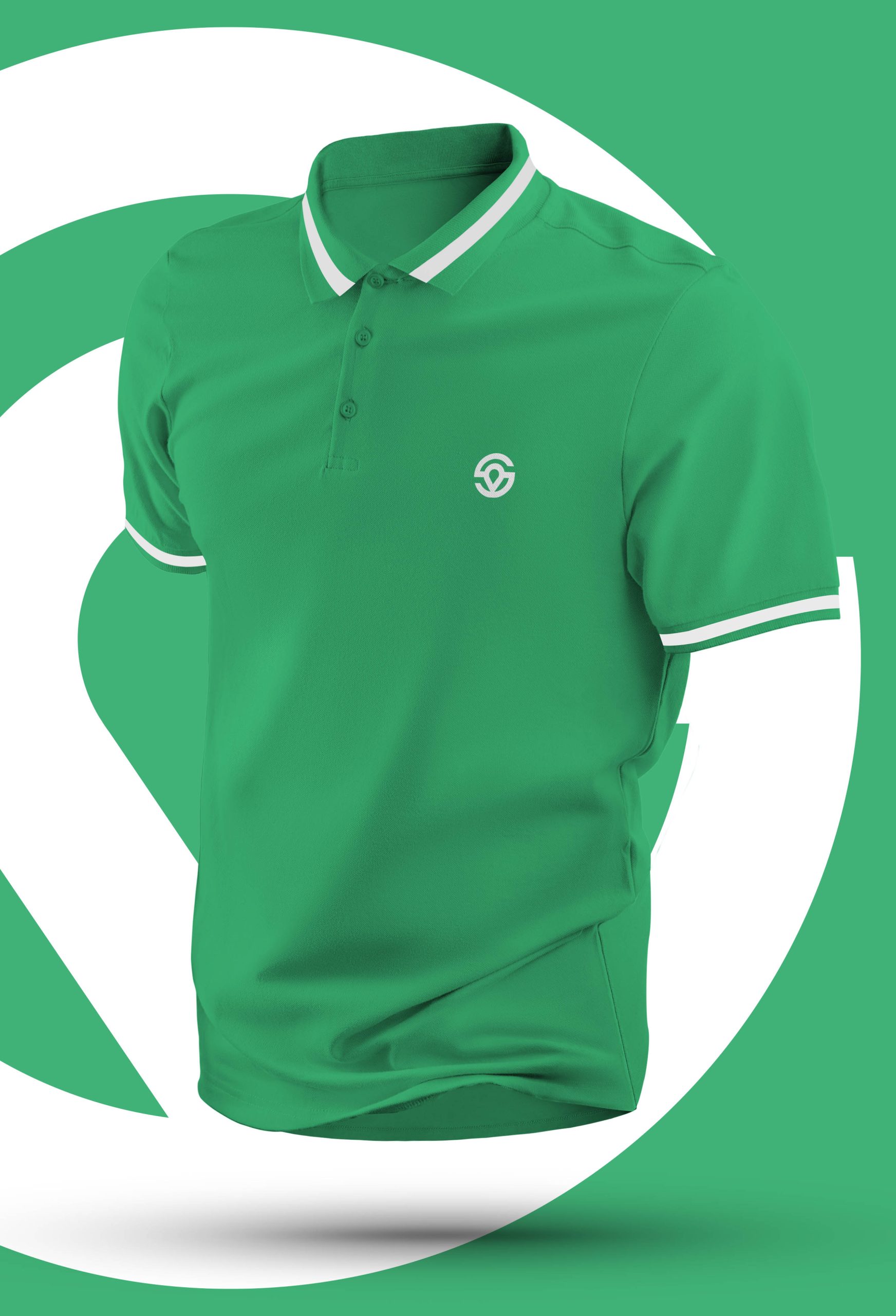
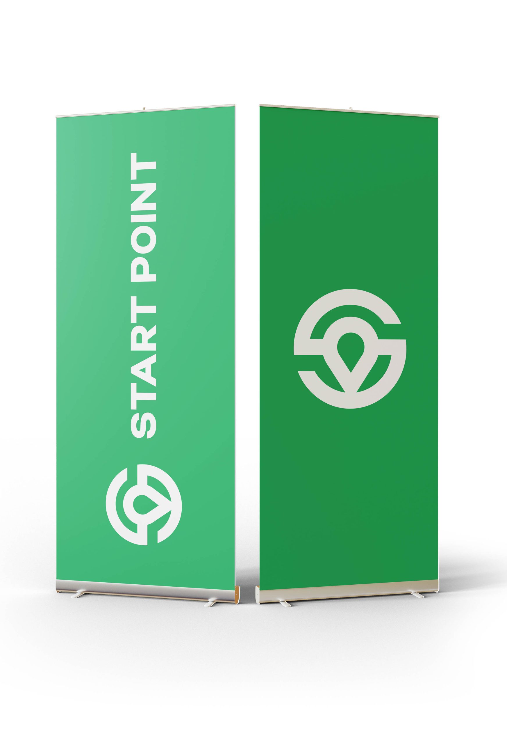
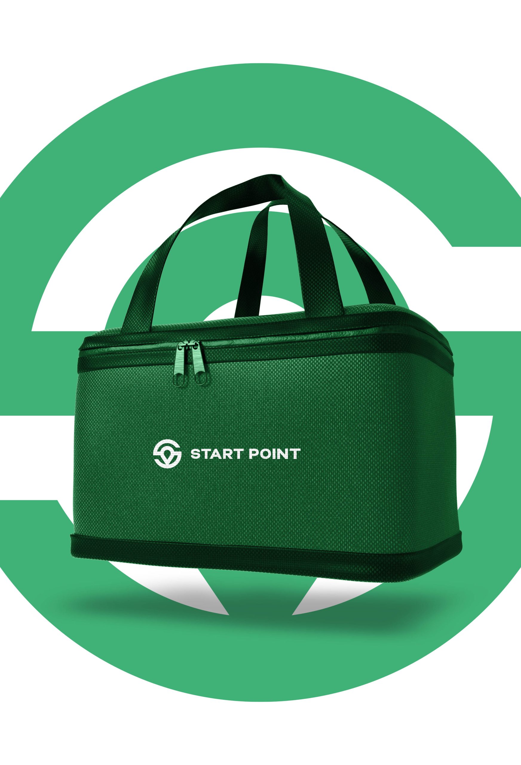
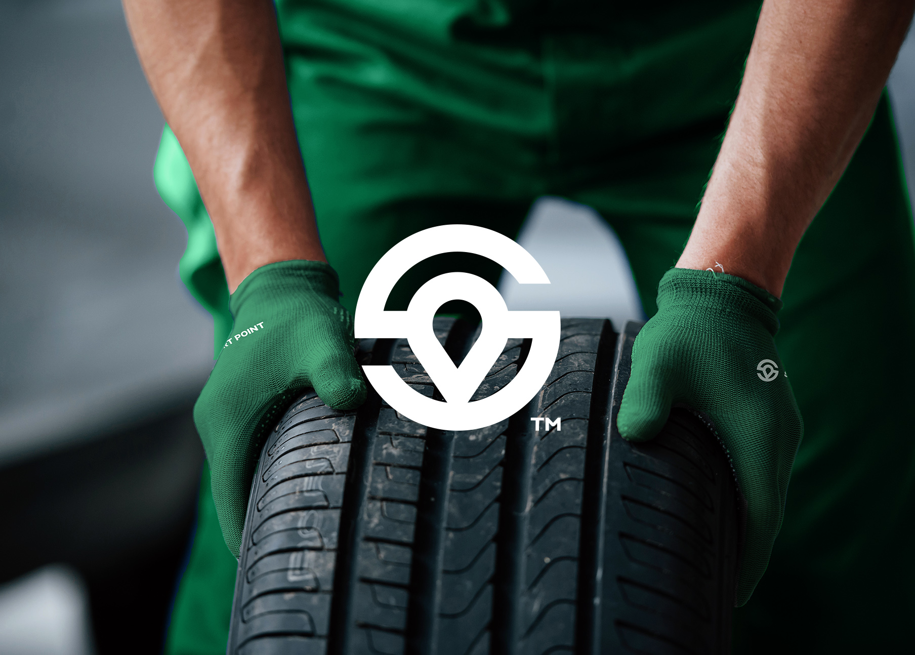
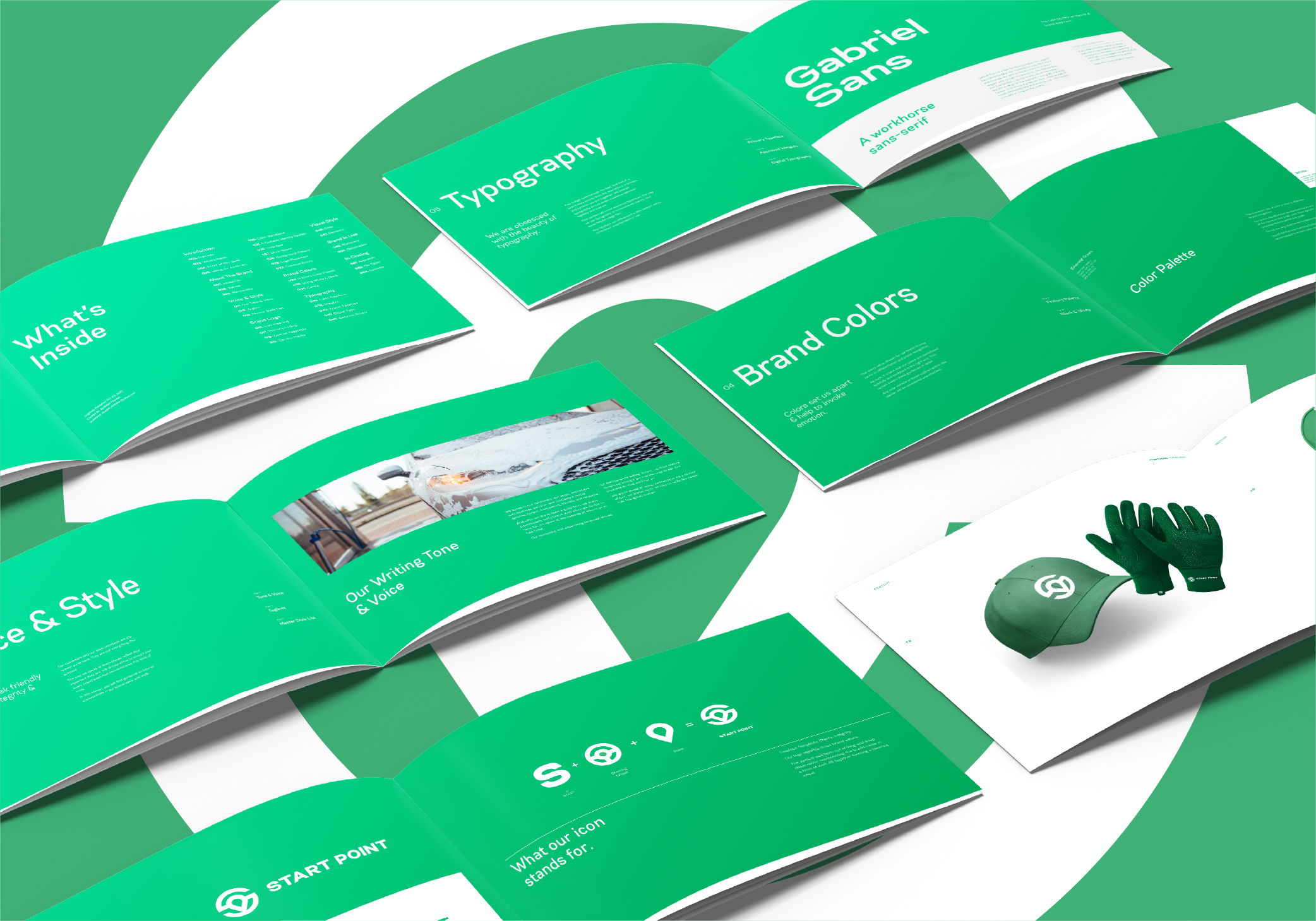
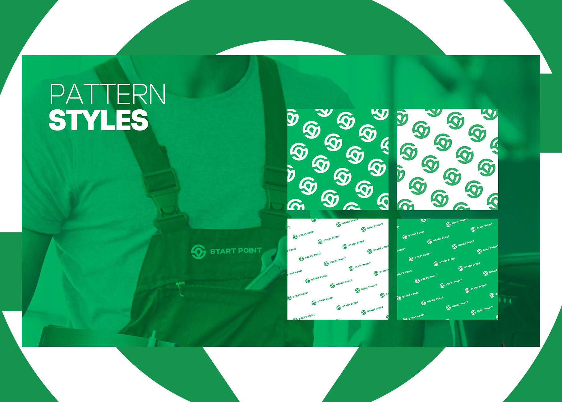
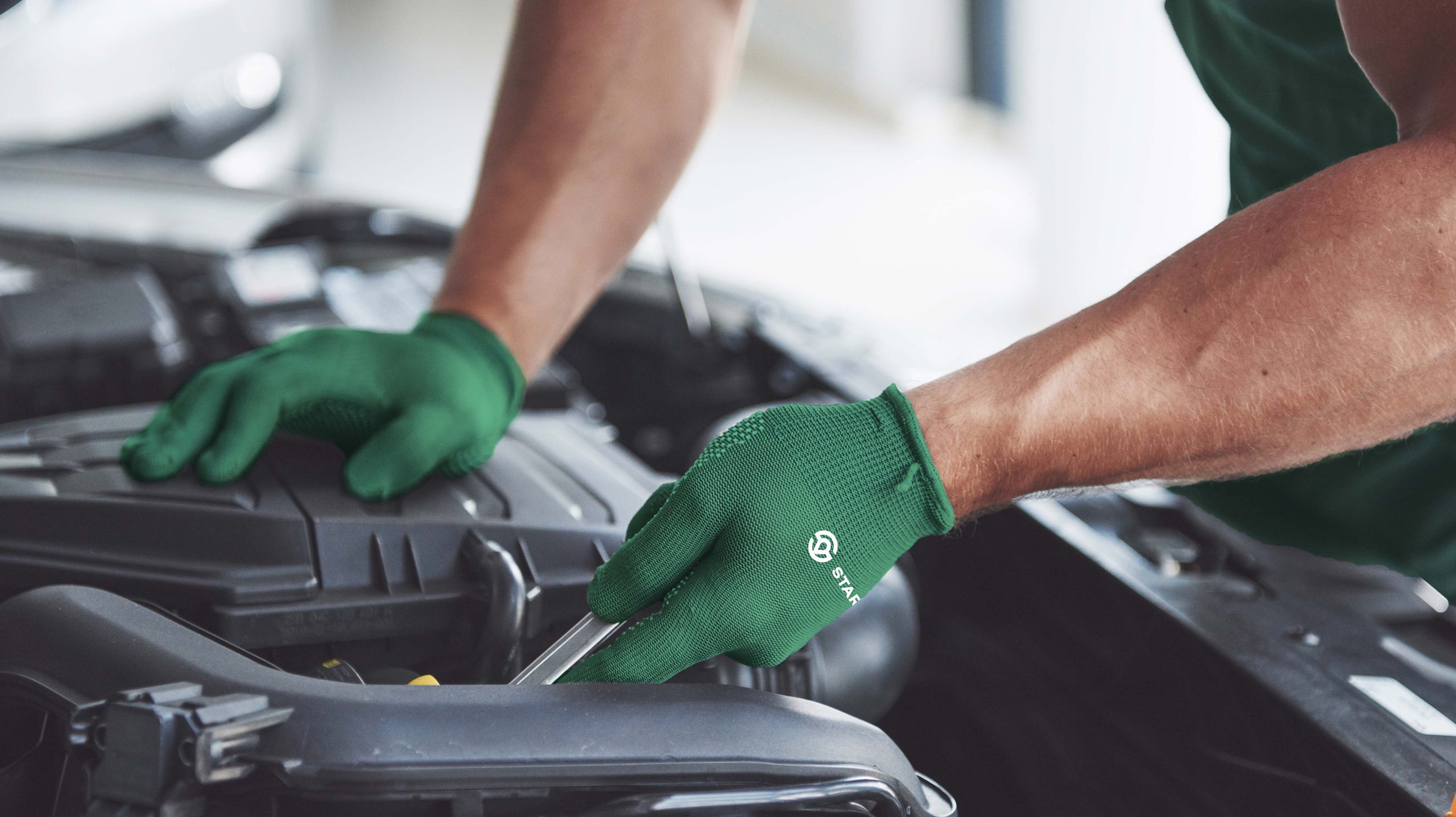
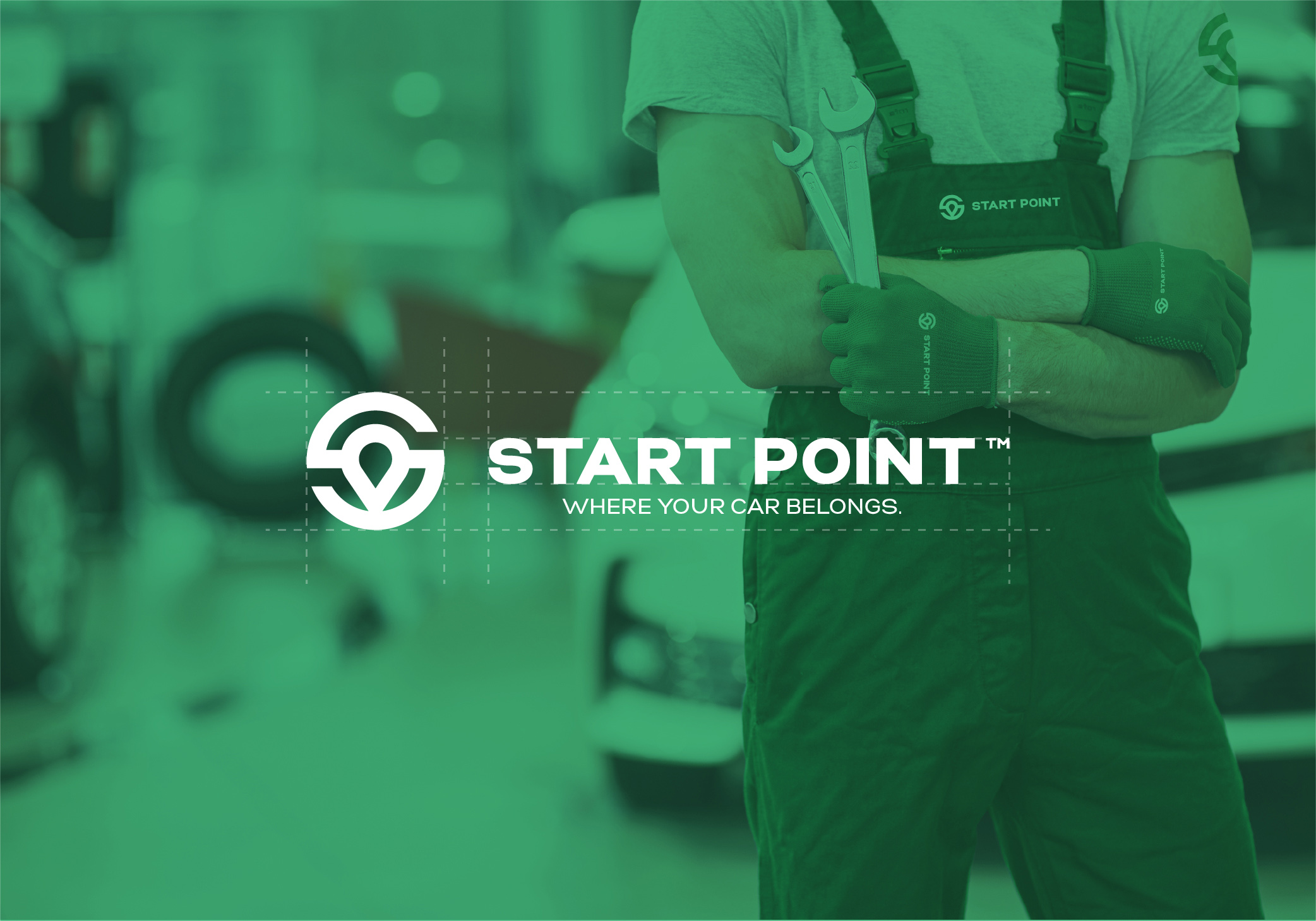
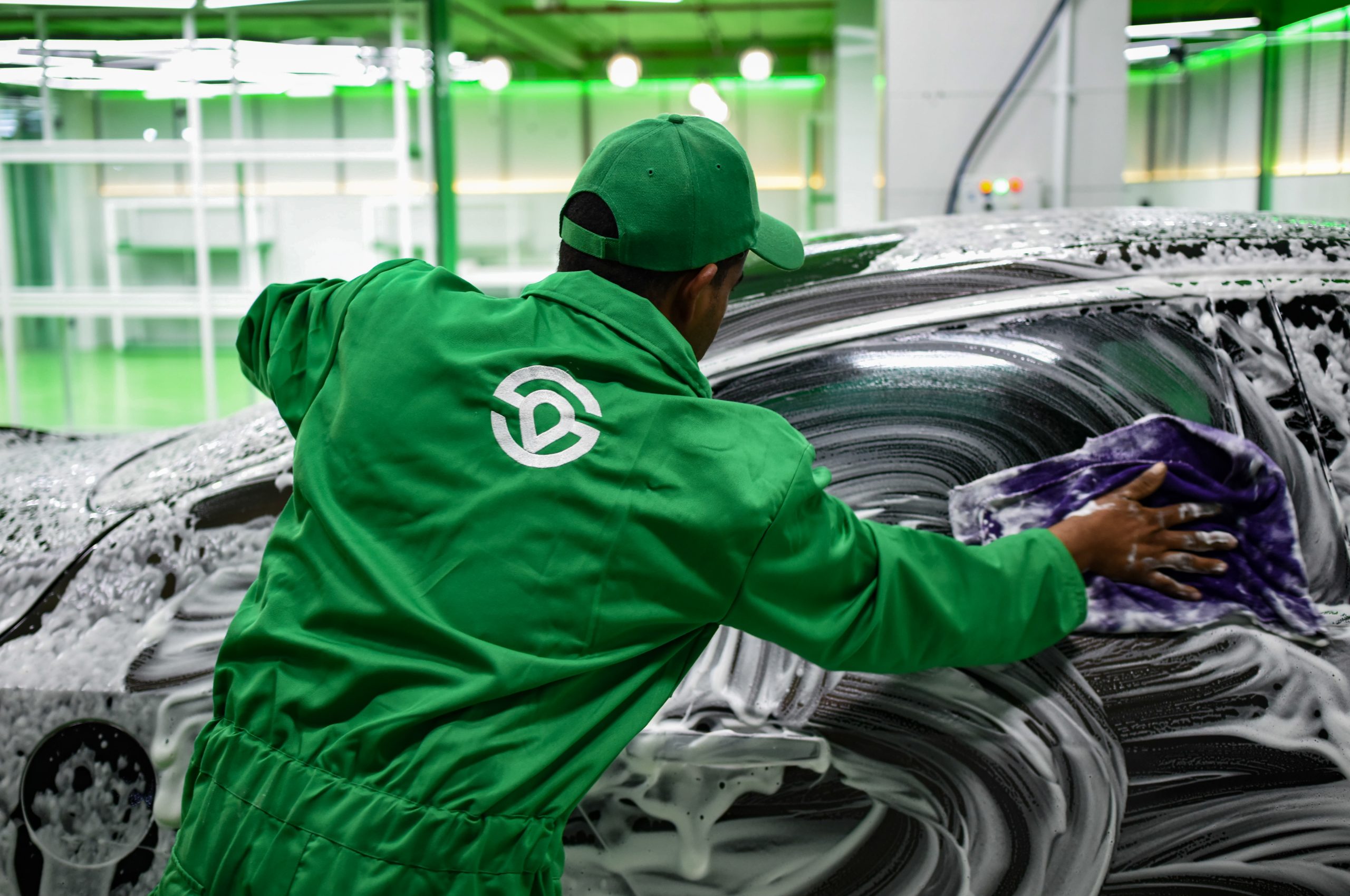
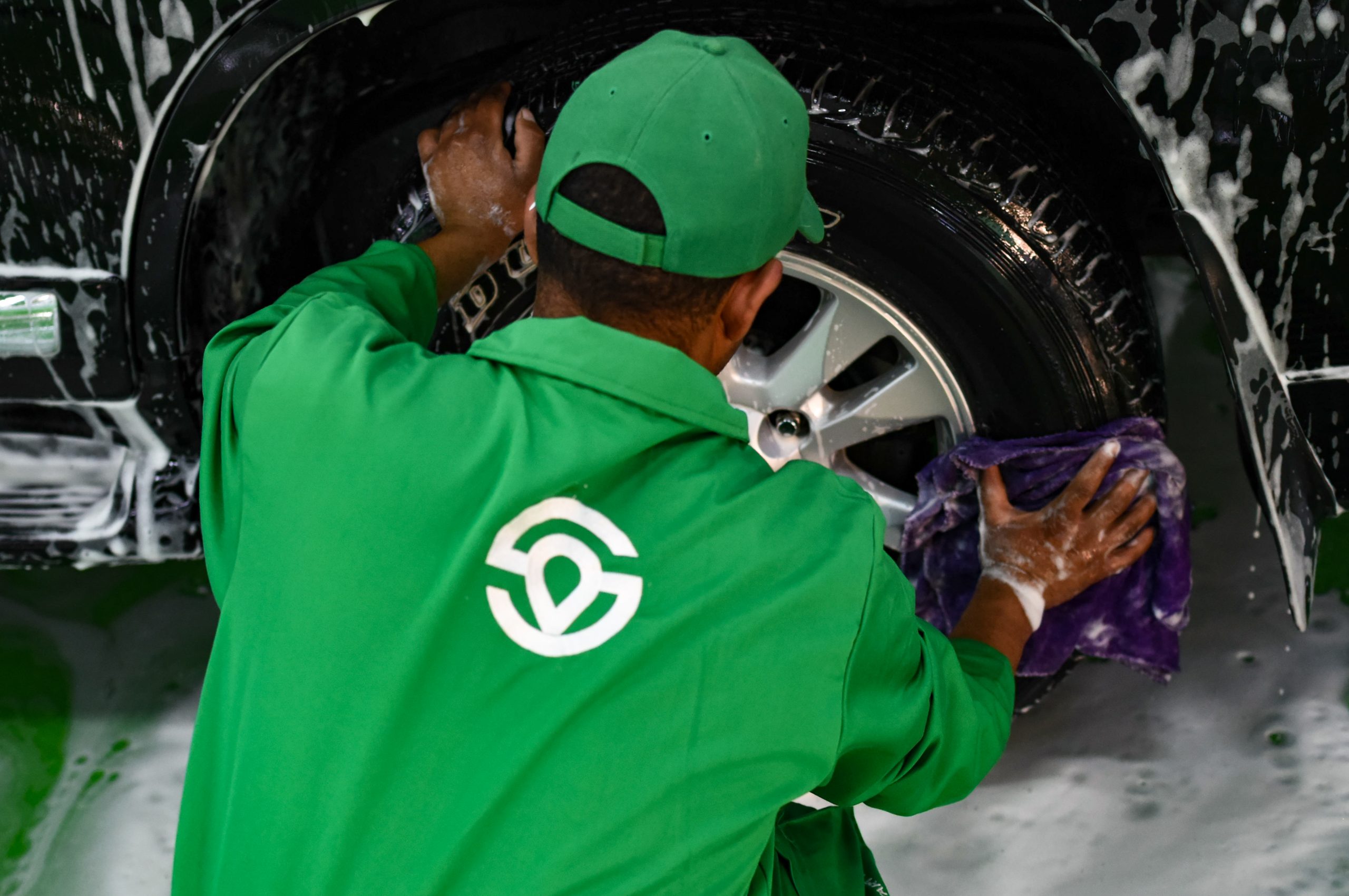
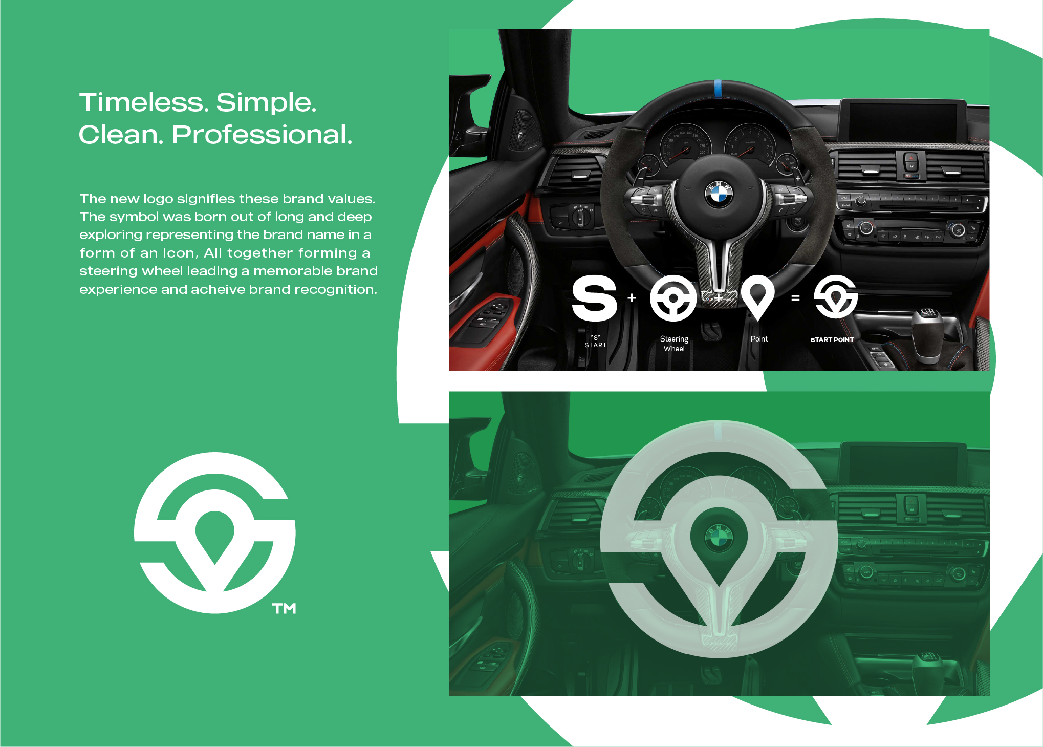
The new logo represents timelessness, simplicity, clarity, integrity, and professionalism, and signifies the values of the brand. The symbol was created to represent the brand name START POINT in a form of an icon using letter S combined with Location Point forming a steering wheel to symbolize the company’s focus on auto services.
PANTONE 7480 C
#00BC70
PANTONE 663 C
#FFFFFF
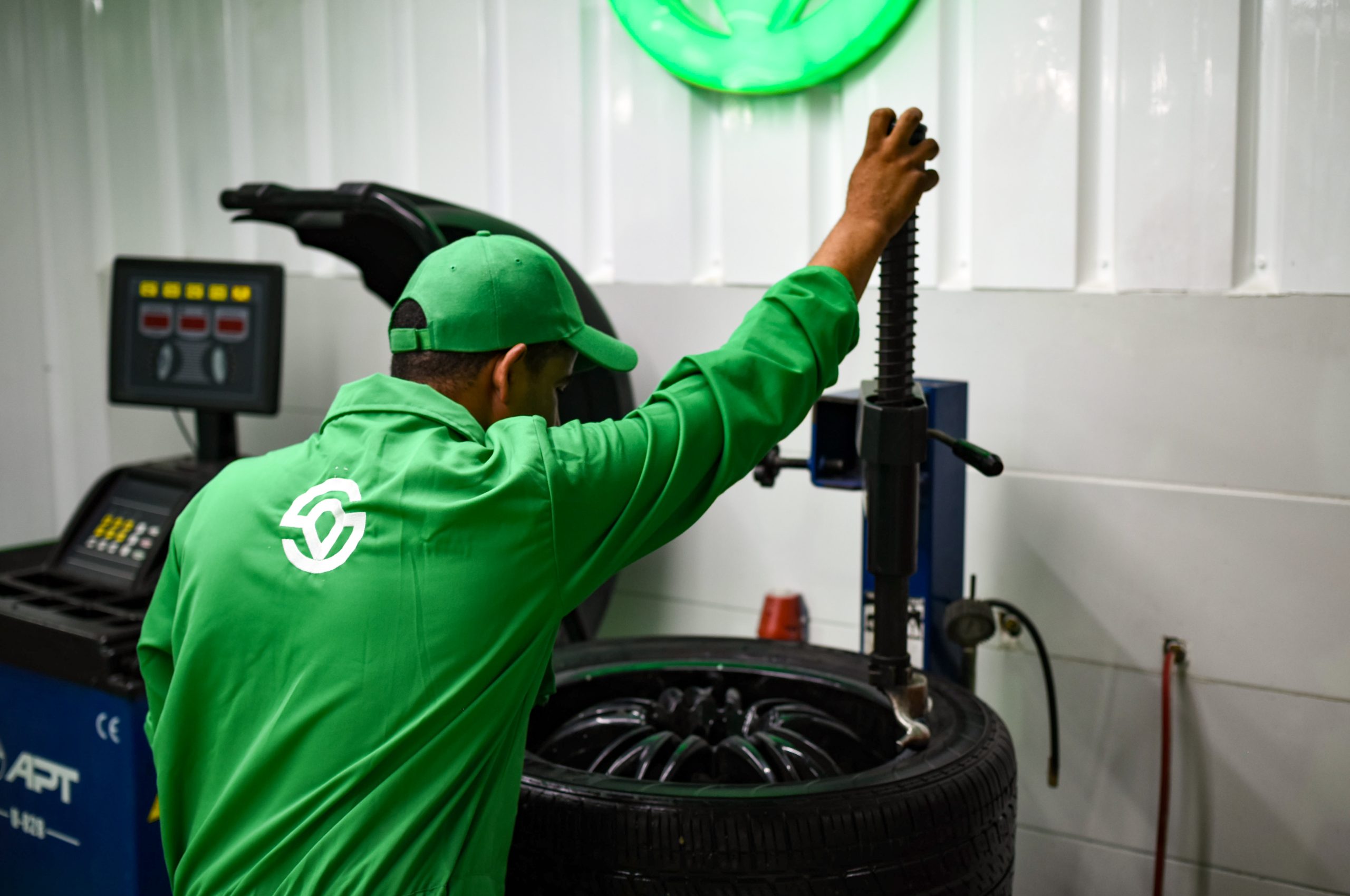
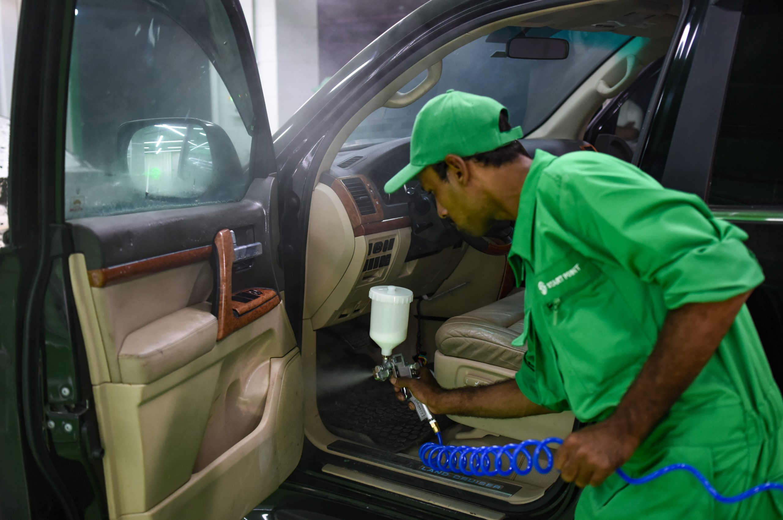
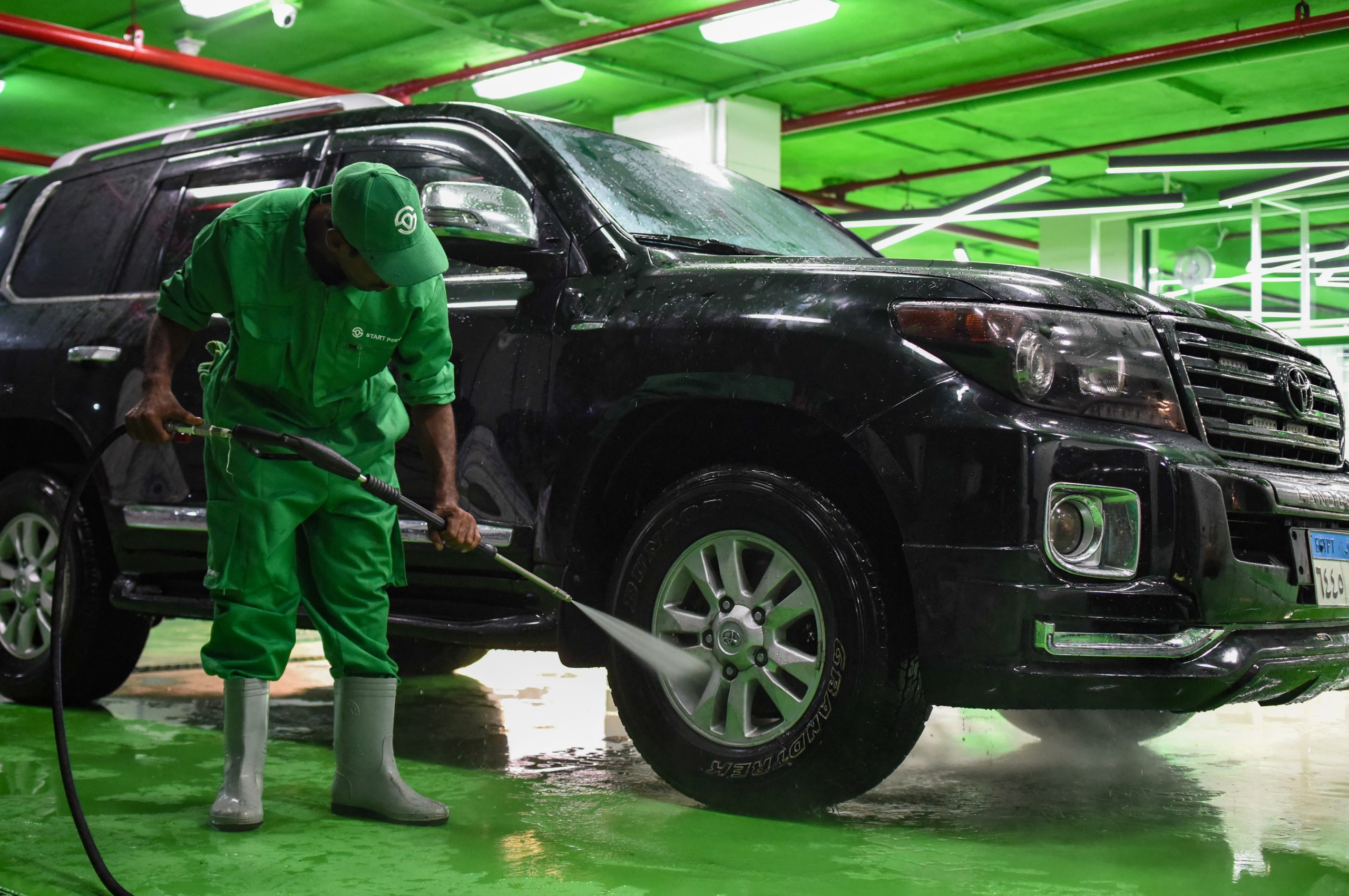
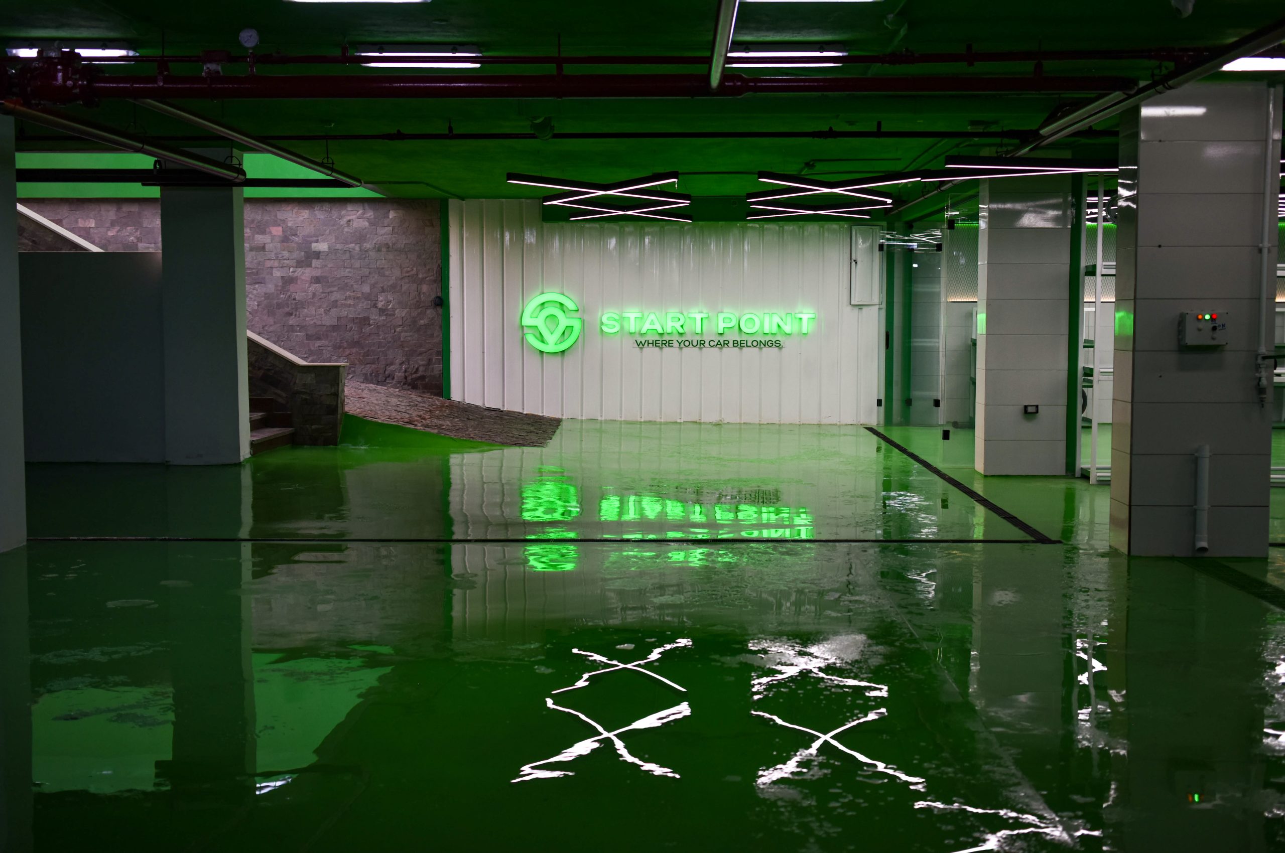
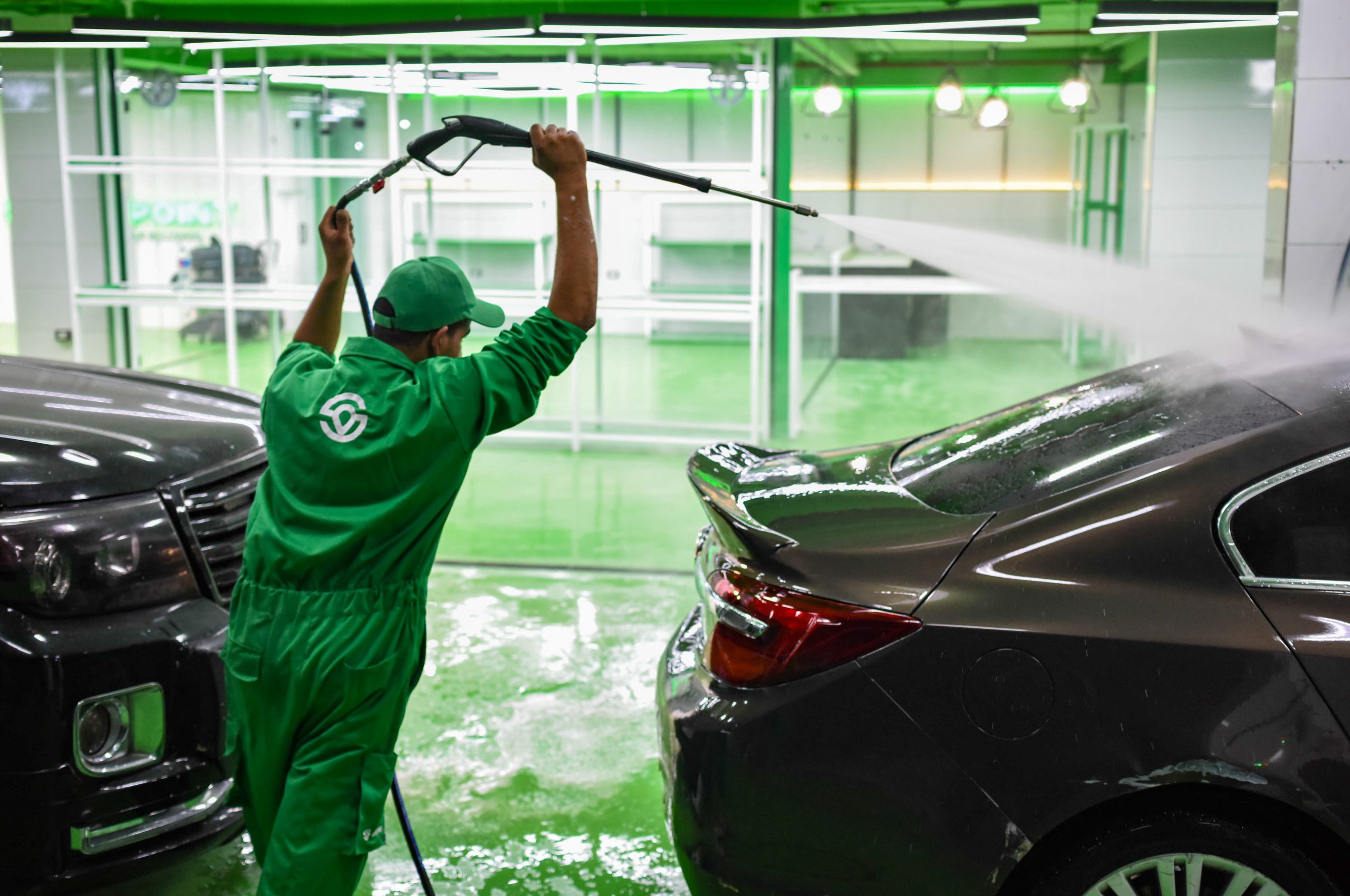
The new Ambience with a Greeny Touch
With its iconic representation of a the start point, the green color is inspired from the green of the traffic light which represents the brand name in an indirect way, furthermore the green color is known to be the color of fixed issues inside the car. The result is a memorable and distinctive color palette that captures the essence of the brand and its commitment to helping clients take care of their vehicles.