CHALLENGE
Helping People Navigate Medication Management with Ease. Achieving Balance between Functionality and Empathy.
The challenge for Voithy was to find a balance between the functionality of the application and the empathy required to connect with the target audience. This was crucial in ensuring that the brand could effectively provide a solution for managing medication and help patients navigate the process with ease.

APPROACH
Transparent and Calm Approach. A Clear Message of Comfort and Peace.
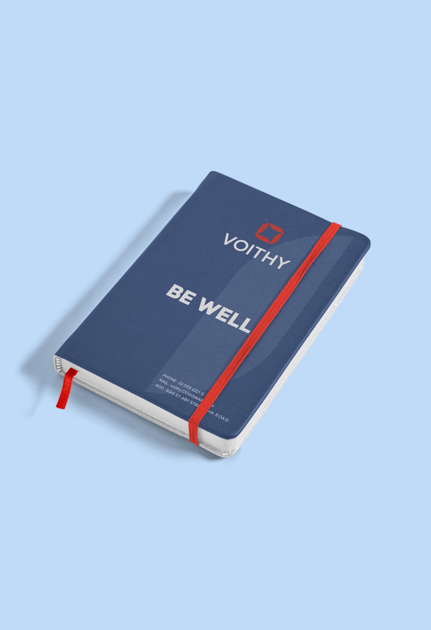
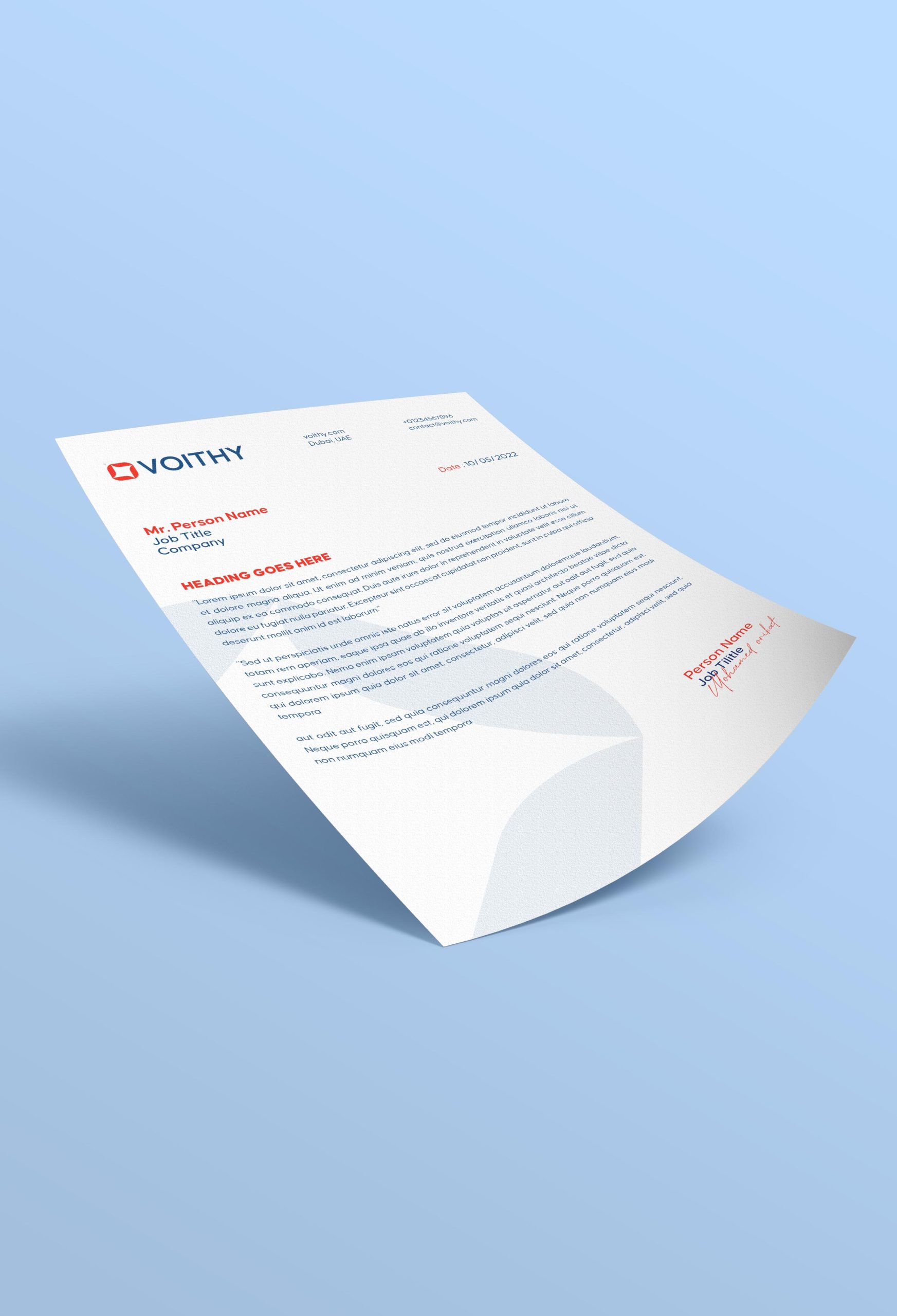
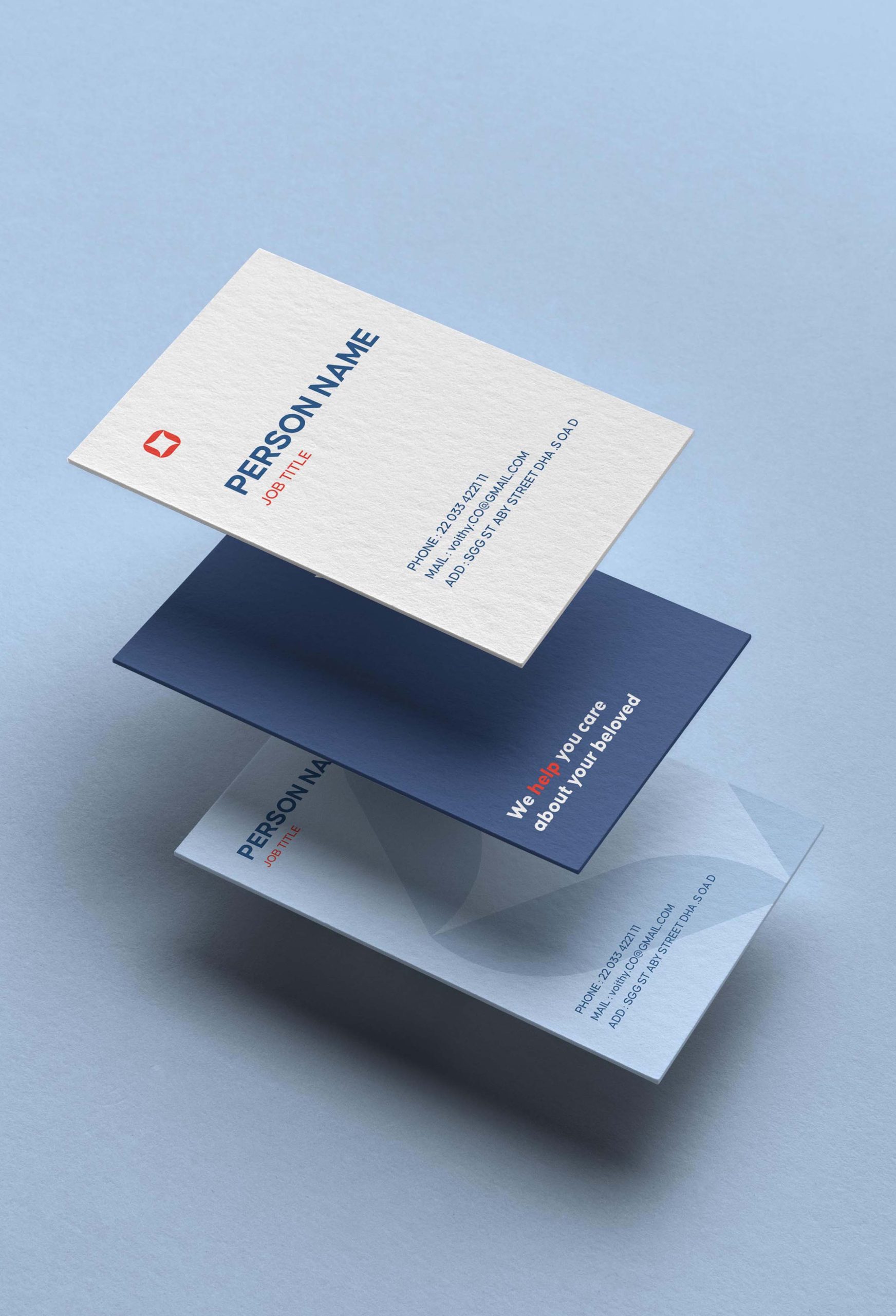
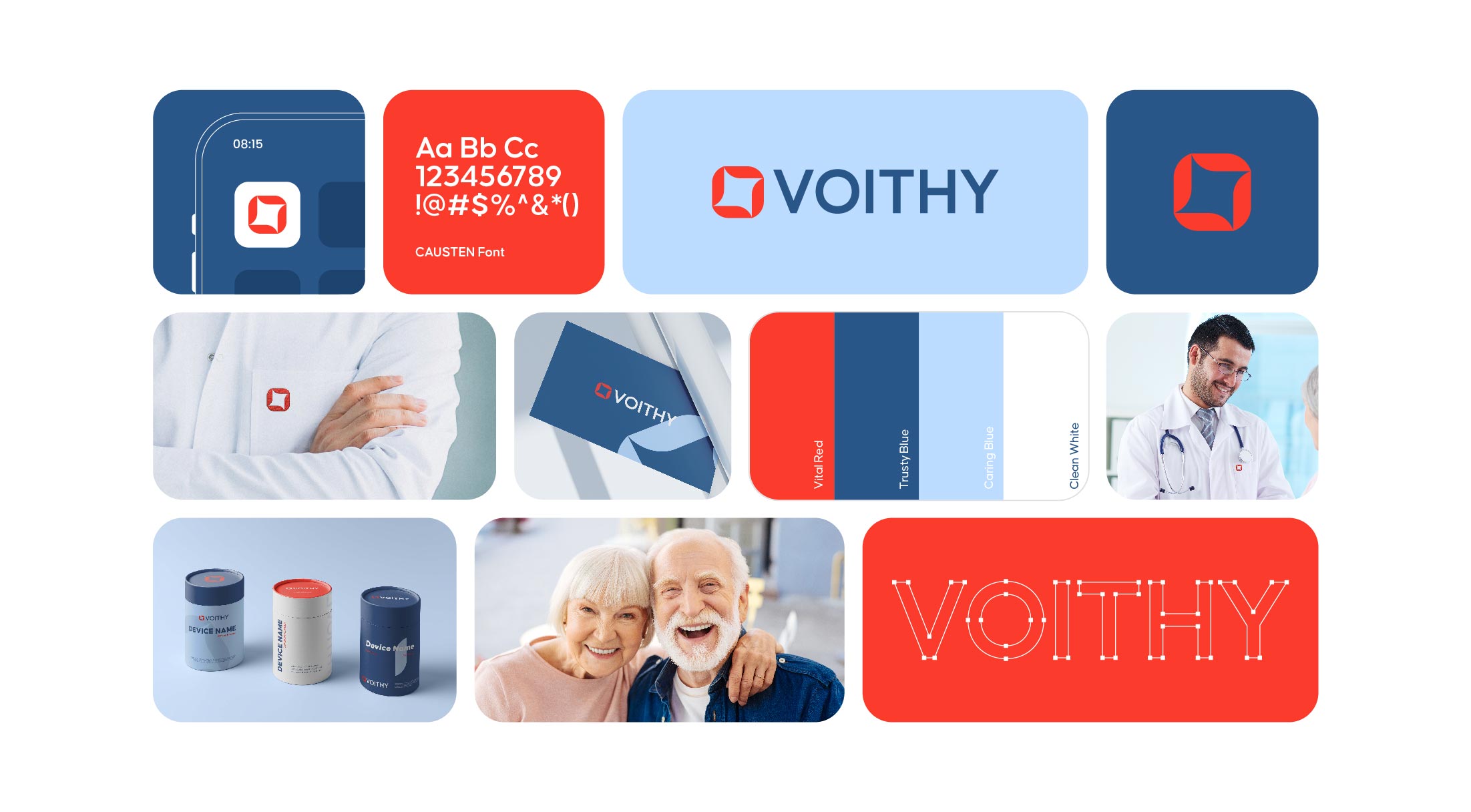
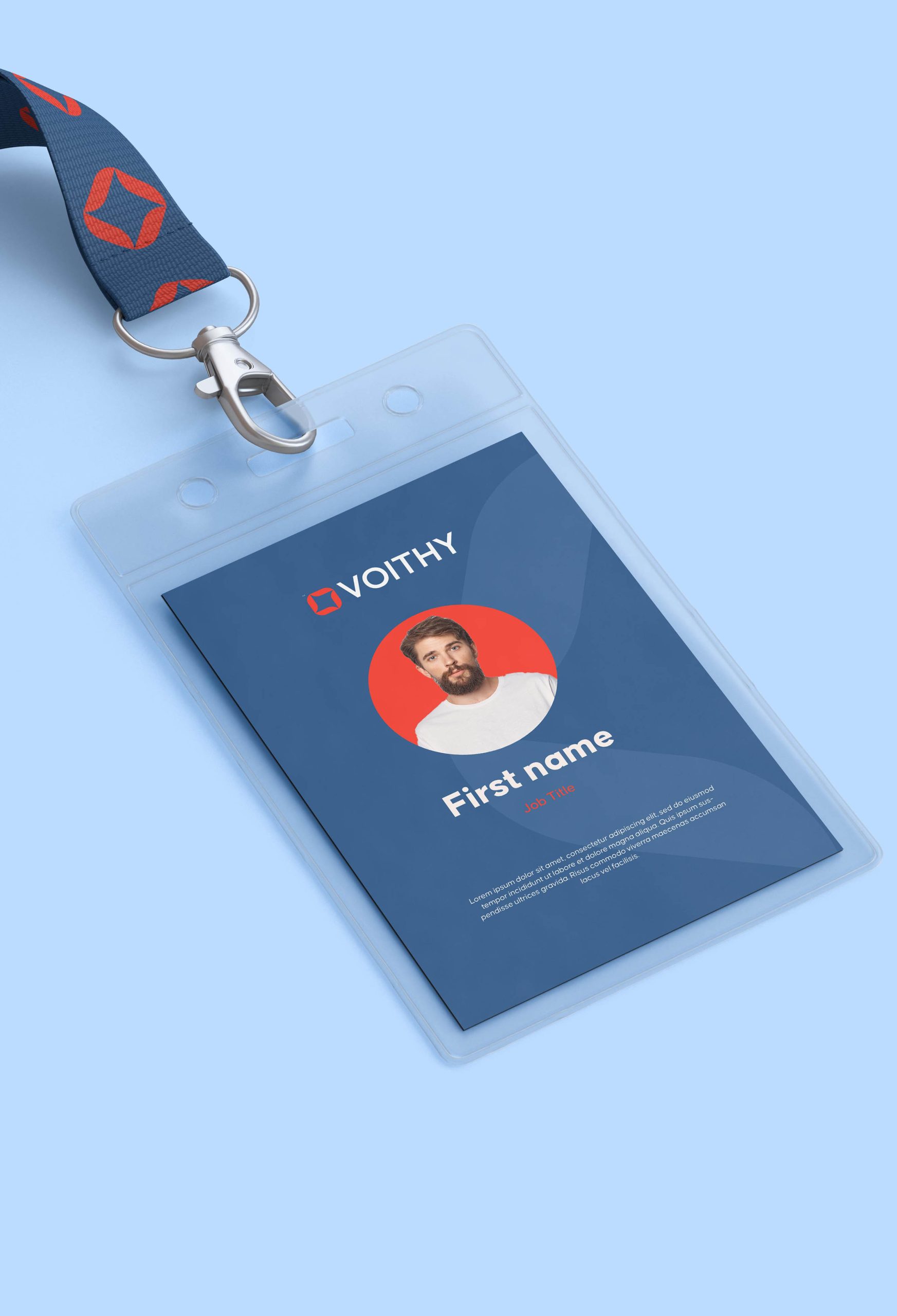
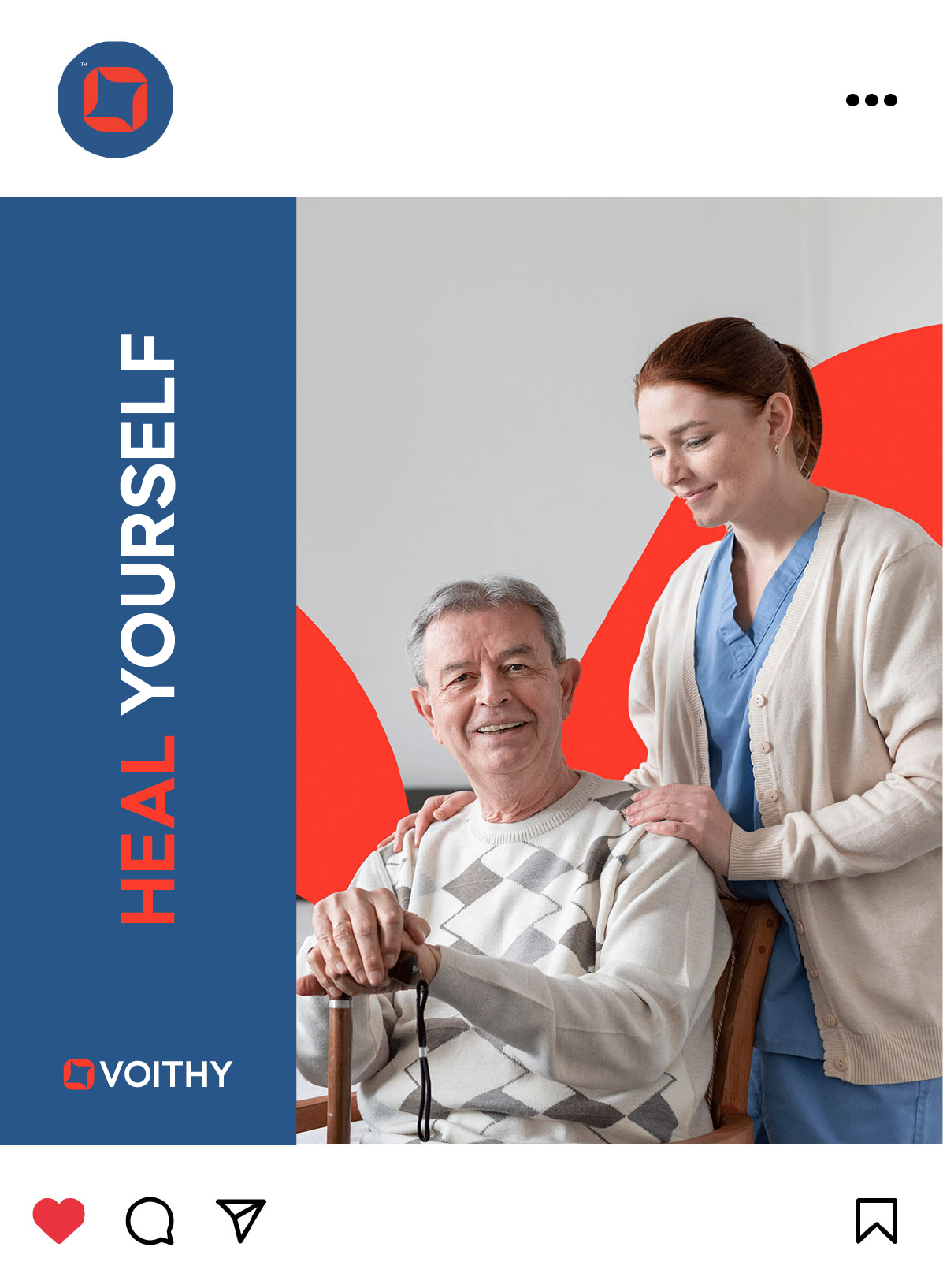
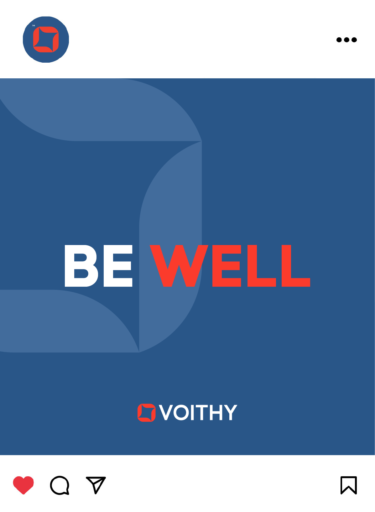
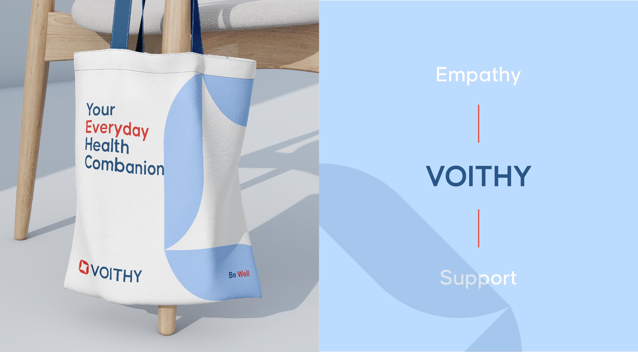
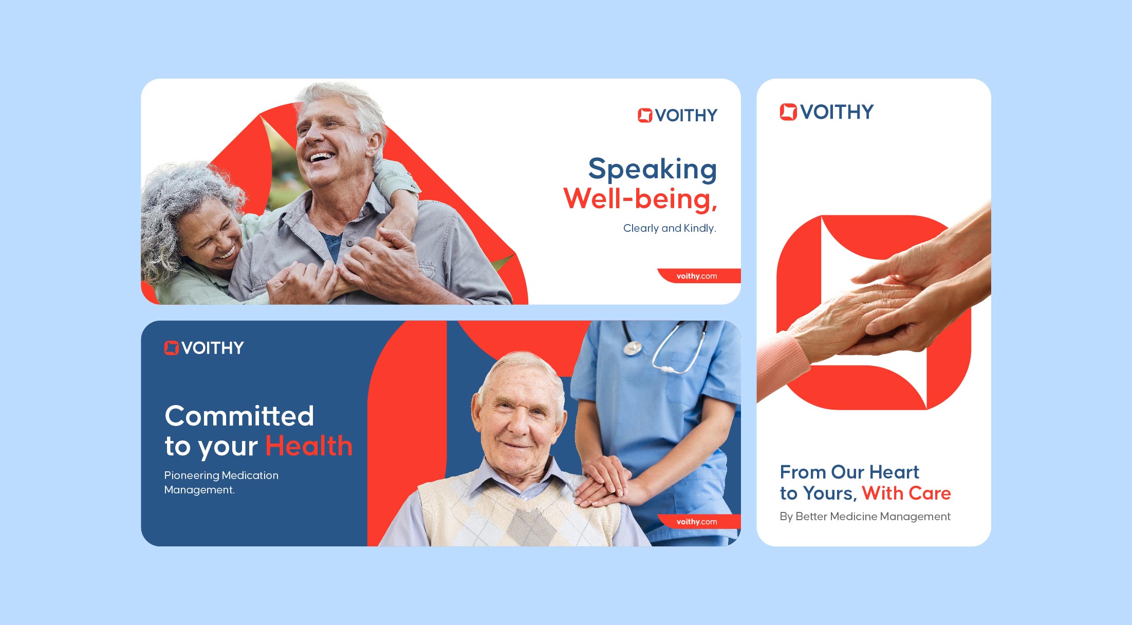
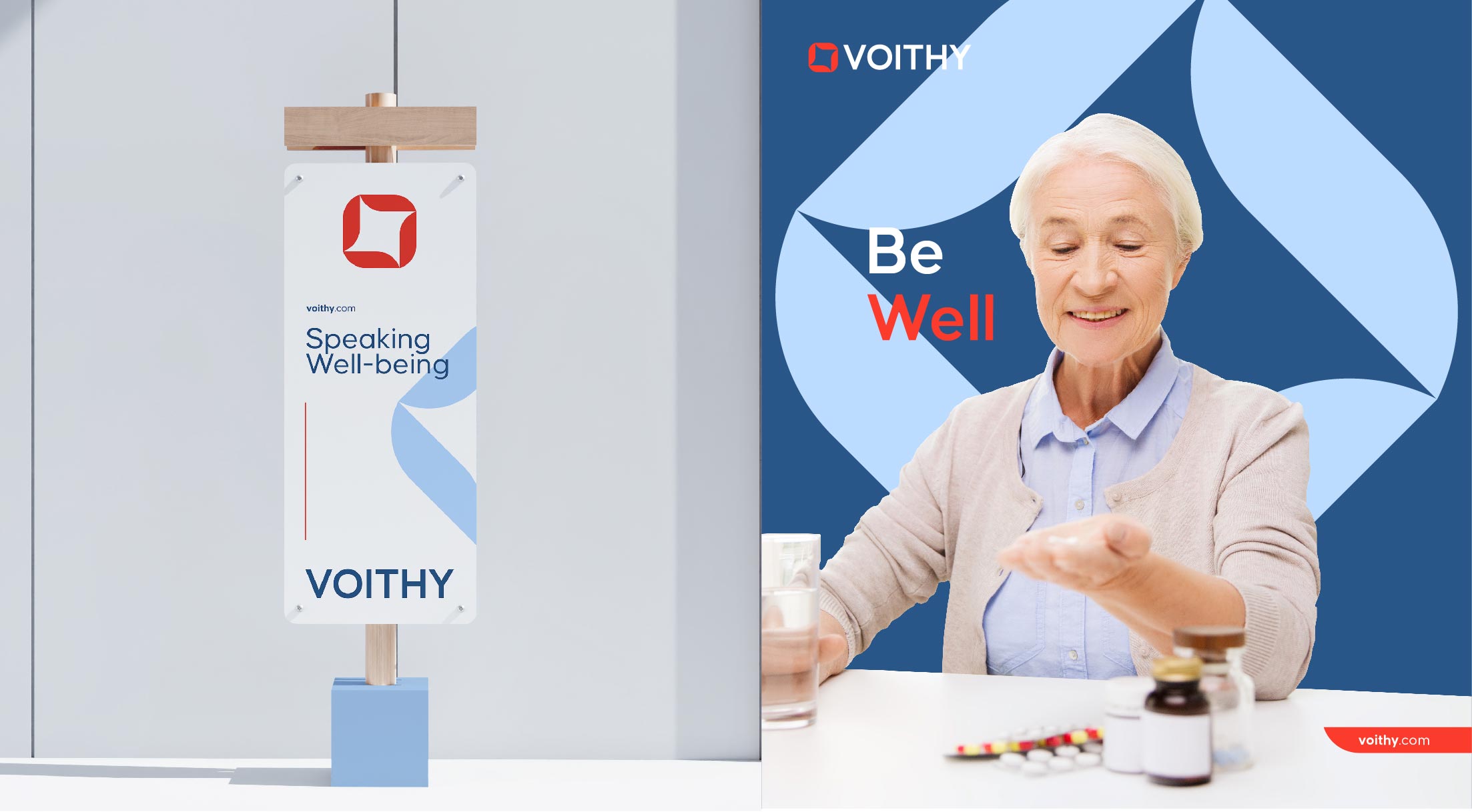
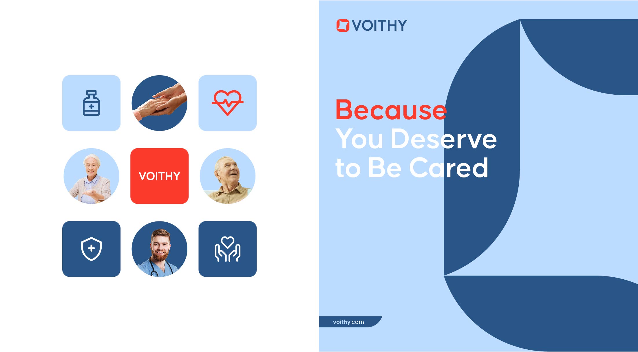
Voithy’s approach to branding was focused on creating a clear and transparent brand image, aimed at conveying a message of comfort and peace. This was achieved by using a minimal and calm color palette, and a clean and simple typeface that reflect the brand’s mission of providing a solution for managing medication for elderly people and those with chronic diseases.
- Empathy Mapping
- Customer-centric Approach
- Transperancy


We knew that we had an opportunity to create a truly special brand.
Voithy’s approach was centered on creating a brand that conveyed a message of comfort and peace. This was reflected in the minimal and calm color palette and the clean and simple typeface that we chose.
SOLUTION
A Connected Solution.
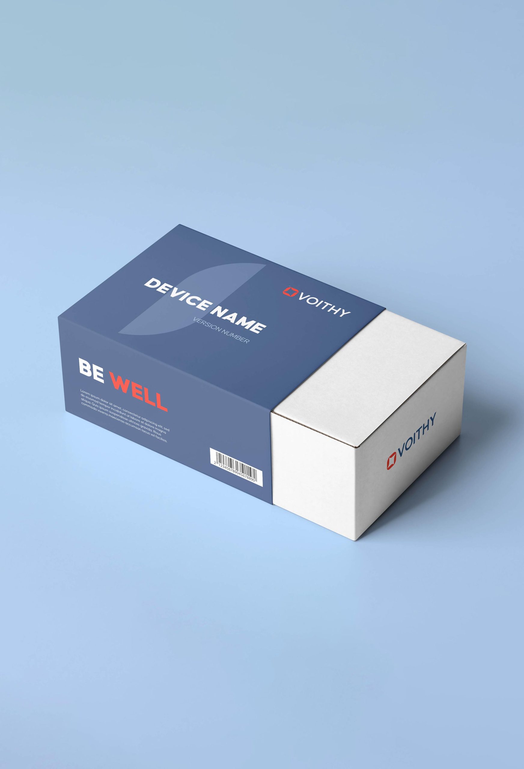
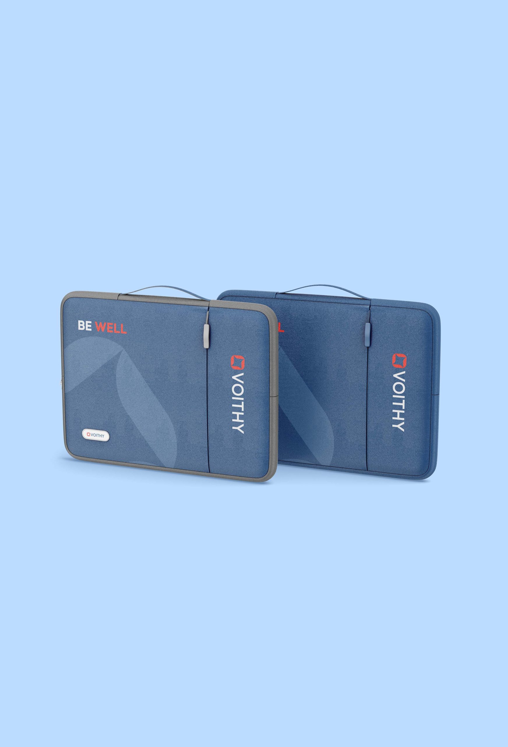
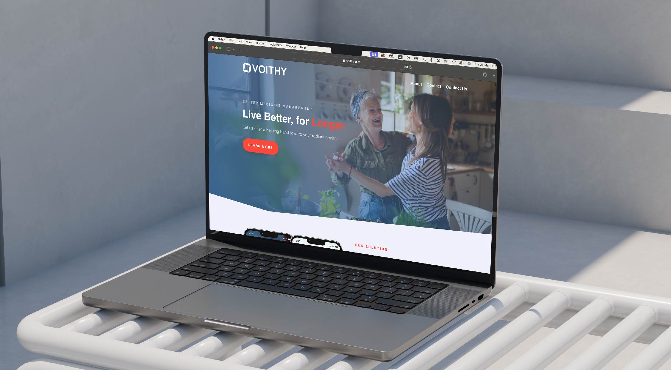
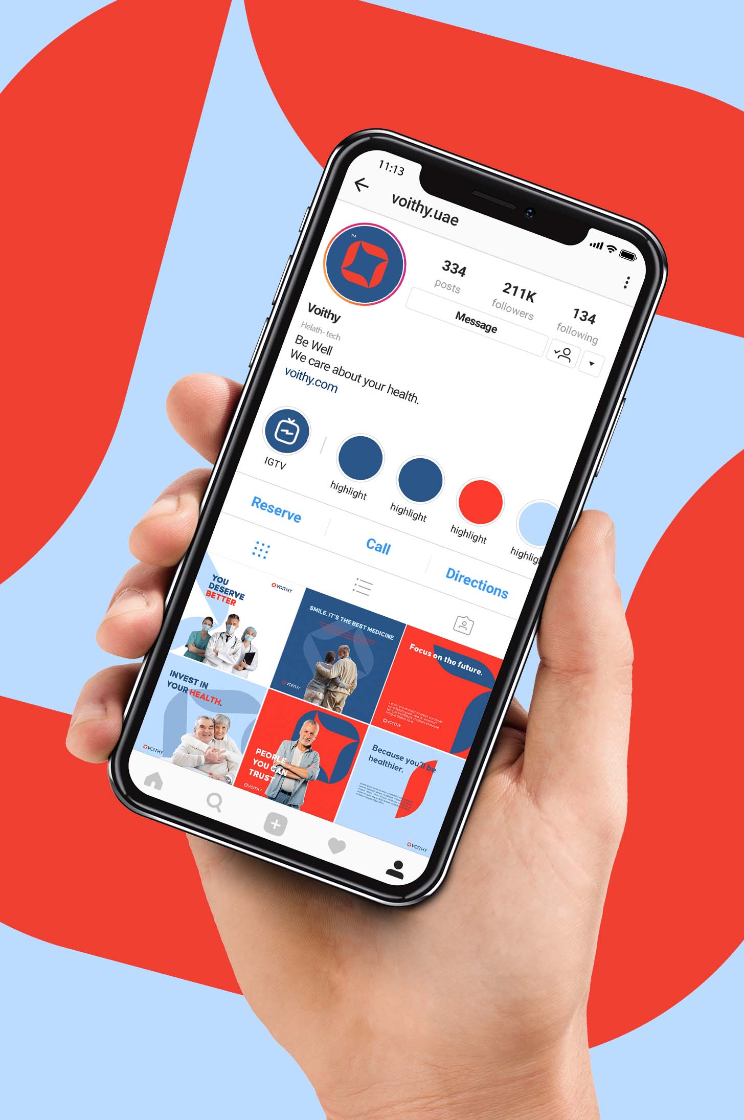
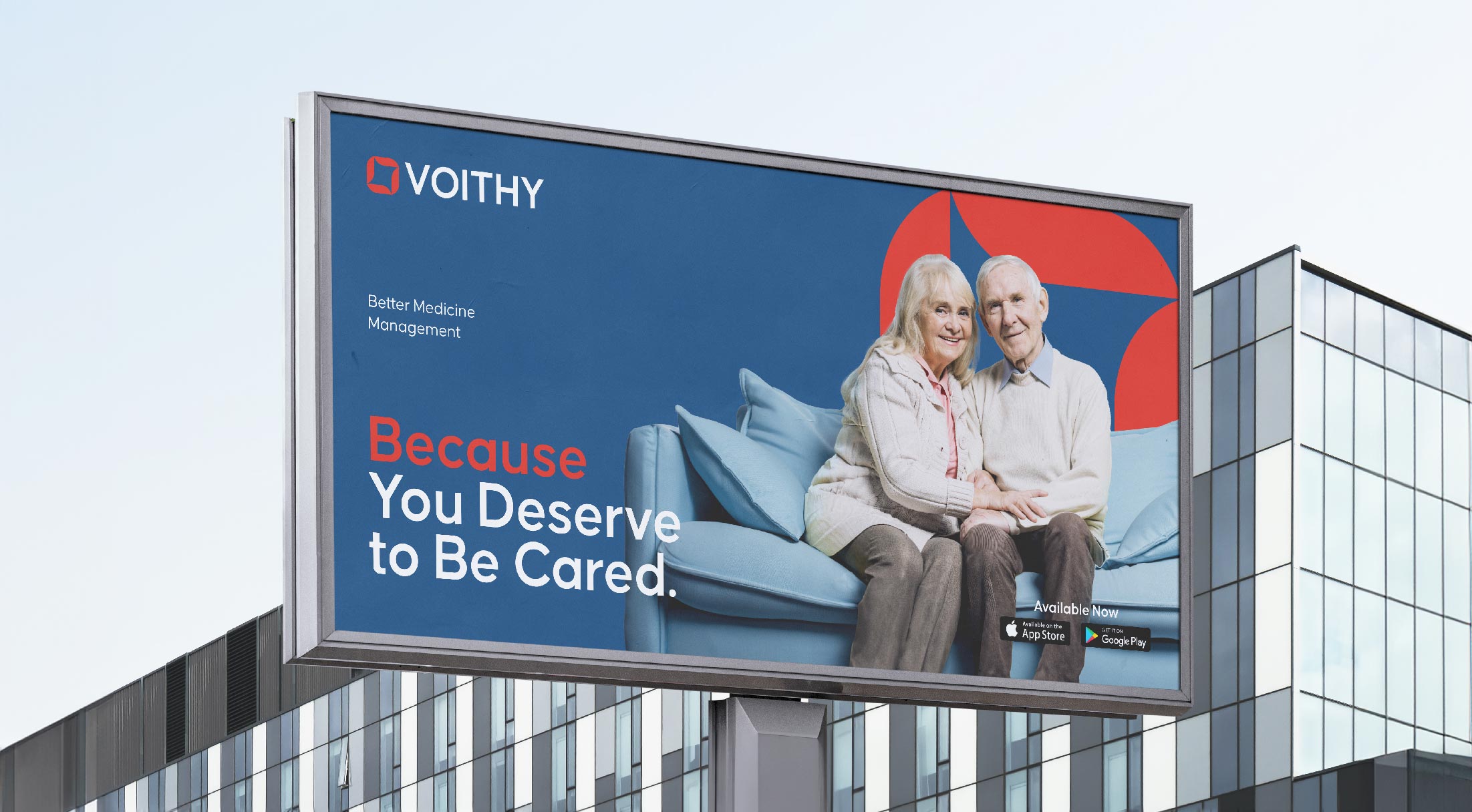
The combination of a calm and transparent brand image with a functional solution helped to create a sense of comfort and peace for the target audience. This is the power of a well-crafted brand, and it is what sets Voithy apart in the crowded healthtech market.
- Simple Color Palette
- Values
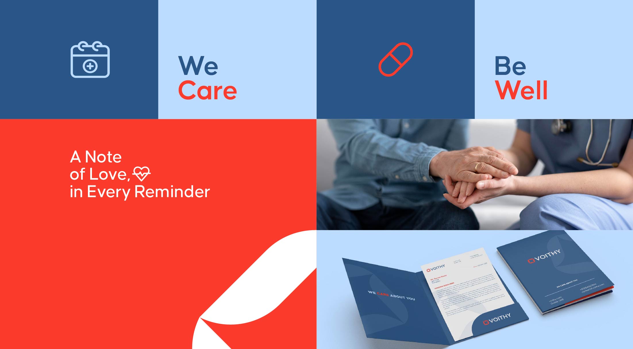
- Clear and Close-to-Heart Messages





Voithy’s solution was simple and straightforward, helping to ease the burden on patients and their families.
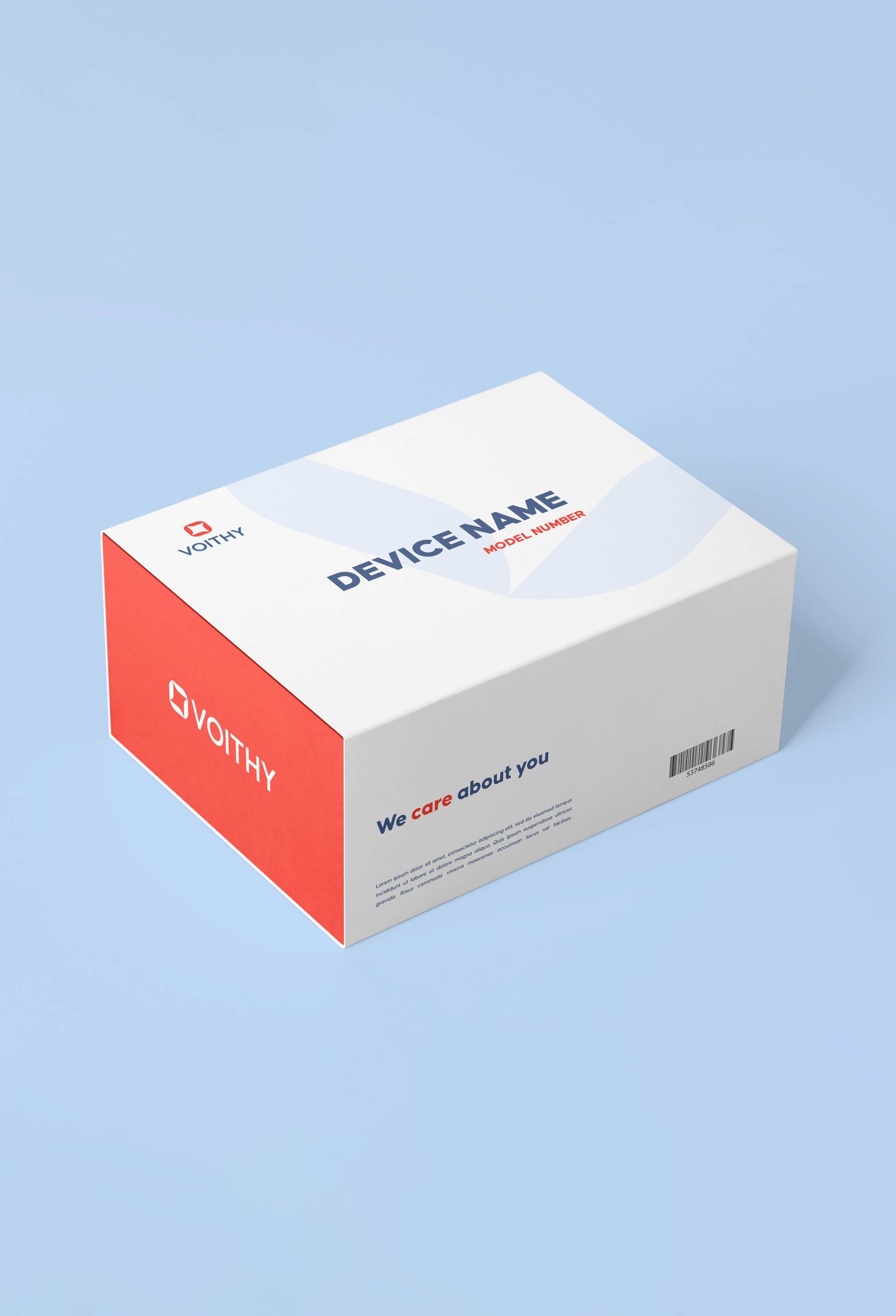
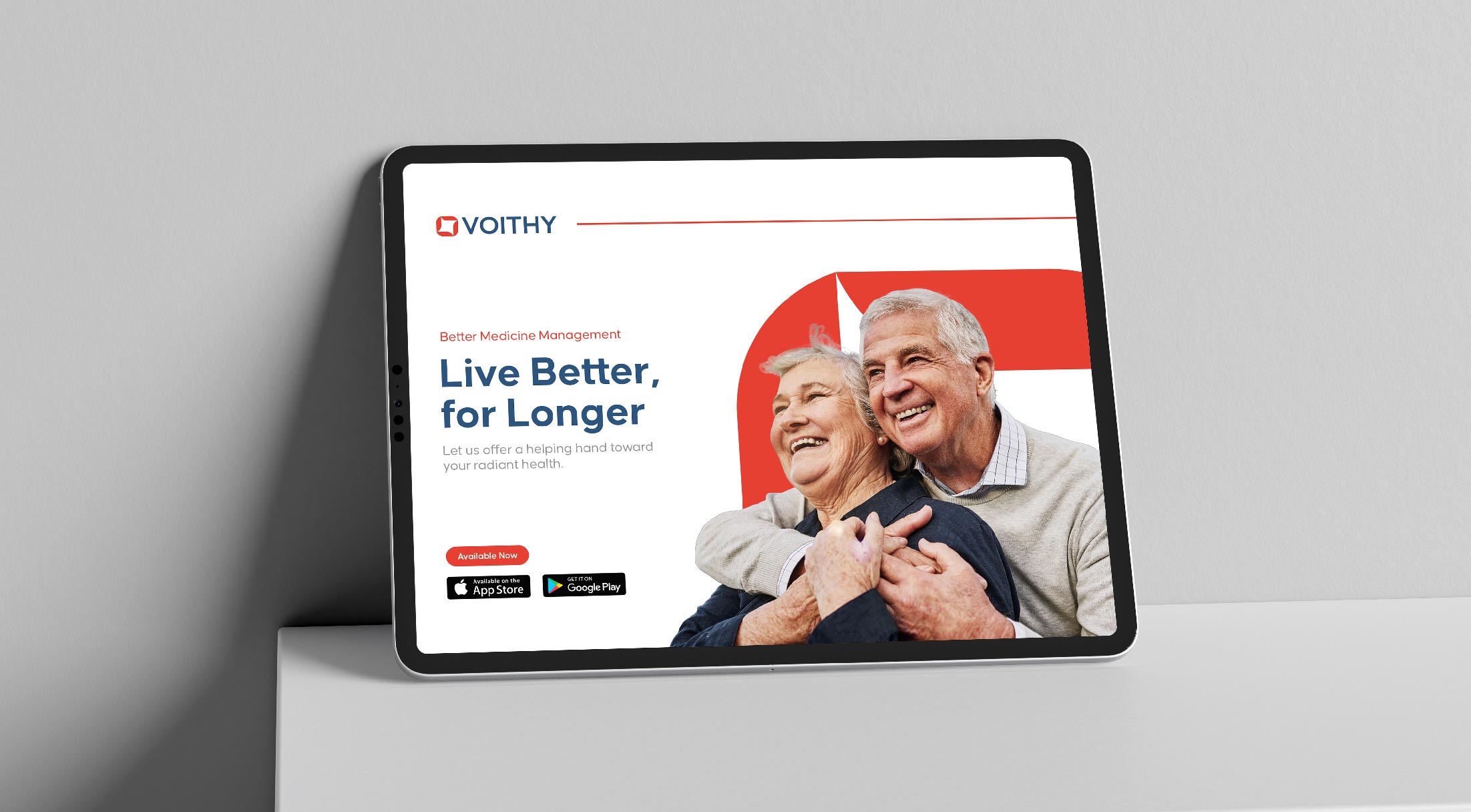
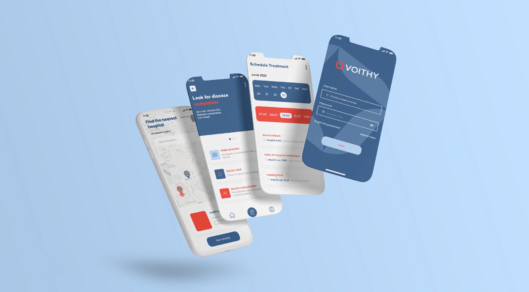
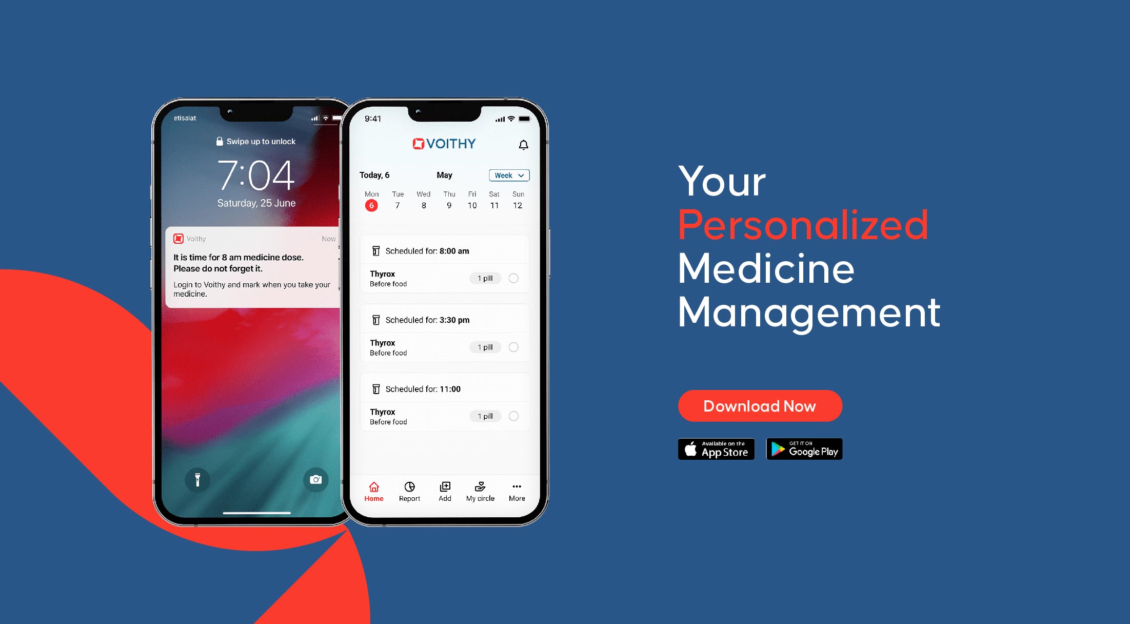
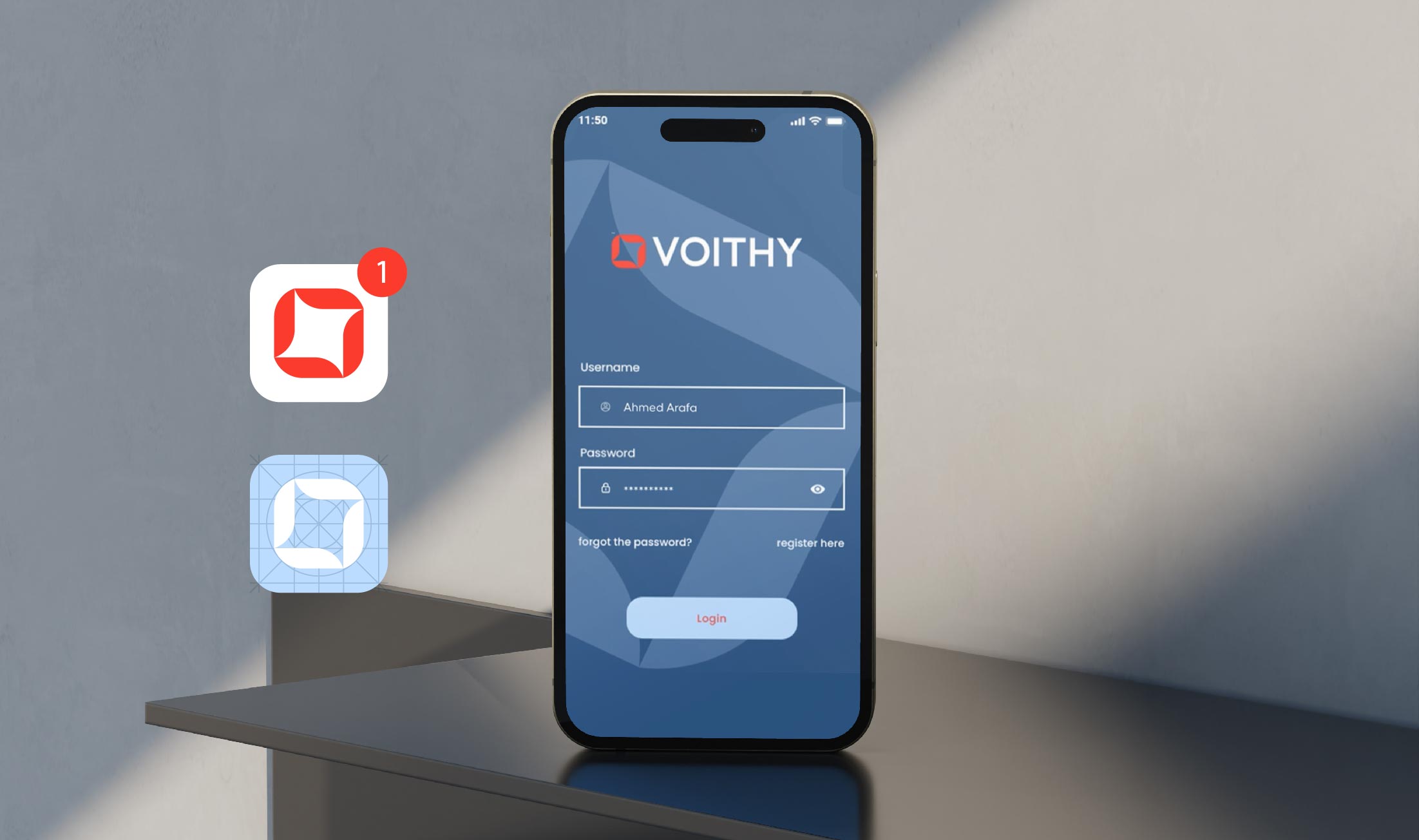
Ryveal worked closely with Voithy to create wireframes and imagination of a device and application that synced with each other, allowing patients to easily manage their medication.
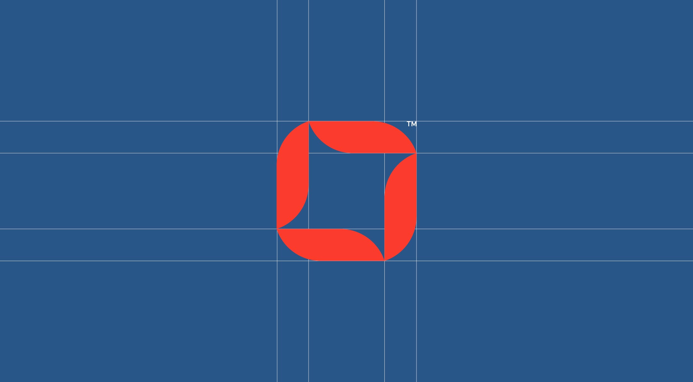
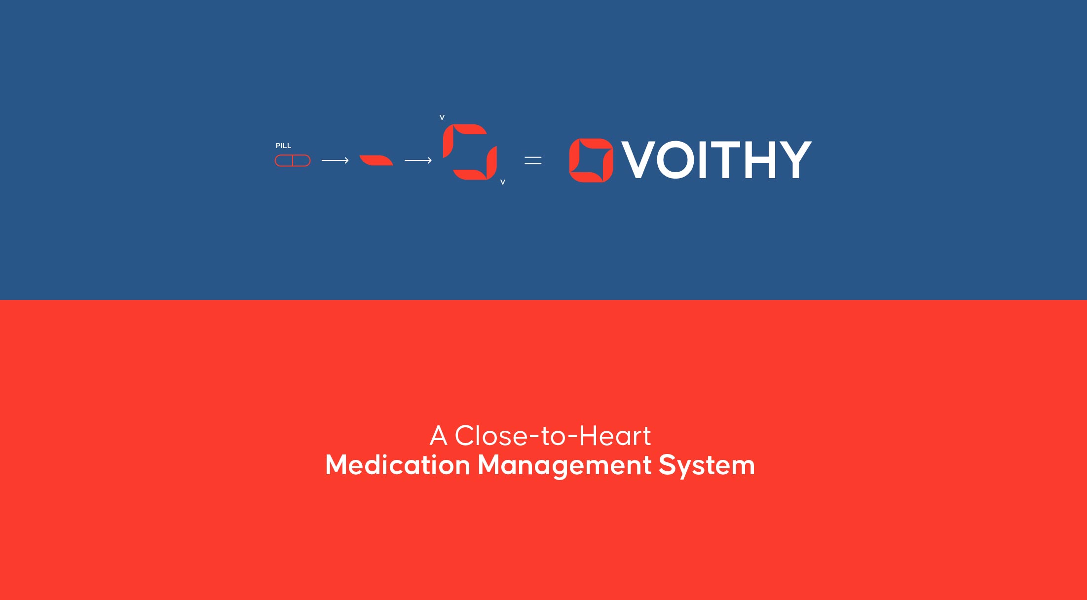
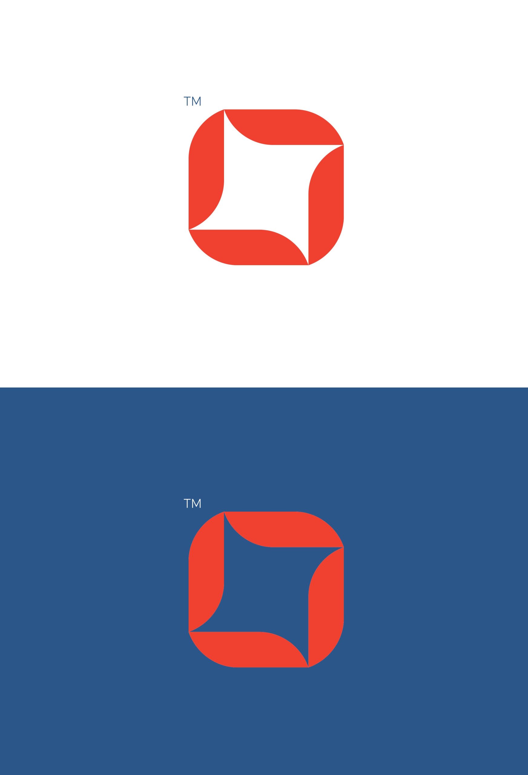
The logo concept consists of 2 V letters facing eachother derived from the pill shape. The logo represents support and empathy.
ST TROPAZ
#295688
RED ORANGE
#FB3B2C
SKY BLUE
#BCDCFF
The combination of a calm and transparent brand image with a functional solution helped to create a sense of comfort and peace for the target audience.
This is the power of a well-crafted brand, and it is what sets Voithy apart in the crowded healthtech market.
